- Get Started
- Install Theme
- Theme Settings
- Require Apps
- Collection, Products
- Blogs
- Menu Config
- Pages
- Languages
- Markets
- Metafields
- Section
- Collection Pages
- Product Pages
- Blog Pages
- Other Pages
- Support
-
About Amerce
-
About Amerce
What is Amerce?
Amerce is a modern, feature-rich Shopify Online Store 2.0 theme built for general commerce, fashion, and lifestyle stores. Built on top of Shopify's Skeleton Theme foundation and heavily extended with mega menu navigation, quick add/quick view, wishlist, compare, product bought-together, bundle & discount sections, and a marquee announcement bar. Amerce helps merchants build a fast, conversion-focused storefront without any build step — every asset is hand-written and served directly by Shopify.
Key Features
- Mega menu navigation: Multi-column dropdown menus with menu links, product lists, and image cards.
- Quick add & Quick view: Let customers add to cart or preview full product details without leaving the current page.
- Wishlist & Compare: Customers can save favorite products and compare products side by side.
- Bought together & complementary products: Increase average order value with smart product recommendations powered by Shopify Search & Discovery.
- Bundle, discount & urgency sections: Bundle save, discount banners, countdown timers, urgency badges, live-viewer counts, and stock progress bars.
- Advanced product cards: 6 card layout styles, swatch hover preview, badges & tags, and product ratings.
- Powerful cart: Drawer or page cart type, cart recommendations, free-shipping progress bar, gift wrap, order notes, shipping estimator, and discount code field.
- Facets & filtering: Collection filters and smart search powered by Shopify Search & Discovery.
- Marquee announcement bar & top bar: Highlight promotions across your store.
- Multi-language & multi-currency ready: Built for Shopify Markets and Translate & Adapt.
- Shopify Online Store 2.0: Flexible drag-and-drop customization with sections and theme blocks.
- Mobile-first, SEO & performance optimized: Fast loading and search engine friendly.
-
Install Theme
-
What you receive
1. One .zip file per Homepage design
Amerce is delivered as a set of ready-to-use Shopify theme .zip files — one complete, independent package per homepage design (Main Demo, also referred to as Home Fashion, is the flagship design, plus additional Home designs — see the list below). Each zip already contains its own
templates/index.json(with that design's homepage already built), its own header/footer, color schemes, and settings — it is fully self-contained and ready to publish as-is. You do not need to copy or merge files between zips.Note: Do not unzip/extract the file before uploading — Shopify's theme uploader expects the original .zip package.
2. Available Homepage designs
The theme's Home navigation menu on the live demo lists every planned Home design. The designs below are already built and included as separate .zip files:
- • Main Demo (Home Fashion) — the flagship design.
- • Home Mental
- • Home Electronics
- • Home POD
- • Home Pet Care
- • Home Baby
- • Home Auto
- • Home Decor
- • Home Cosmetic
- • Home Organic
- • Home Sport Wear
- • Home Head Phone
- • Home Jewelry
- • Home Garden
- • Home Construct
- • Home Furniture
- • Home Fashion
- • Home Bag
- • Home Sport
- • Home Office
- • Home Sneaker
3. Choosing a Homepage design
Open the demo preview links provided with your purchase, pick the homepage design you like from the list above, then locate the matching zip file by name (e.g.
Amerce-Home-Auto.zip) and use that one in the install steps below. You can install more than one Home design at the same time (see step 5) to compare them live before deciding which one to publish. -
Amerce Theme Installation
Upload and publish a Home design
Follow the steps below to install a chosen Home design of the Amerce Shopify Theme on your online store:
- 1. Log in to your Shopify Admin and navigate to Online Store → Themes.
- 2. Under Theme Library, click Add theme → Upload zip file.
- 3. Choose the .zip file for the Home design you selected (see What you receive above) and click Upload.
- 4. Wait for Shopify to finish uploading and processing the theme file.
- 5. The theme now appears in your Theme Library as an unpublished theme. Click Customize to preview and adjust content, or Preview to see it without editing.
- 6. When you're ready to make it live, open the theme's Actions menu → Publish.
Note: Shopify lets you keep several themes in your Theme Library at once, but only one theme can be Published (live) at a time. Unpublished themes can still be freely previewed and edited.
Setting up store content after install
A freshly uploaded theme only contains the demo layout — it does not include your own products, collections, pages, menus, or images. After publishing, continue with the guides in this documentation to add your real store content:
- • Theme Settings — logo, colors, typography, product cards, cart.
- • Require Apps — install the apps the theme depends on for search/filtering, translations, and reviews.
- • Collection & Products, Blogs, Menu Config, Pages — recreate the demo content with your own products/pages/menus.
- • Metafields — required for blocks like Live viewers, Countdown timer, Stock progress bar, Urgency badge, and Bought together.
-
Theme Settings
-
Logo
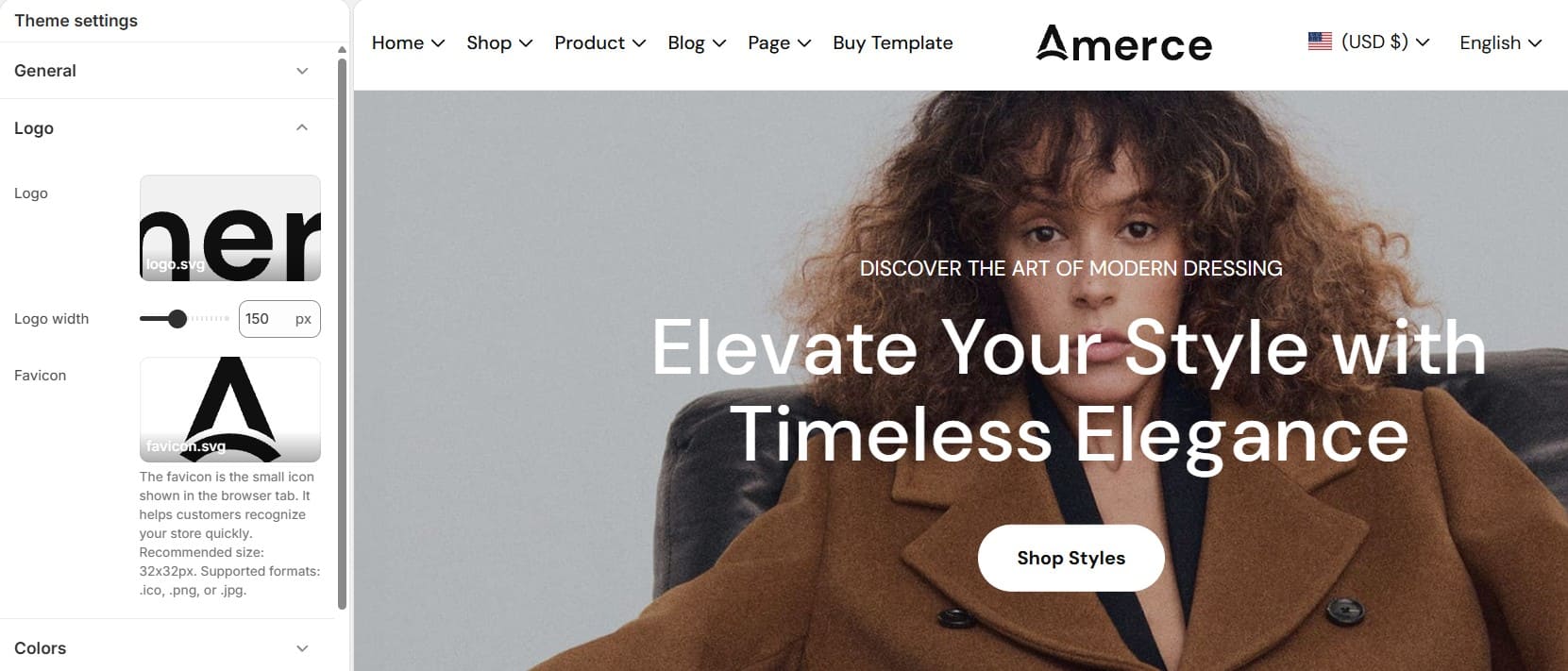
1. Logo
In the Logo area, you can upload the main image representing your brand.
- • Select –Click to upload a logo from your computer.
- • Explore free images – Choose free images from Shopify’s library.
- • Width – Adjust the displayed logo size for desktop. You can drag the slider or manually enter a pixel value (e.g., 150px).
2. Favicon
The Favicon is the small icon that appears on the browser tab.
In this section, you can:
- • Upload a favicon image (e.g., favicon.png)
- • The image will automatically be scaled down to the standard 32 x 32px size.
A favicon helps improve brand recognition when users open multiple tabs.
-
Color Schemes
Color schemes help you manage your store's branding consistently across your website. Instead of setting colors for each element individually, you can create and apply predefined color schemes throughout your store.
You can read more about color schemes here.
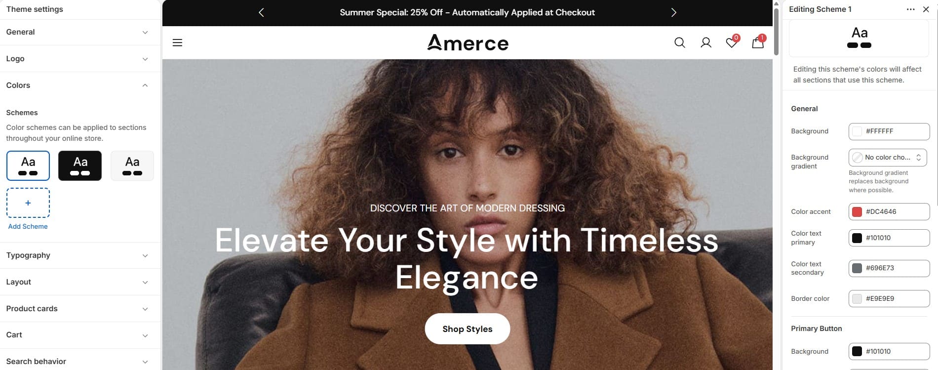
Included settings
Each color scheme can be customized with your preferred colors for backgrounds, text, headings, links, buttons, and borders, helping you maintain a consistent brand identity across your store.
- • Primary color
- • Border color
- • Background color
- • Background gradient
- • Heading text color...
- • Additional UI colors depending on the theme
How it works
- • Go to Theme settings → Colors
- • Select an existing scheme or click Add Scheme (+)
- • Customize the colors you want
- • Assign the scheme to supported sections from the Theme Editor
Changes made to a scheme will automatically affect all sections using that scheme.
-
Typography
Typography settings allow you to control how text appears throughout your store. Select fonts for headings and body text, then customize size, weight, line height, and letter spacing to improve readability and match your brand style.
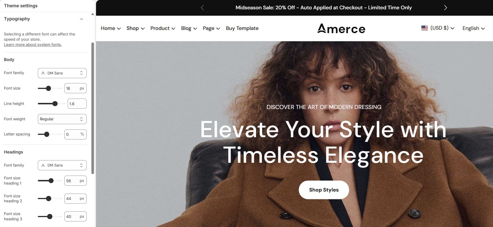
Included settings
- • Font family selection
- • Body text settings
- • Heading text settings
- • Font size
- • Font weight
- • Line height
- • Letter spacing
Changes will automatically apply to all sections using these typography settings.
-
Layout
Customize your store's width and spacing settings. Control the page width, full-width section offset, and the corner radius of buttons and inputs to create a clean and consistent layout across different screen sizes.
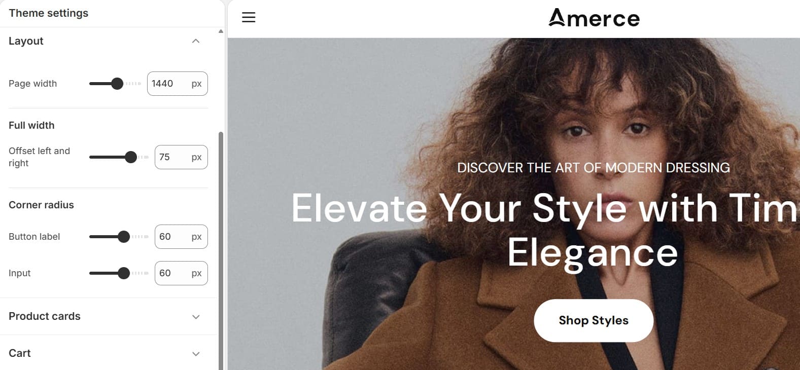
-
Product cards
Customize the appearance and functionality of product cards throughout your store. Control the card layout style, quick actions, and displayed variant information to create a better shopping experience.
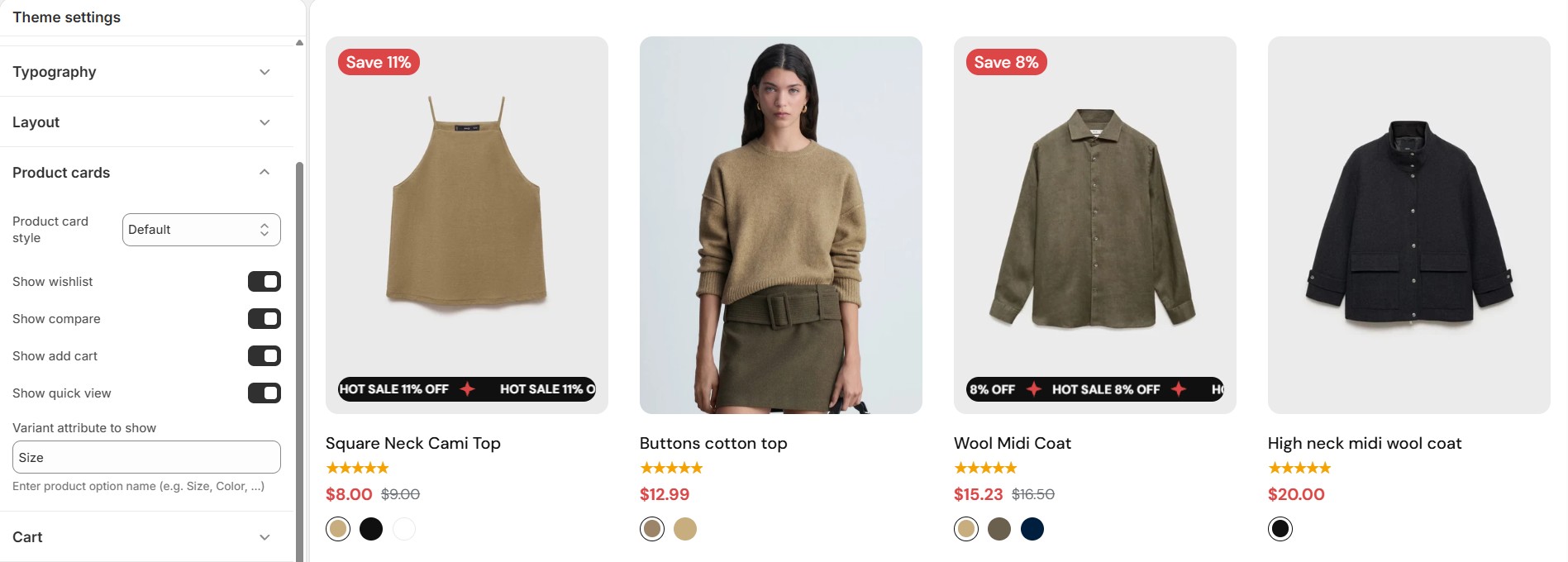
Included settings
- • Product card style (6 layout variants)
- • Show wishlist, Show compare
- • Show add to cart, Show quick view
- • Variant attribute to show on the card (e.g. color swatches)
- • Badges & tags (sale, new, sold out, custom tags)
-
Cart
Configure how the cart behaves and what it displays. These settings control the cart drawer/page, product recommendations, free shipping progress, and checkout-related options.
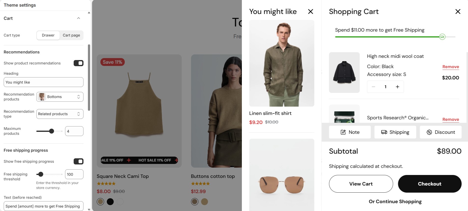
Included settings
- • Cart type: Drawer or Page
- • Show cart recommendations (related or complementary products), recommendation limit
- • Free shipping progress bar with configurable threshold and messages
- • Enable order note, shipping estimator, discount code field
- • Enable gift wrap (with linked gift-wrap product)
- • Show terms & conditions checkbox, linked terms page
- • Show dynamic checkout buttons (Shop Pay, PayPal, etc.)
-
Search & Filter behavior
Amerce's predictive search and collection filters (facets) are powered by the Shopify Search & Discovery app. These settings control how search results and collection filters behave in the storefront.
-
Social media
This section allows you to connect your store with your social media platforms by adding the URLs to your official accounts. Once added, the theme will display these links in areas such as the header, footer, and social icon sections—depending on the layout.
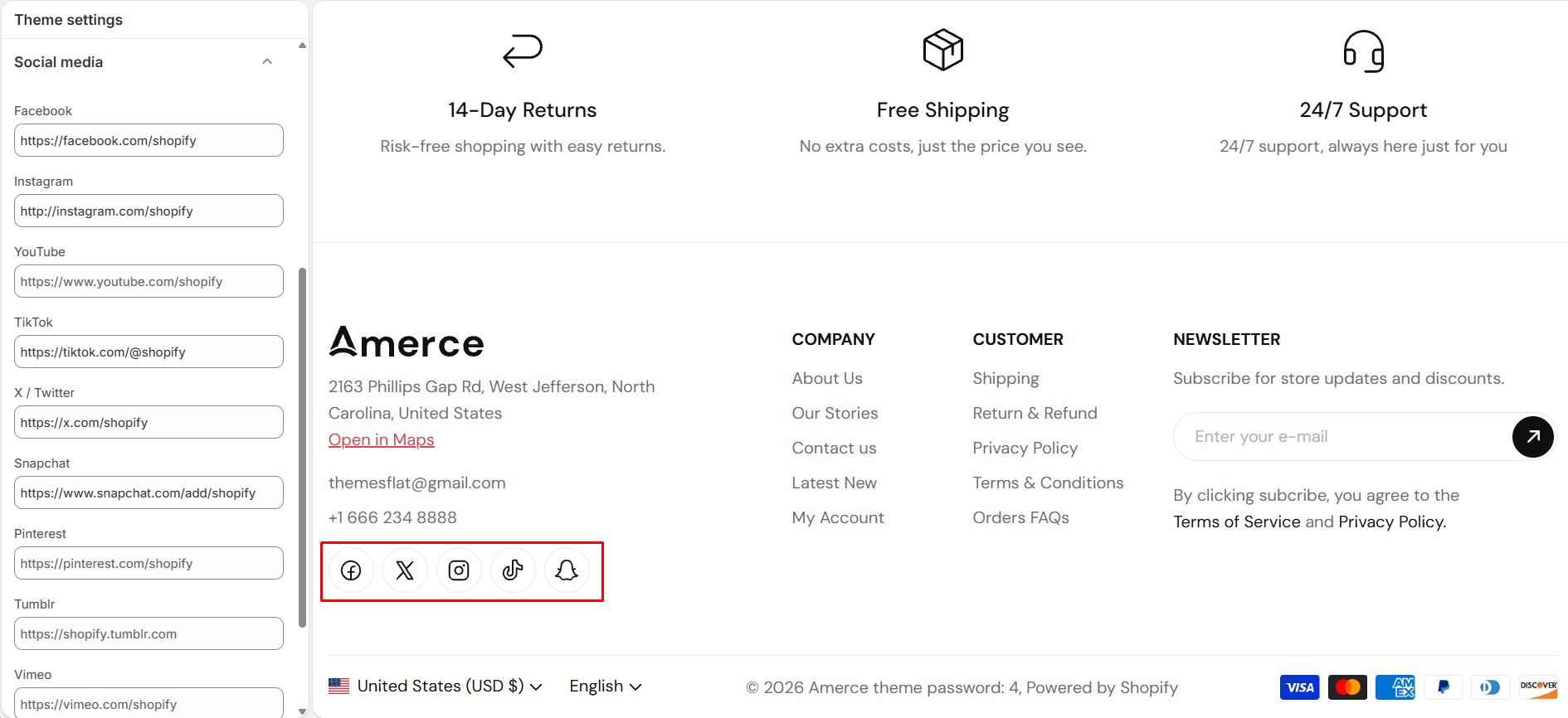
How It Works
Add the URLs of your social media profiles to display their icons on your storefront. Leave a field blank to hide the corresponding icon.
Supported Platforms
Facebook
Enter your Facebook Page URL.
Example: https://www.facebook.com/xxxx
Instagram
Enter your Instagram profile URL.
Example: https://www.instagram.com/xxxx
YouTube
Add a link to your YouTube channel.
Example: https://www.youtube.com/xxxx
TikTok
Add your official TikTok profile link.
Example: https://www.tiktok.com/xxxx
Twitter (X)
Enter your Twitter/X profile URL.
Example: https://x.com/xxxx
Snapchat
Insert your Snapchat profile link.
Example: https://www.snapchat.com/xxxx
Pinterest
Add your Pinterest account link.
Example: https://www.pinterest.com/xxxx
Tumblr
Enter your Tumblr blog or profile URL.
Example: https://www.tumblr.com/xxxx
Vimeo
Add your Vimeo profile or channel link.
Example: https://vimeo.com/xxxx
LinkedIn
Add your LinkedIn company page link.
Example: https://www.linkedin.com/company/xxxx
Notes
- • Only enter valid URLs to ensure icons display correctly.
- • Icons will appear only for platforms that have a URL filled in.
- • The theme automatically loads the correct social icon for each platform; no extra setup is required.
-
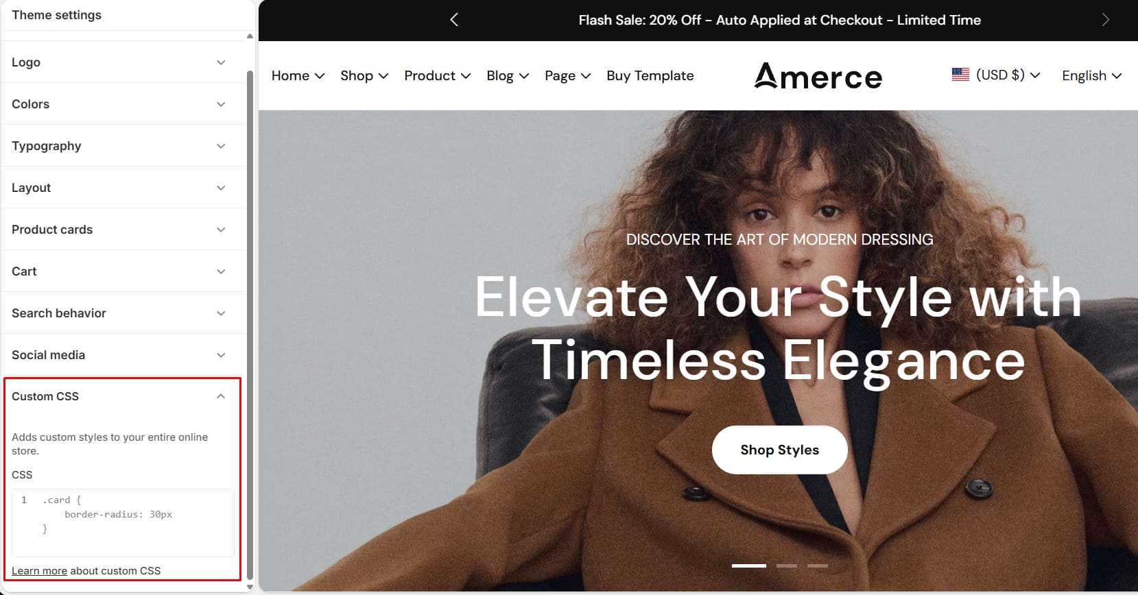
Custom CSS
The Custom CSS section allows you to add your own CSS code and apply styling changes across your entire Shopify online store. This feature is useful for advanced customizations that are not available through the standard theme settings.

-
Require Apps
-
Recommended Apps
Amerce relies on the third-party apps listed below to support specific enhanced functionalities. These apps are not bundled with the theme by default. To use those features, you will need to install each required app manually from the Shopify App Store.
Shopify Search & Discovery
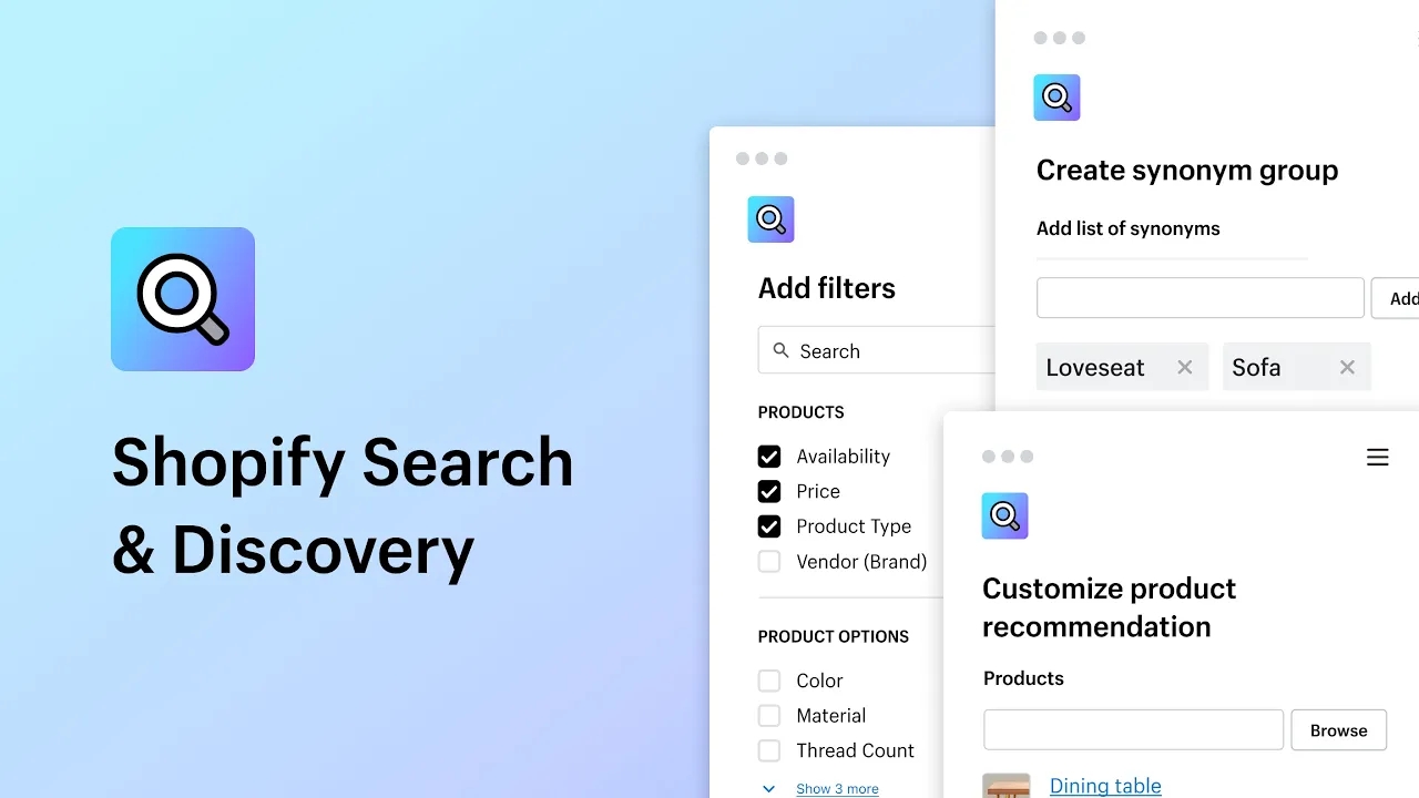
A great shopping experience starts with simple search and seamless discovery. Customize search, filtering, and product recommendations to enhance your products' relevance and boost sales. Use the Shopify Search & Discovery app to power the theme's facets (collection filters), predictive search, and the Bought together / Complementary products block on the product page. Additionally, employ analytics to gain insights into how customers navigate your store, helping shoppers find exactly what they’re looking for.
- • Customize filters to let shoppers refine their search by multiple categories.
- • Make synonym groups, so product descriptions match the terms shoppers use.
- • Use product boosts to feature products you want highlighted in search results.
- • Add related and complementary products on product detail pages.
- • Access analytics to understand your store’s search and discovery performance.
Shopify Translate & Adapt
Translate & Adapt lets you auto-translate up to two languages for free, and manually add as many translations as you wish. The side-by-side editor makes it easy to compare and review your translations, and can also be used to adjust content between markets that speak the same language to ensure cultural, seasonal, and regional relevance.
- • Manually add, edit, and review translations with the side-by-side editor.
- • Auto-translate 2 languages with Google Translate (cloud.google.com/translate).
- • Adapt content to reflect spelling and messaging variations between markets.
- • Localize directly from the theme editor, or any resource page in your admin.
- • Manage localized store content seamlessly from your Shopify admin.
Judge.me Product Reviews
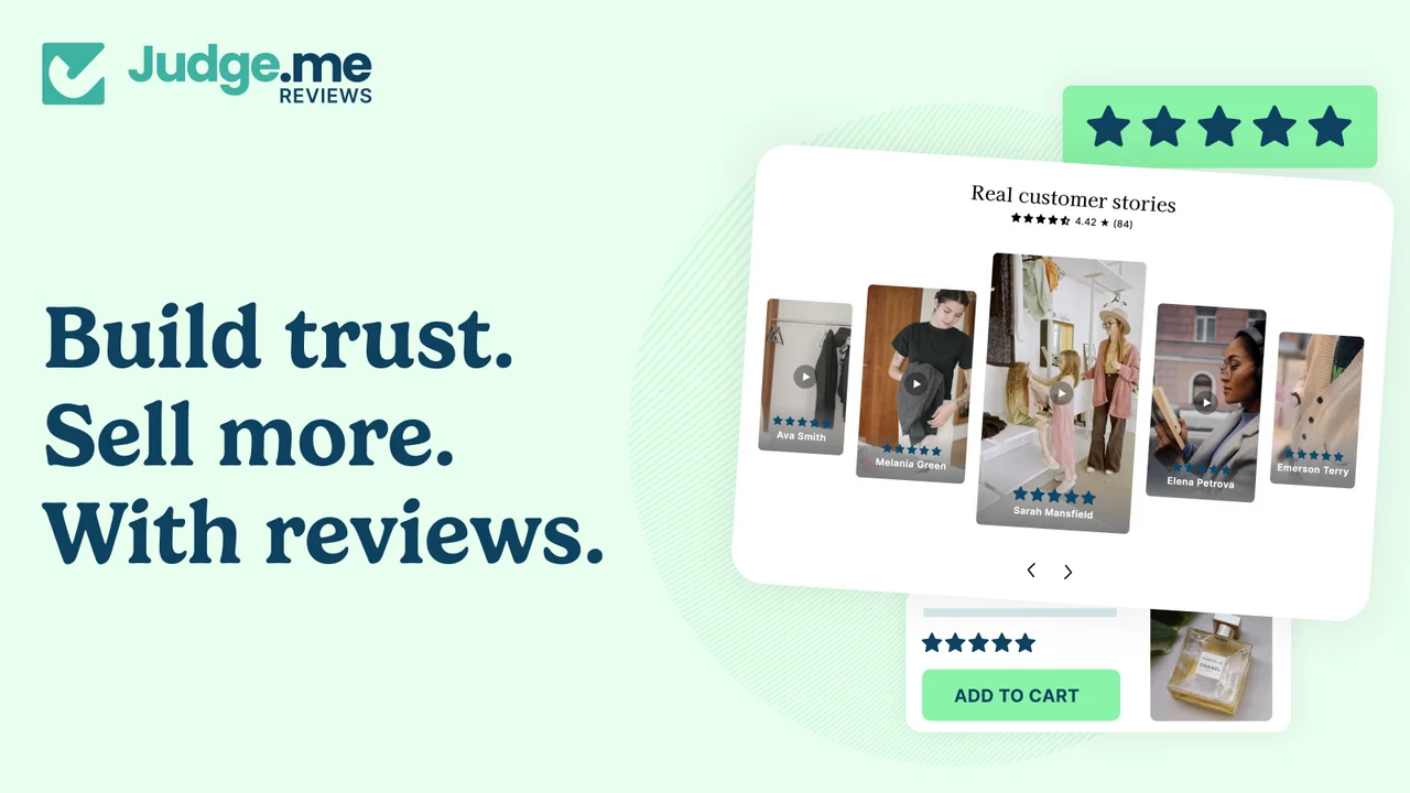
Amerce uses Judge.me Product Reviews to collect and display customer reviews. Judge.me writes its rating data into the standard reviews.rating and reviews.rating_count product metafields, which the theme reads directly to show the star-rating badge on product cards, the product page, and Featured product sections — no extra theme configuration is required once Judge.me has synced ratings to a product.
- • Automatically collect reviews via post-purchase review request emails.
- • Let customers submit photo/video reviews from the storefront.
- • Show a star-rating summary and review count on product cards and the product page.
- • Sync the average rating to reviews.rating and reviews.rating_count so the theme can render it without any extra setup.
- • Import existing reviews from other platforms (Shopify Product Reviews, Loox, Yotpo, etc.) when migrating.
-
Collection & Products
-
Collection
Collections in Shopify allow you to group products into categories, making it easier for customers to browse and find items they’re looking for. You can create collections manually by selecting specific products, or automatically using conditions such as tags, price, vendor, or product type. Once created, collections can be displayed on your homepage, menus, or any page throughout your store. Properly organized collections not only improve navigation but also enhance the overall shopping experience.
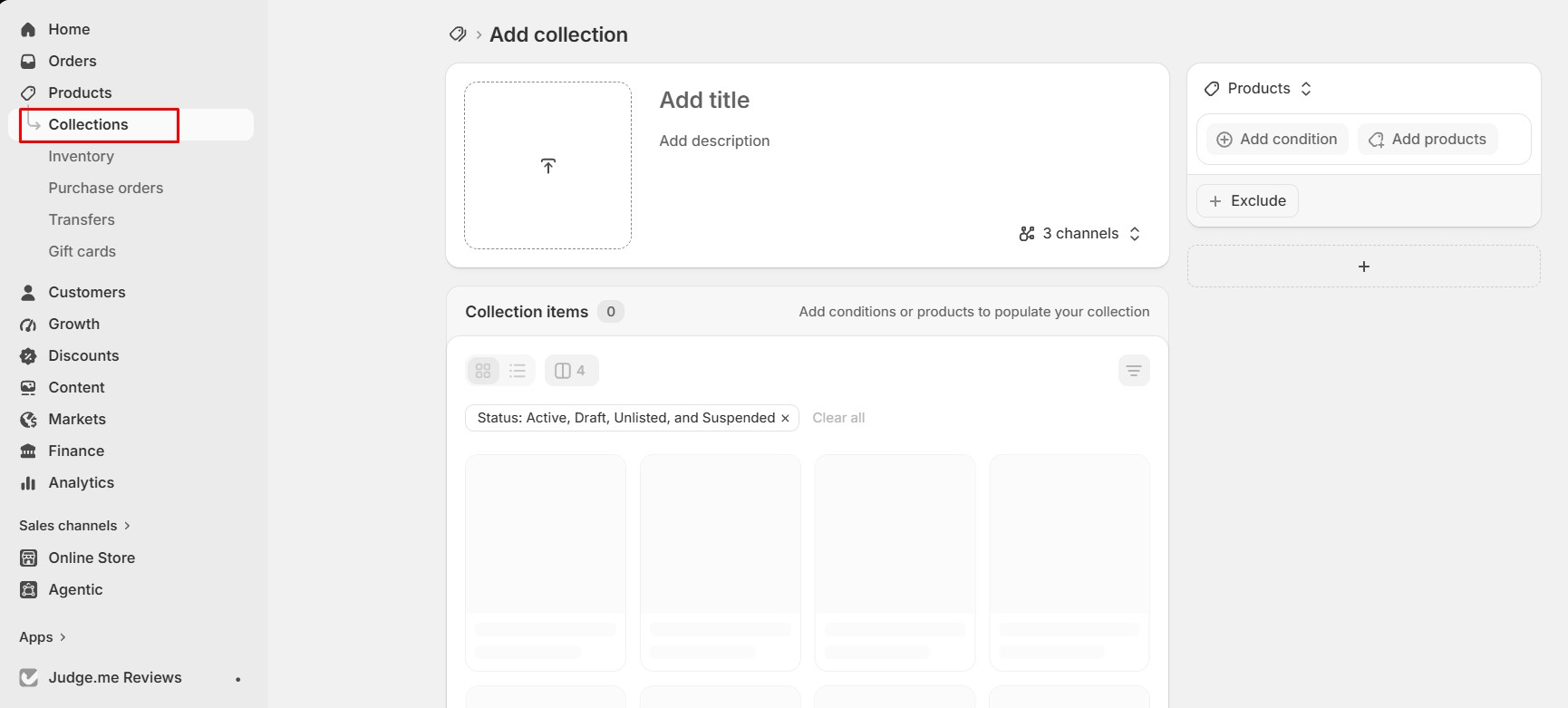
1. Create a Collection
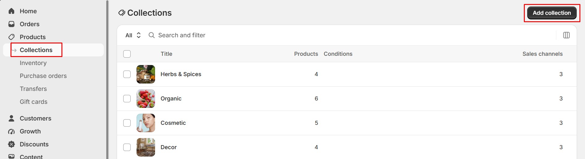
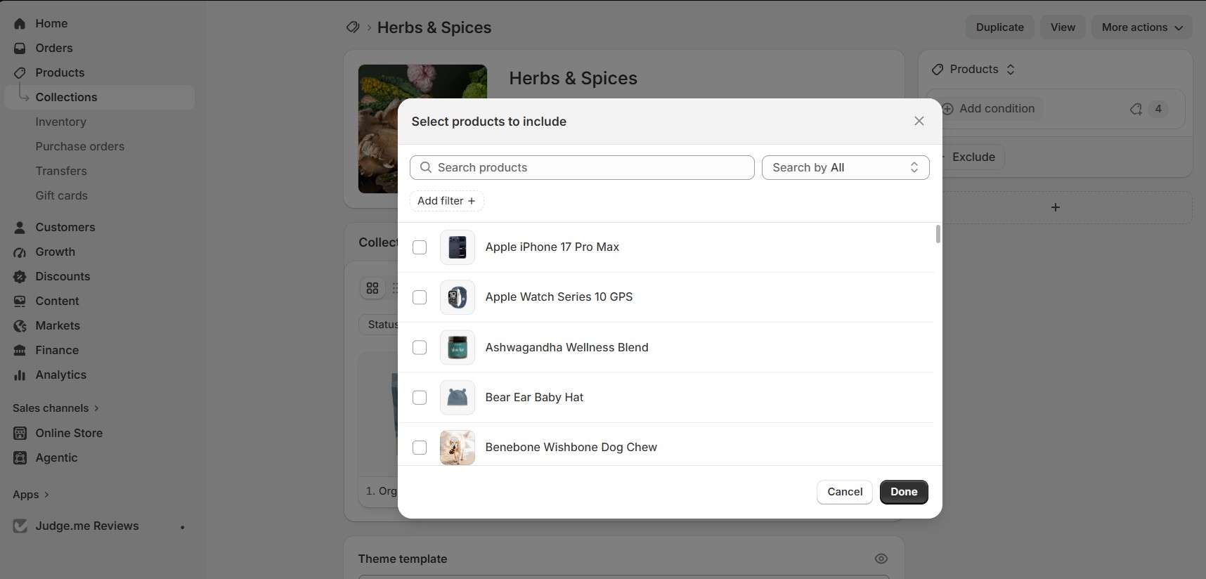
Go to Products > Collections in your Shopify admin and click Create collection. Enter a title, description,image, choose product and save
2. Add Products to the Collection
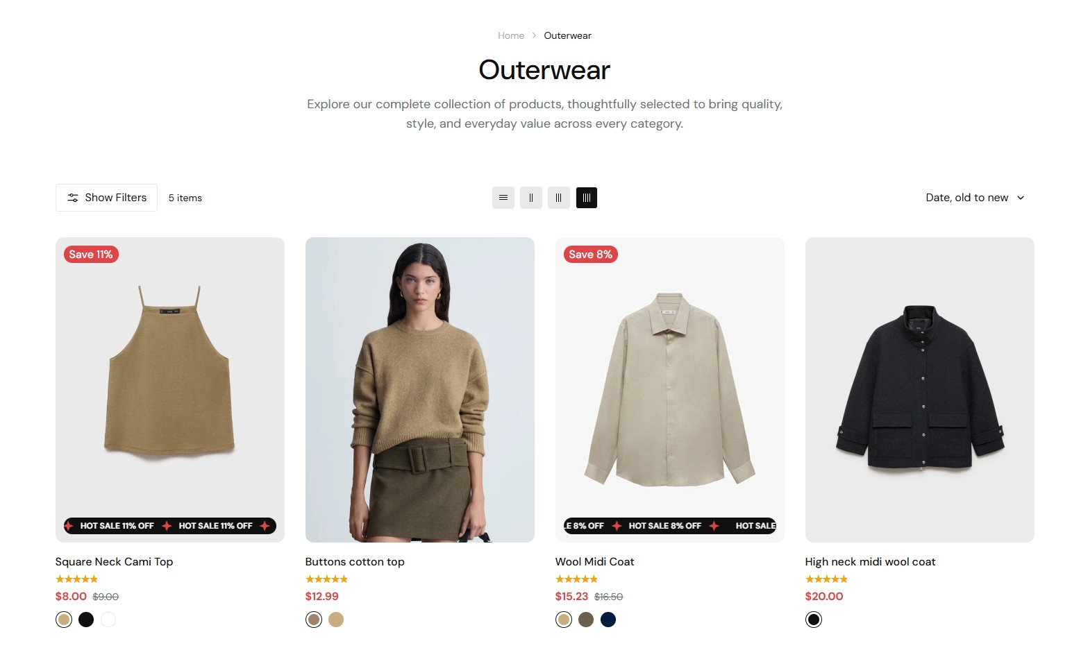
3. Display the Collection on Your Store
You can show collections on your homepage, add them to your navigation menu, or link them in any page section that supports collections.
-
Products
Products are where you manage all the items in your Shopify store. Here, you can add product titles, descriptions, images, pricing, inventory, and variants such as size or color. Proper product management helps keep your store organized and makes shopping easier for customers.
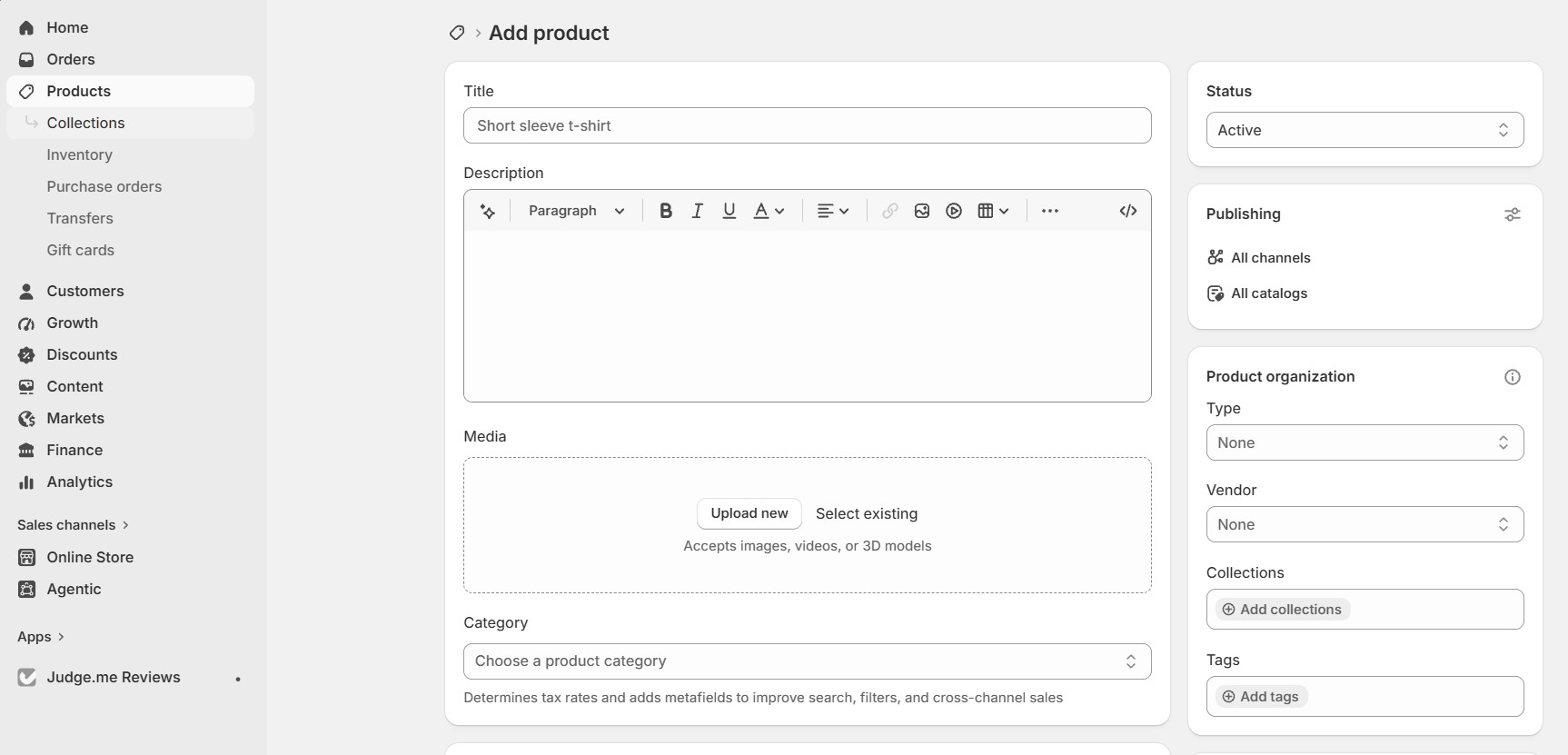
How to Add Products Manually
You can add products one by one directly inside Shopify:
- 1. Go to Products > Add product.
- 2. Enter the Title and Description of your product.
- 3. Upload product images or videos.
- 4. Set up Pricing (price and compare-at price).
- 5. Configure Inventory (SKU, barcode, stock quantity).
- 6. If your product has options like size or color, enable Variants and add your options.
- 7. Set the Product status to Active so it appears on your store.
- 8. Click Save to finish.
How to Import Products (CSV)
Shopify allows you to import multiple products at once using a CSV file.
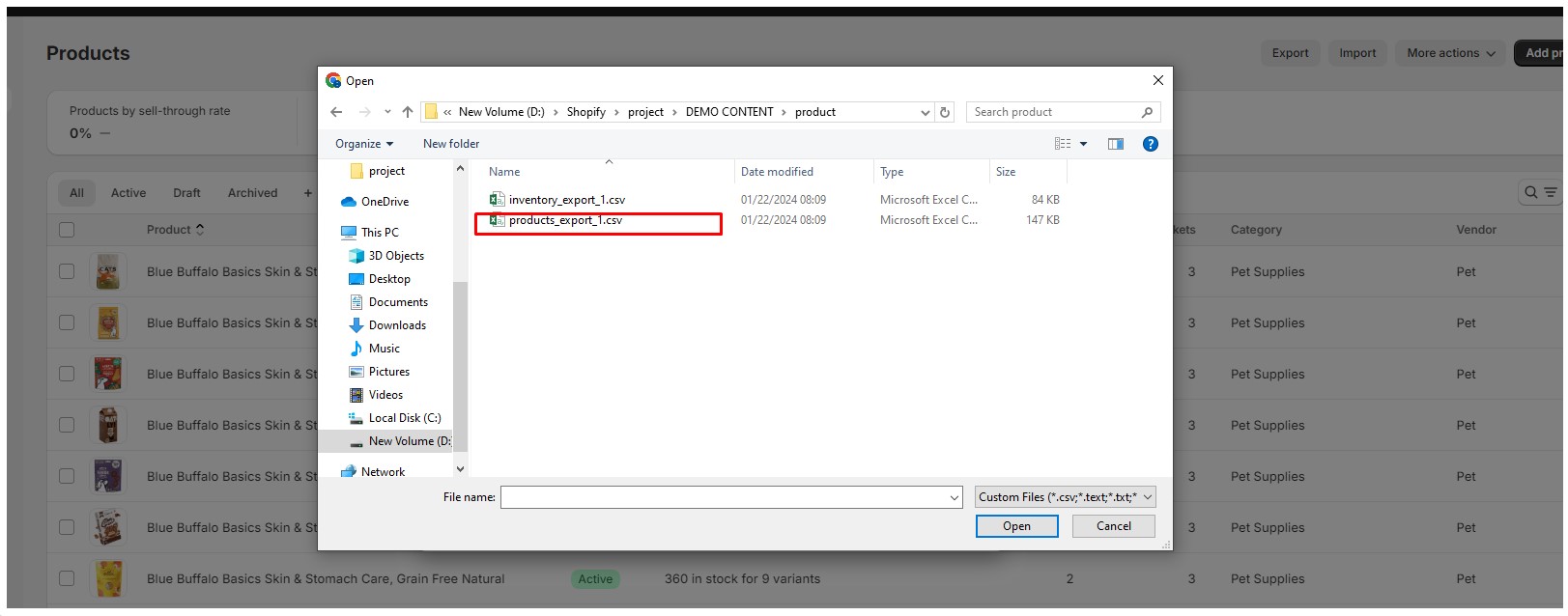
- 1. Go to Products > Import.
- 2. Click Add file and upload your CSV file.
- 3. Click Upload and continue.
- 4. Review the preview to make sure everything looks correct.
- 5. Click Import products to complete the process.
- • The CSV file must follow Shopify’s required format.
- • You can download a sample CSV from the import page.
- • Product images in the CSV must be valid image URLs.

-
Blogs
-
blogs
In Shopify, a Blog is a built-in content feature that allows you to publish articles and organize them into different categories. Each blog can contain multiple posts, and you can create as many blogs as your store needs.
1. How to Create a New Blog
A blog is used to organize blog posts into categories such as News, Guides, or Updates.
Step 1: Create a New Blog
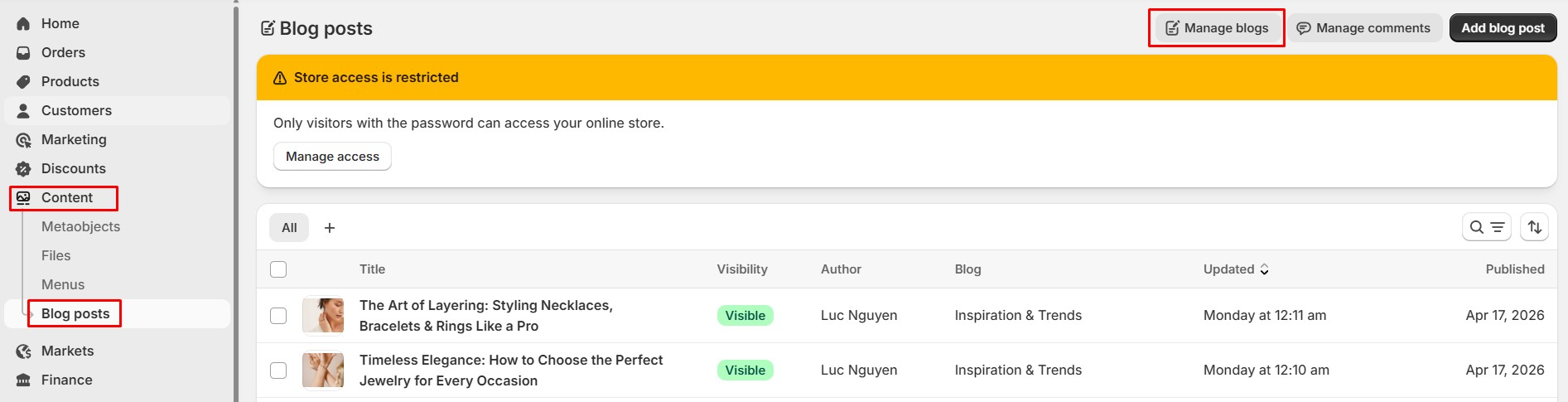
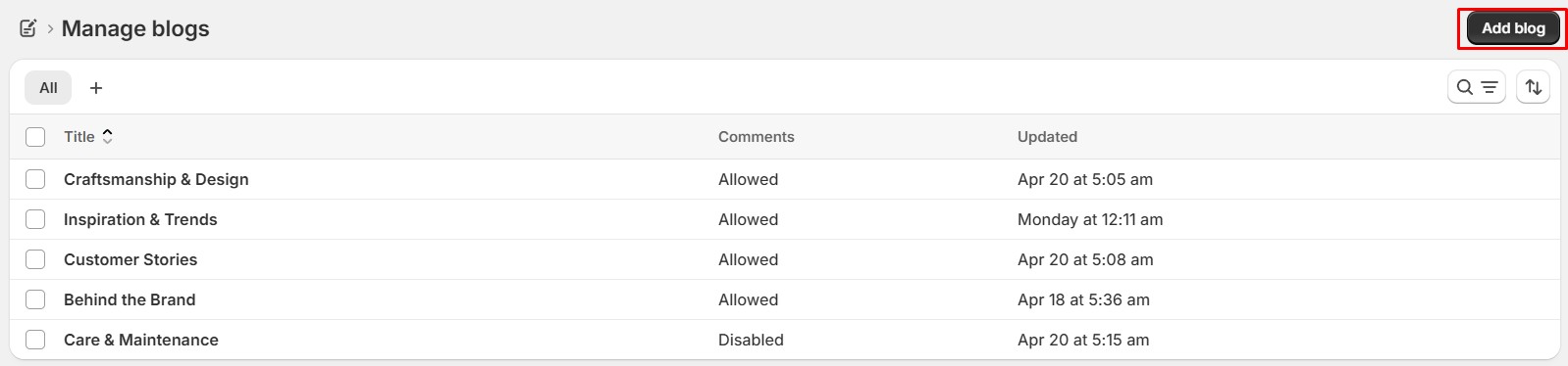
Go to: Content → Blog posts → Manage blogs then click Add blog
Step 2: Add Your Content
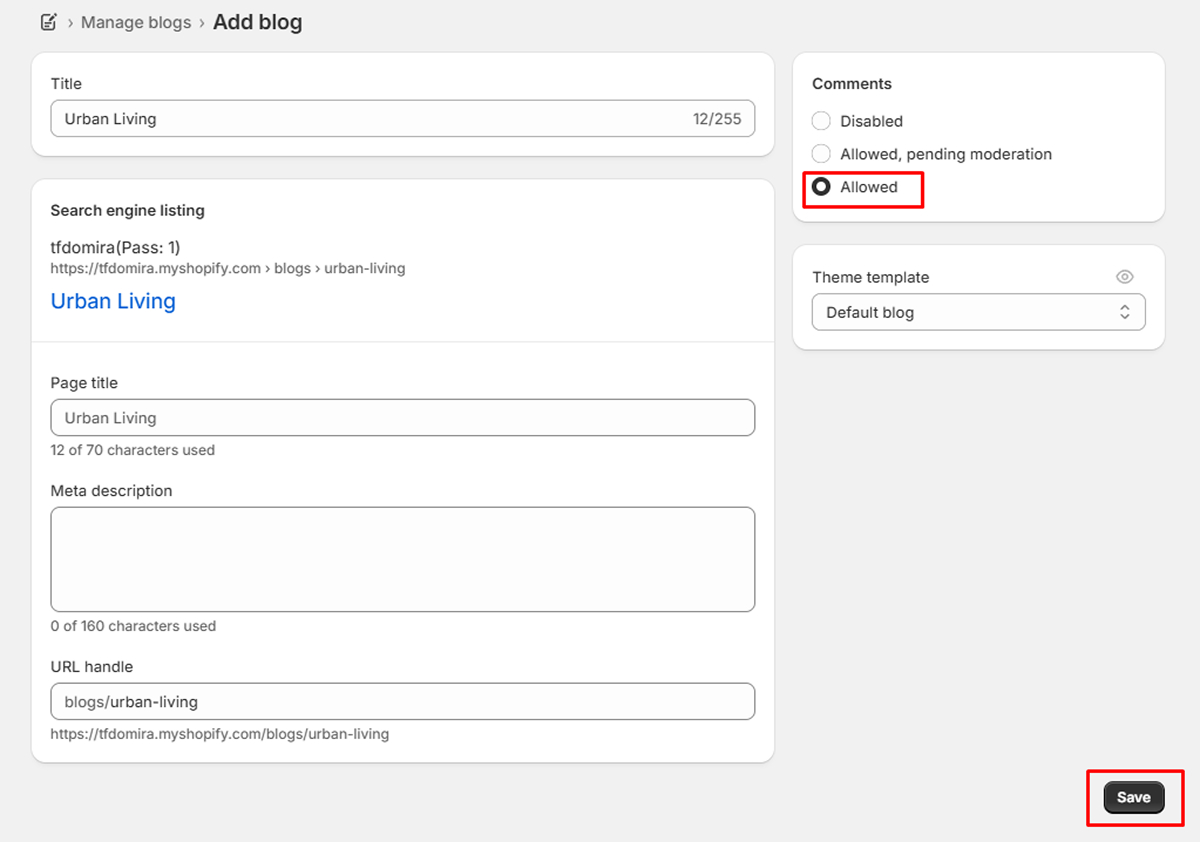
Enter a Title for your blog, choose the Comments setting, optionally update the Search engine listing and Theme template, then click Save.
2. How to Add a Blog Post
After creating a blog, you can add posts to it.
Step 1: Create a New Blog Post
Go to: Online Store → Content → Blog posts then click Add blog post
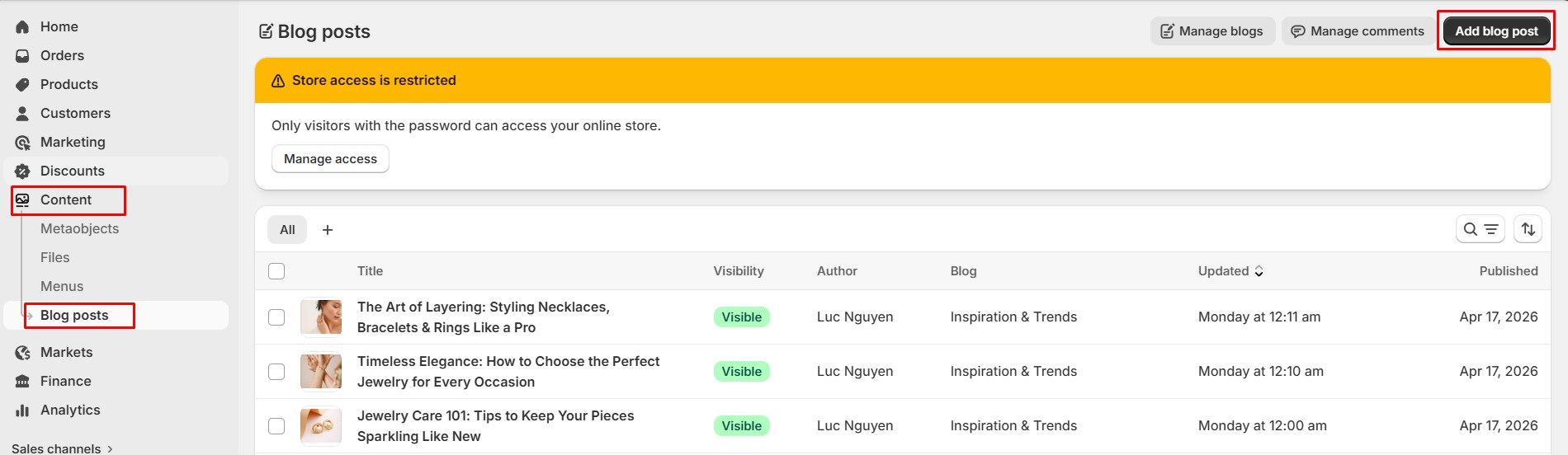
Step 2: Add blog post
Enter a Title, write your content, select a Blog, and optionally upload a Featured image.
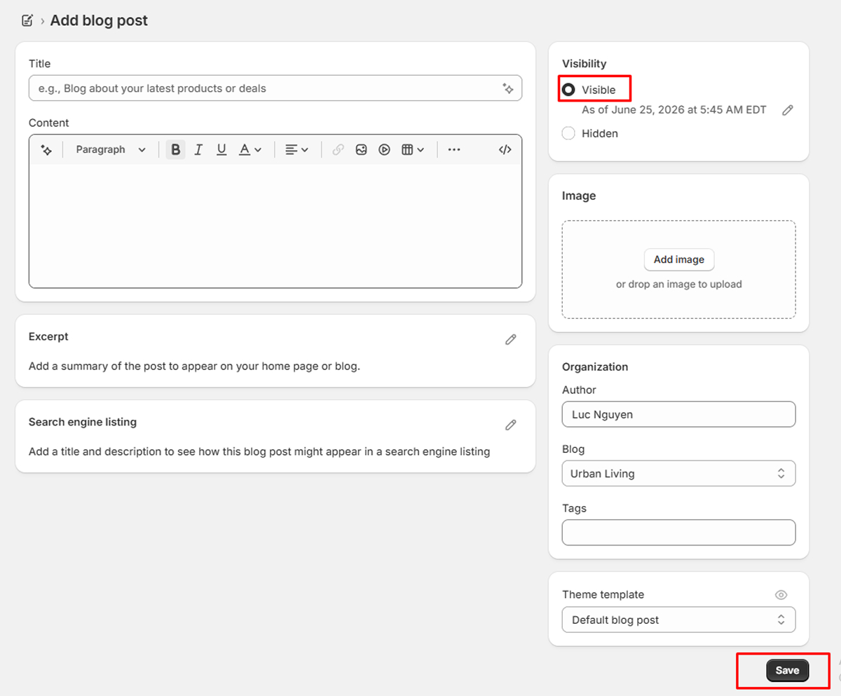
Step 3: Publish the Post
Review the content and click Save or Publish.
-
Menu Config
-
Menu Config
The first, you need read about menu here: Menus and Links
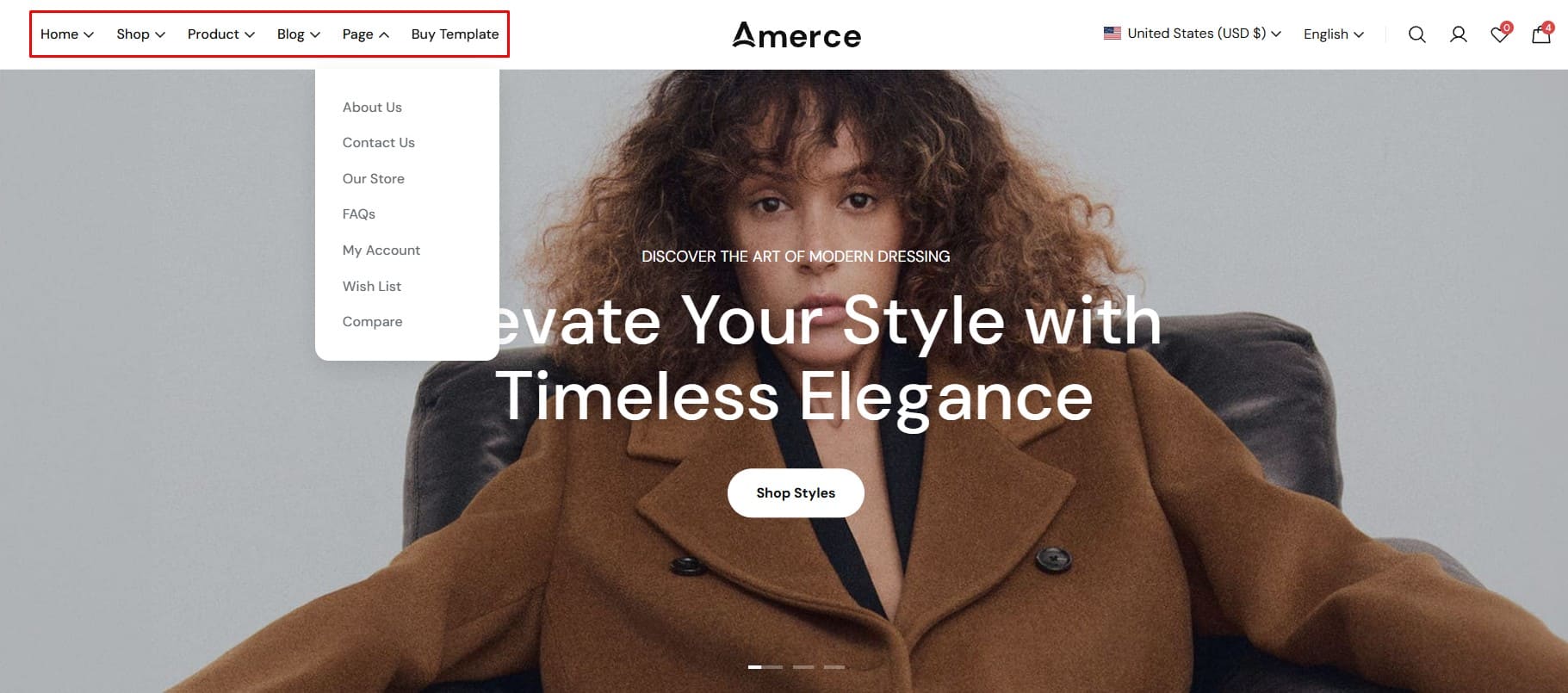
How to Create a Menu in Shopify
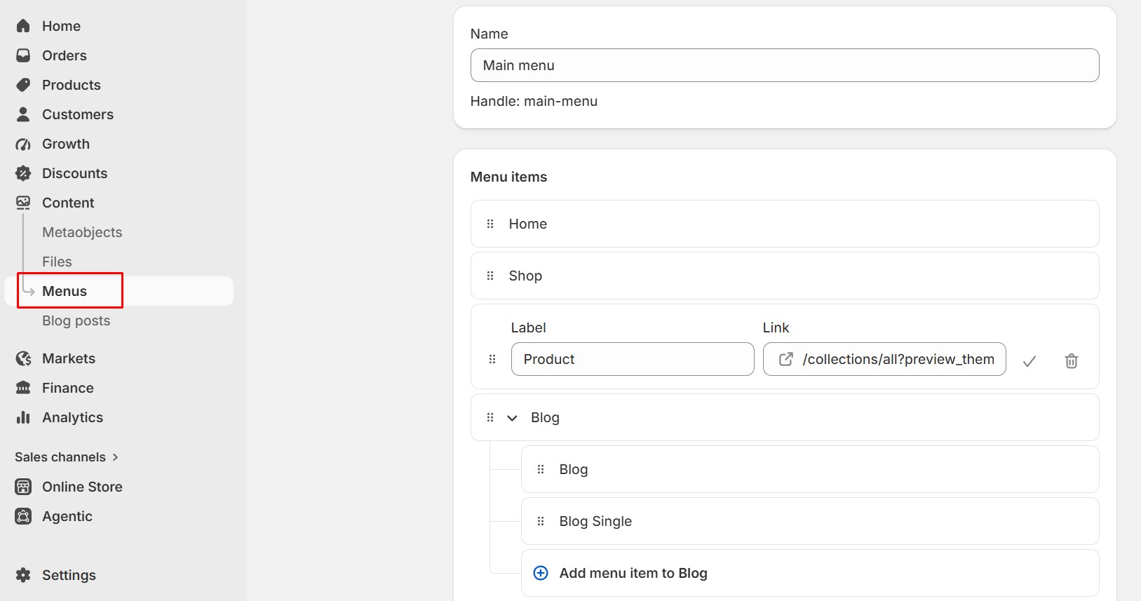
- 1. From your Shopify Admin, go to Content > Menus.
- 2. Click Add menu to create a new menu.
- 3. Enter a Title for your menu.
- 4. Click Add menu item, enter a label, then choose a destination by clicking Link. You can link to a Page, Collection, Product, Blogs, or other available content.
- 5. To create a submenu, drag and drop a menu item under another menu item.
- 6. To edit or remove a menu item, click the menu item and update or remove it.
- 7. When finished, click Save to save your menu.
-
Pages
-
pages
Setting Up Pages in Shopify
When you first install the theme, it will not include the additional pages that you may have seen in the live demo. These pages need to be created and assigned manually. Shopify allows you to create various pages for your store—such as About Us, Contact, FAQ, Policies, or any custom content required. Follow the steps below to set up and configure your pages:
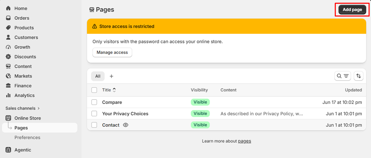
1. Create a New Page
Go to Online Store → Pages, then click Add page.
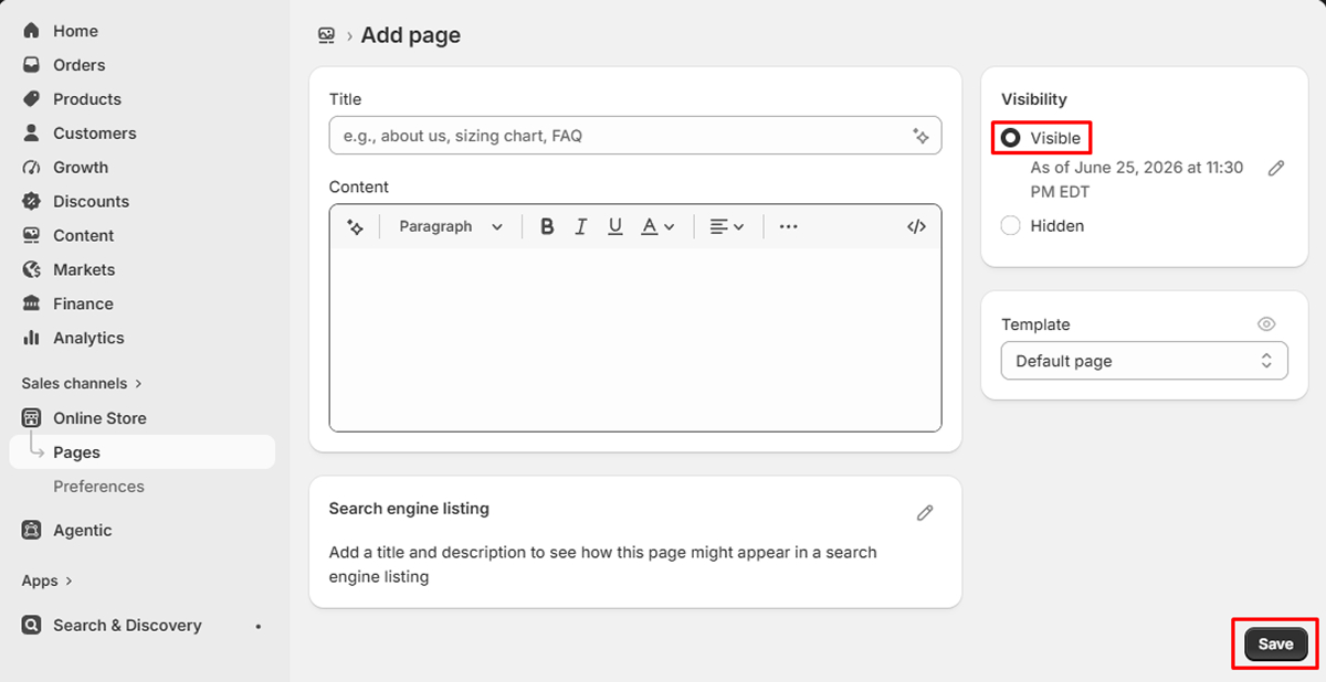
2. Add Your Content
Enter a Title, add your page Content, choose whether the page should be Visible, select the appropriate Page template, optionally configure the Search engine listing, then click Save.
-
Languages
-
Languages
Shopify allows your store to operate in multiple languages to serve different markets. When you add a new language, all content such as products, collections, pages, blogs, navigation, and theme text can be translated manually or automatically using the Shopify Translate & Adapt app.
How to Add Languages
Below is the standard process for adding and activating new languages in Shopify.
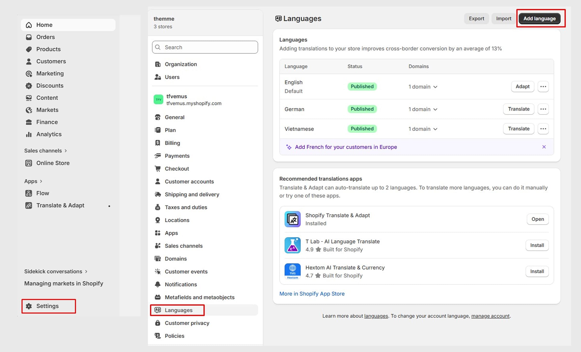
1. Open Language Settings
Go to: Settings → Languages
Here you can see all active languages and add new ones.
2. Add a New Language
Click Add language → select the language you want to enable (e.g., French, German, Japanese).
The language will be added to your list but will not appear on the storefront until you publish it.
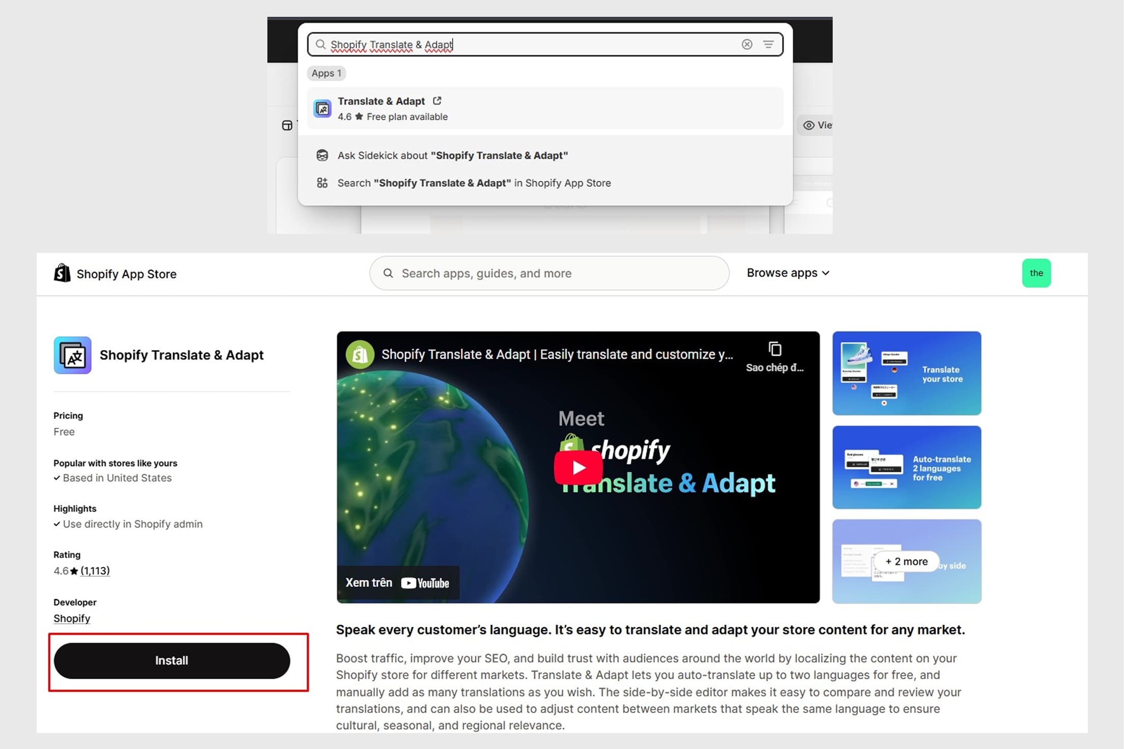
3. Install “Shopify Translate & Adapt”
To translate your store’s content, you need to install:
This app allows you to:
- • Auto-translate your store
- • Manually edit translations
- • Manage content for each language
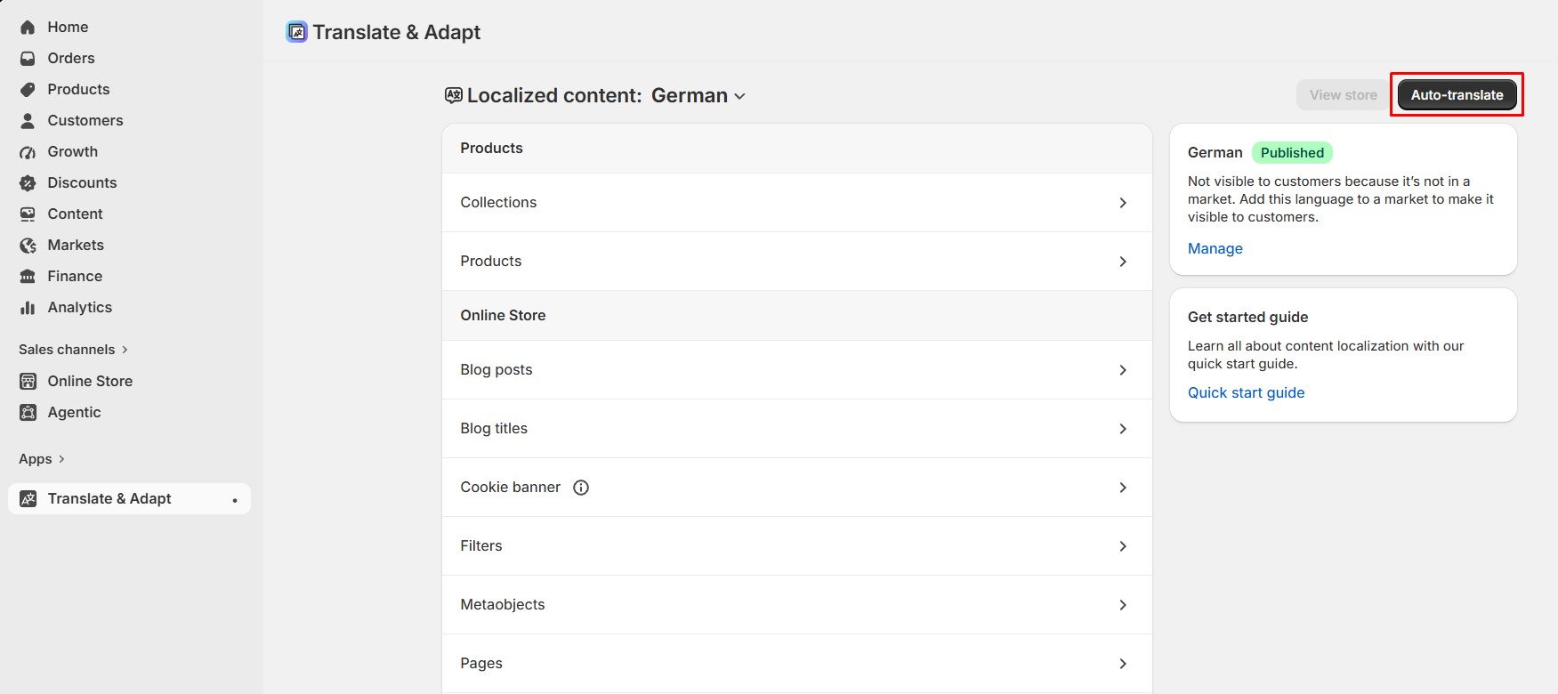
4. Translate Your Store
Open the Shopify Translate & Adapt app → choose the language you want to translate.
You can translate:
- • Products
- • Collections
- • Pages
- • Blogs
- • Navigation
- Theme content (text from the theme such as buttons, labels, headings)
You may use automatic translation first and then adjust the text manually.
If you haven’t installed the app yet, please follow the instructions below to set it up.
-
Markets
-
Markets
Shopify Markets allows you to organize and manage how your store sells to different countries or regions. Each Market can include one or multiple countries, and it inherits the store’s default settings such as currency, catalog, domain, and languages. You can later customize these settings to create a localized experience for customers in that regio
How to Create a Market in Shopify
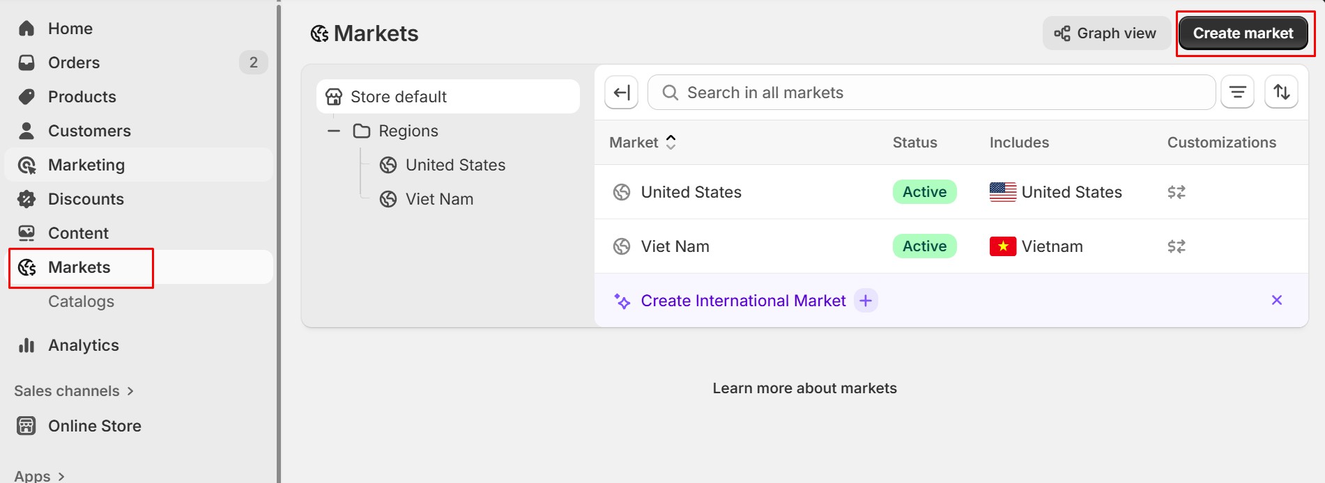
1. Go to Shopify Admin → Markets
This is where all your markets are managed.
2. Click “Create market”
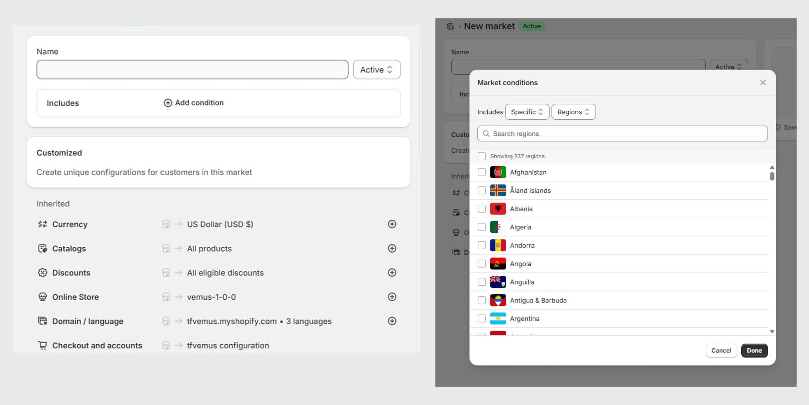
Shopify will open the New Market setup screen (like the one shown in your image).
3. Enter a Market Name
Fill in the Name field to label your Market.
Example: Vietnam, Asia, Europe, Wholesale, etc.
4. Add Countries or Regions
Click Add condition under Includes, then choose the countries that belong to this Market.
5. Review Inherited Settings
The Market will automatically inherit the default settings from your main store, including:
- • Currency → e.g. Vietnamese Dong (VND)
- • Catalogs → All products
- • Online Store → your store name (e.g. amerce)
- • Domain / language → e.g. amerce.myshopify.com • 3 languages
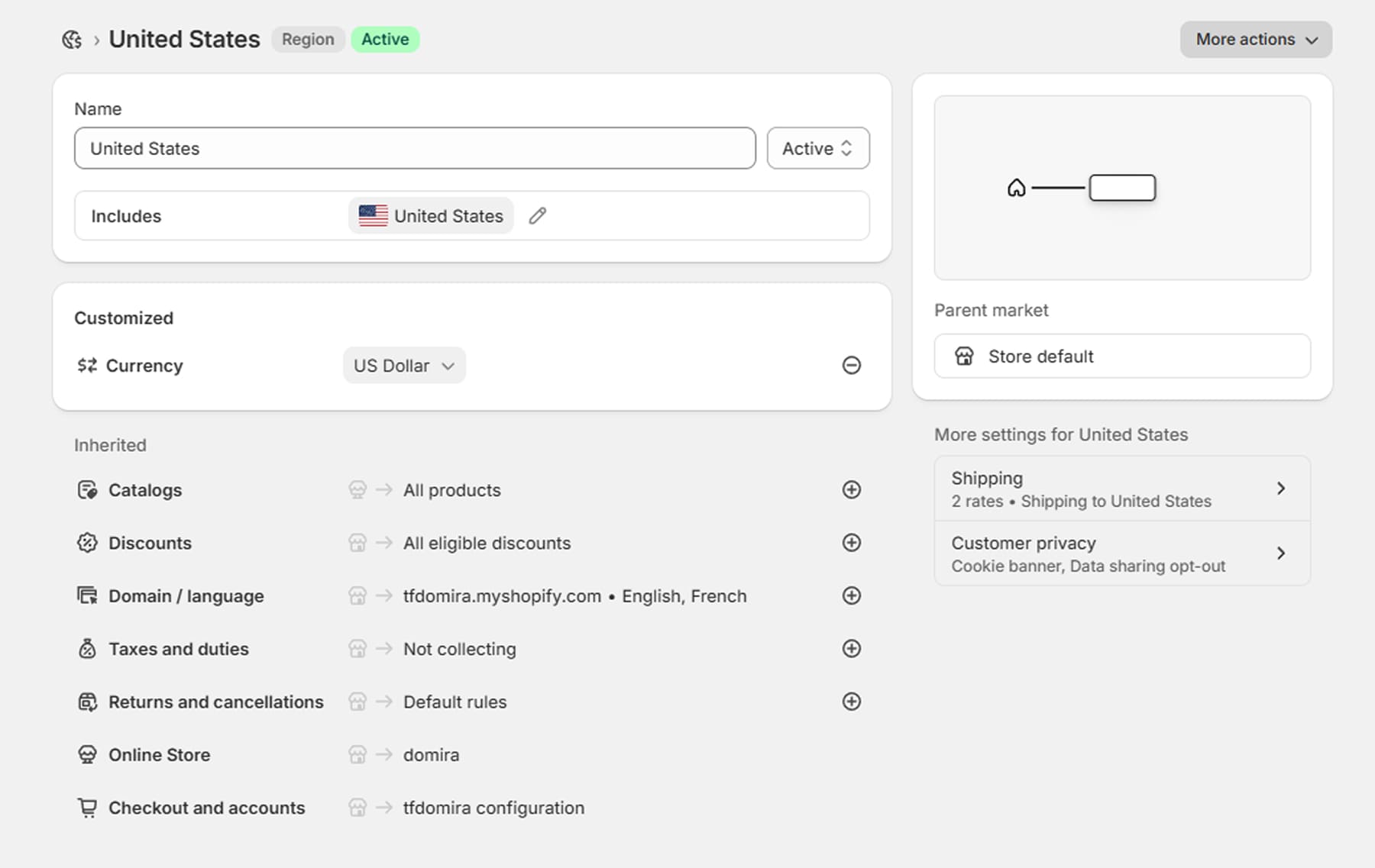
These settings can be customized later by clicking the ( + ) icon after saving the Market.
6. Click “Save”
Once saved, the Market will appear in your Markets list. You can then open it to further customize currency, domain, language, pricing, and other settings if needed.
-
Create Required Metafields
You can learn more about metafields by checking the detailed documentation here: Link
-
Live Viewers
1. Create Live Viewers Metafields
- • Go to Settings → Metafields and metaobjects → Products, then click Add definition
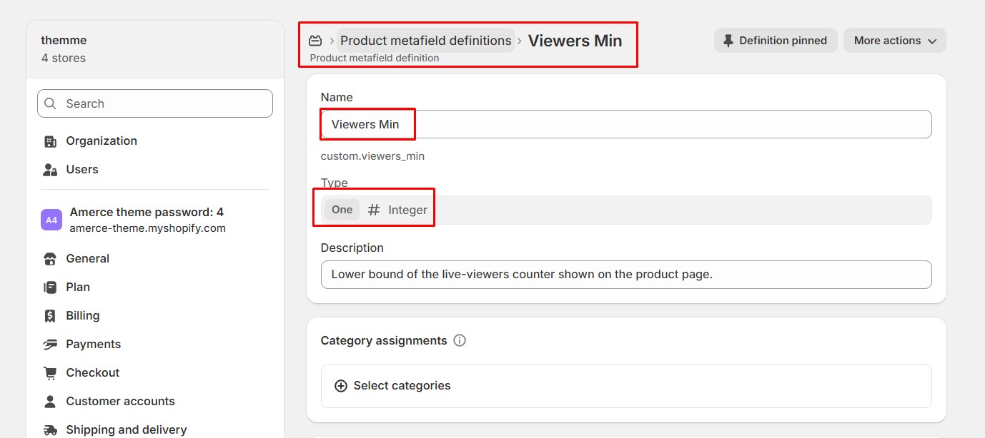
- • Enter Viewers Min as the Name (namespace custom.viewers_min), set the Type to Integer (One), then click Save.
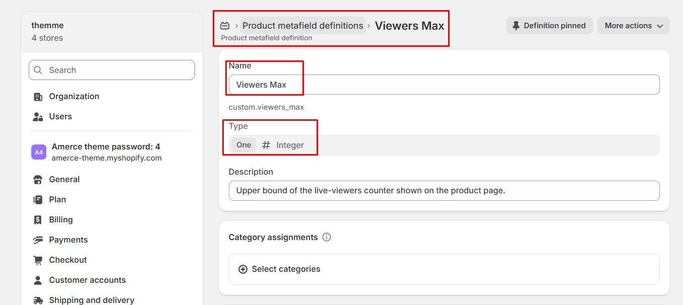
- • Repeat with Viewers Max (namespace custom.viewers_max), also Integer (One).
2. Product setting
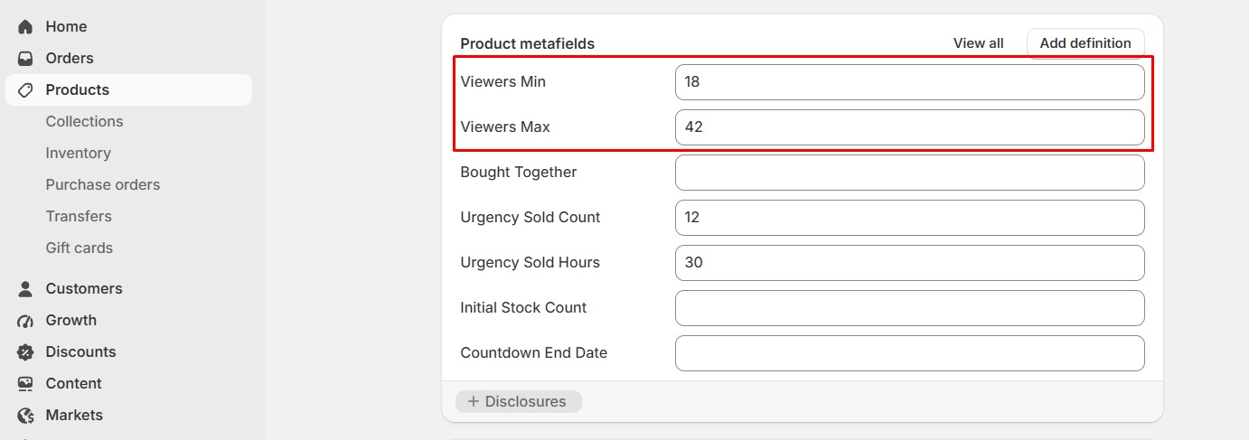
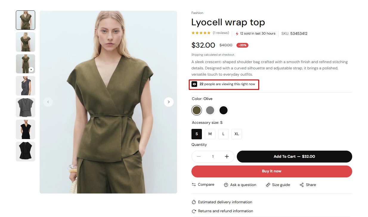
Enter a lower and upper bound (e.g. 12–48). The product page and Featured product section will show a random, refreshing "X people are viewing this" counter within that range.
3. Demo result
-
Countdown Timer
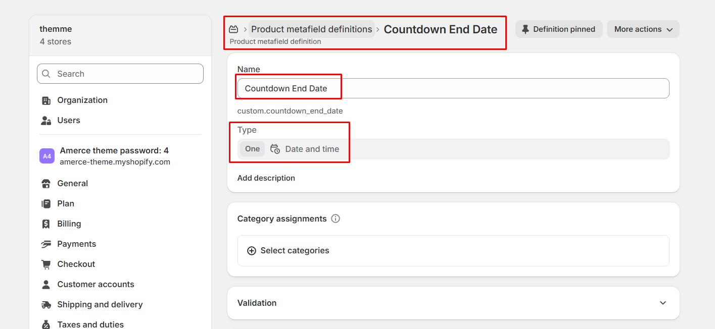
1. Create a Countdown End Date Metafield
- • Go to Settings → Metafields and metaobjects → Products, then click Add definition
- • Enter Countdown End Date as the Name (namespace custom.countdown_end_date), set the Type to Date and time (One), then click Save.
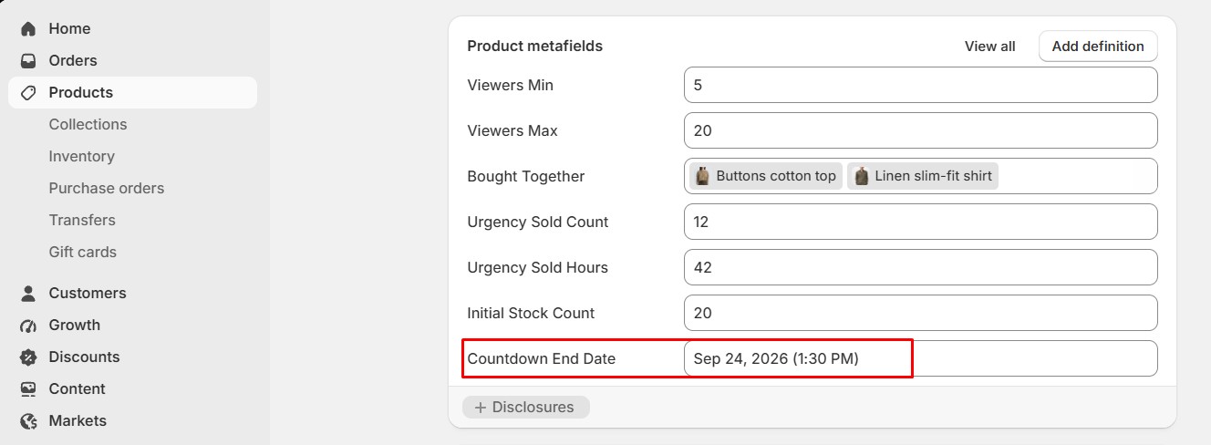
2. Product setting
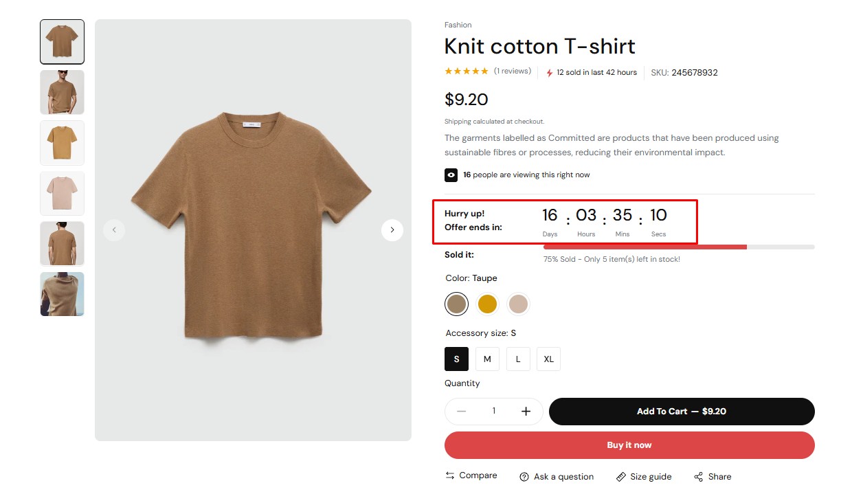
Set a future date/time. Enable the Countdown timer block on the product page or Featured product section to display a live countdown that hides automatically once it reaches zero.
3. Demo result
-
Stock Progress Bar
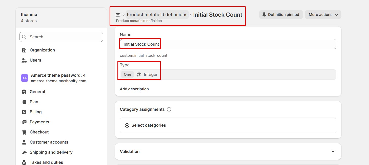
1. Create an Initial Stock Count Metafield
- • Go to Settings → Metafields and metaobjects → Products, then click Add definition
- • Enter Initial Stock Count as the Name (namespace custom.initial_stock_count), set the Type to Integer (One), then click Save.
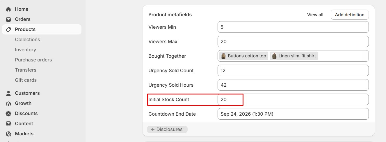
2. Product setting
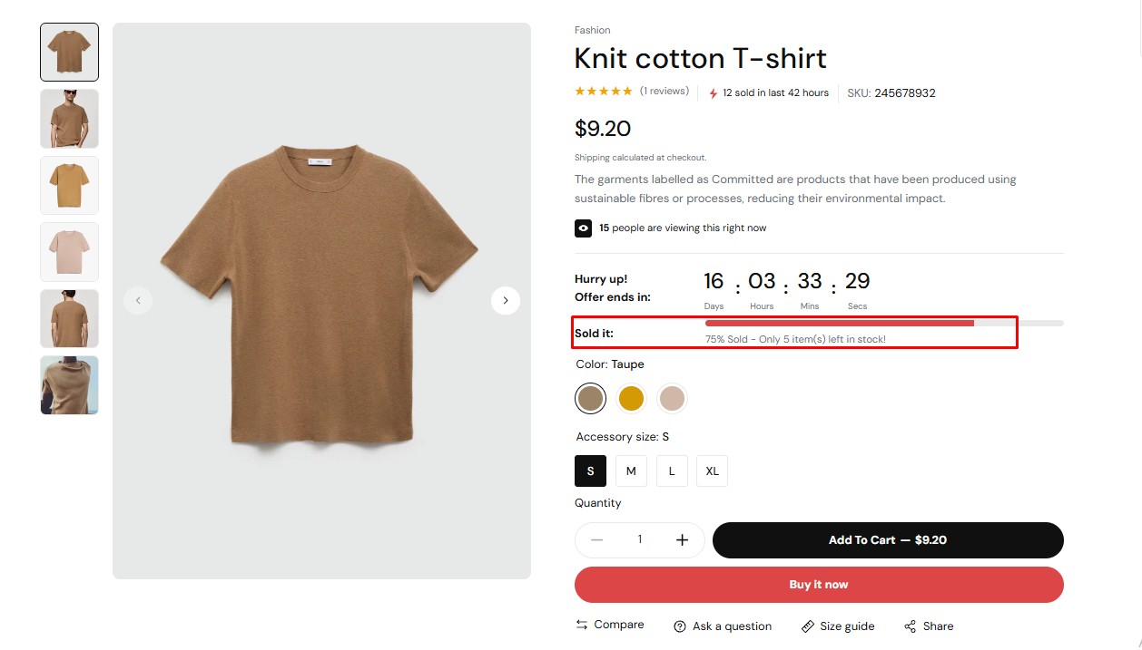
Enter the starting stock count for the launch/restock. The Stock progress bar block compares it against current inventory to display a "X sold, hurry up!" progress indicator.
3. Demo result
-
Urgency Badge
1. Create Urgency Metafields
- • Go to Settings → Metafields and metaobjects → Products, then click Add definition
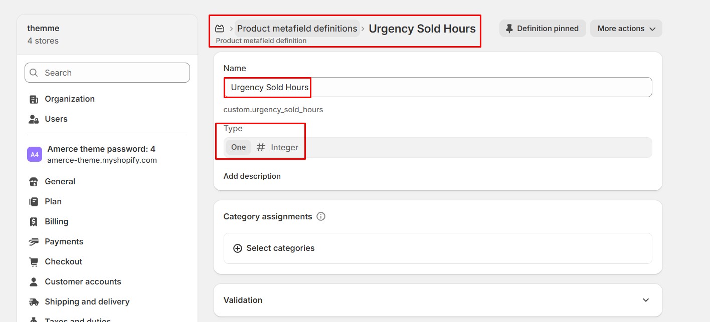
- • Enter Urgency Sold Hours as the Name (namespace custom.urgency_sold_hours), set the Type to Integer (One), then click Save.
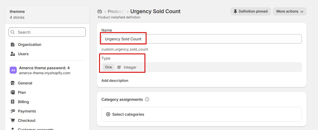
- • Repeat with Urgency Sold Count (namespace custom.urgency_sold_count), also Integer (One).
2. Product setting
Enter how many units were sold and within how many hours. The Urgency badge block uses this to display messaging like "24 sold in the last 12 hours".
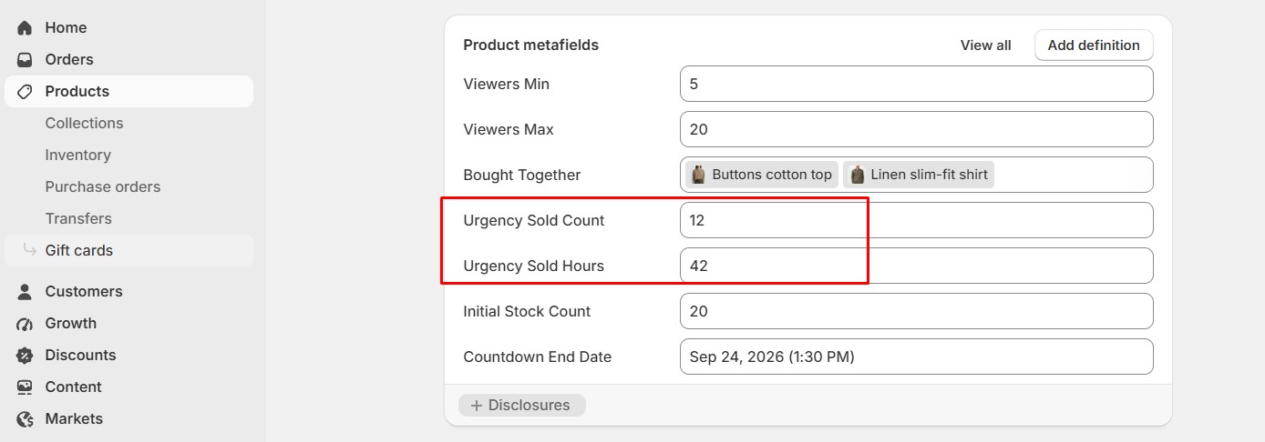
3. Demo result
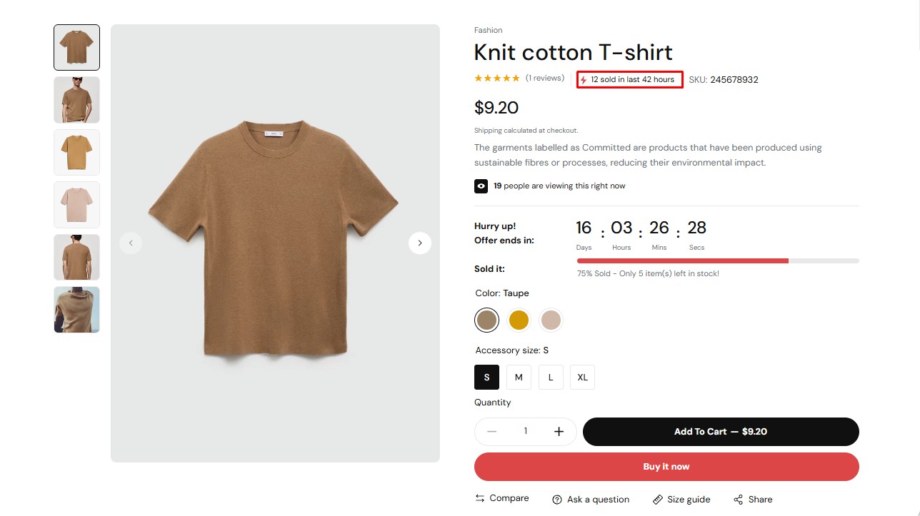
-
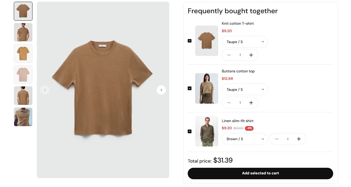
Bought Together
1. Create a Bought Together Metafield
- • Go to Settings → Metafields and metaobjects → Products, then click Add definition
- • Enter Bought Together as the Name (namespace custom.bought_together), set the Type to Product (List) , then click Save.
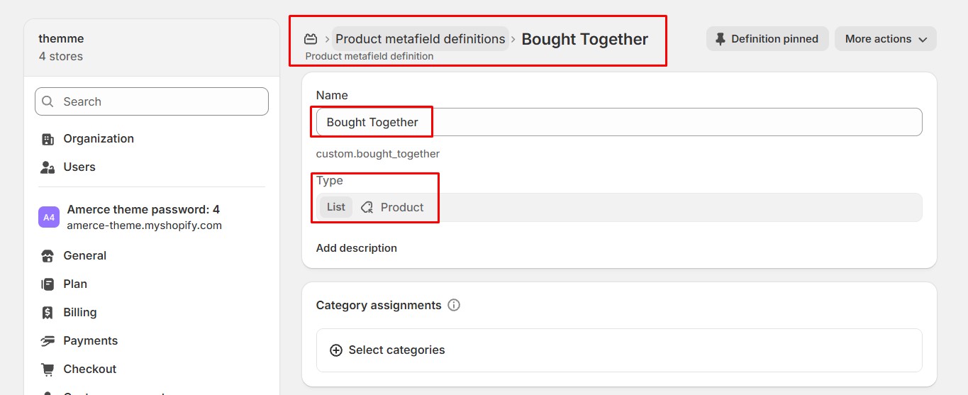
2. Product setting
Add the products you want to recommend as a bundle. The Bought together block on the product page will let customers add the whole set to cart at once.
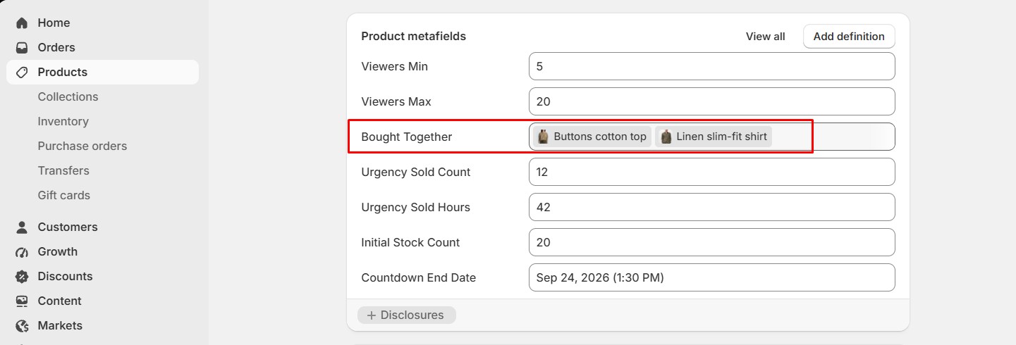
3. Demo result
-
Section
-
Header, Navigation & Announcements
-
Header
1. What is the Header section?
The Header section renders your store logo, main navigation menu, search/account/cart icons, and the Mega menu theme block. It has settings for menu alignment, dropdown trigger (hover or click), header style, sticky header, transparent header (for banners underneath), and header category style.
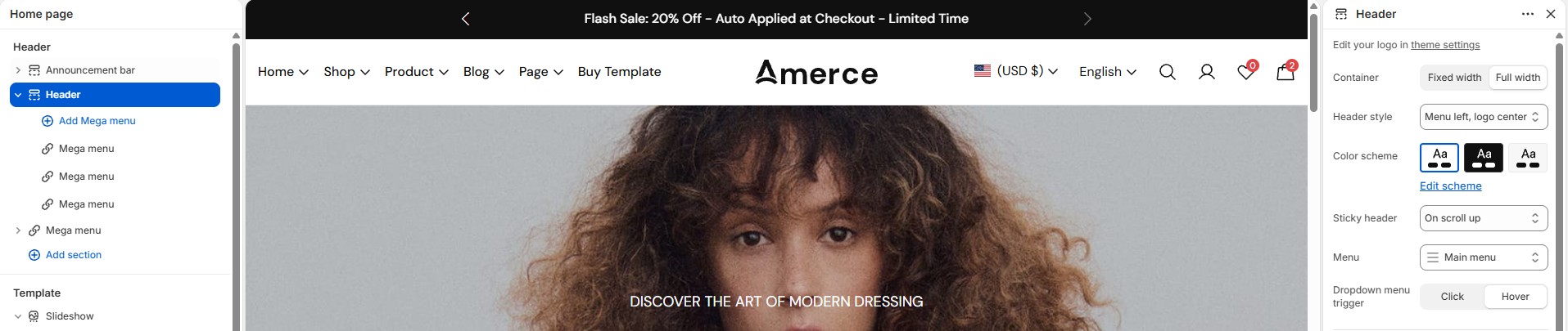
2. How to edit the Header section
- • In the Theme Editor (Customize) → click Header (section groups → header-group).
- • Adjust menu alignment, sticky/transparent header, and header style in the section settings.
- • Attach a Mega menu block to any top-level menu item (see below) to enable a dropdown mega menu for that item.
- • Make the necessary adjustments → click Save.
-
Mega Menu (Header block)
1. What is the Mega menu block?
The Mega menu block turns a top-level menu item's dropdown into a multi-column layout. Inside a Mega menu block you can add Menu parent (column heading linked to a menu handle), Menu link (individual links), Product list (a small product carousel), and Image card (a promotional image with link) sub-blocks.
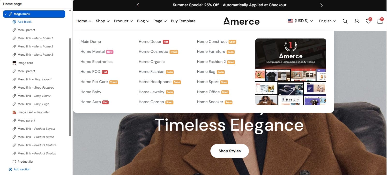
2. How to configure the Mega menu block
- • In the Theme Editor → Header → click Add block → choose Mega menu.
- • Select which menu item (by handle) this mega menu attaches to, and pick the layout (columns).
- • Add Menu parent / Menu link / Product list / Image card sub-blocks to build out the dropdown content, then reorder them as needed.
- • Make the necessary adjustments → click Save.
-
Top bar
1. What is the Top bar section?
The Top bar is a slim promotional strip shown above the Header. It supports one or more Promo text blocks, each with its own text and optional link — useful for shipping promos, store hours, or a secondary utility menu.

2. How to edit the Top bar section
- • In the Theme Editor → header-group → click Top bar (or Add section if not present).
- • Add/edit Promo text blocks with your message and link.
- • Make the necessary adjustments → click Save.
-
Announcement bar
1. What is the Announcement bar section?
The Announcement bar displays one or more Announcement blocks (text + link) that can rotate or scroll as a marquee. It also has a divider option and an "enable absolute position" setting so it can float over a transparent header.

2. How to edit the Announcement bar section
- • In the Theme Editor → header-group → click Announcement bar.
- • Add/edit Announcement blocks; each has its own text and link.
- • Make the necessary adjustments → click Save.
-
Footer & Popups
-
Footer
1. What is the Footer section?
The Footer section sits at the bottom of every page. It supports Menu (footer link columns with a heading), Contact information, Newsletter (heading, subheading, description, and a signup form), and Marquee (a scrolling text strip with its own text style and layout) blocks, plus a payment-icons and "Follow on Shop" toggle.
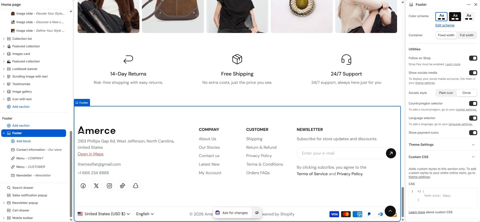
2. How to edit the Footer section
- • In the Theme Editor (Customize) → click Footer (footer-group).
- • Add/edit Menu, Contact information, Newsletter, and Marquee blocks, and reorder them as needed.
- • Make the necessary adjustments → click Save.
-
Newsletter popup
1. What is the Newsletter popup section?
The Newsletter popup shows an on-load (or delayed) popup built from Image, Heading, Text, and Newsletter form blocks, encouraging visitors to subscribe.
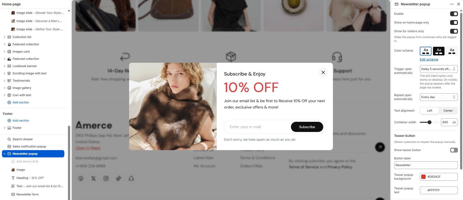
2. How to edit the Newsletter popup section
- • In the Theme Editor (Customize) → choose Newsletter popup.
- • Edit the Image, Heading, Text, and Newsletter form blocks.
- • Make the necessary adjustments → click Save.
-
Sales notification popup
1. What is the Sales notification popup section?
The Sales notification popup shows small, recurring "recent purchase" toast messages in the corner of the screen to build social proof and urgency.
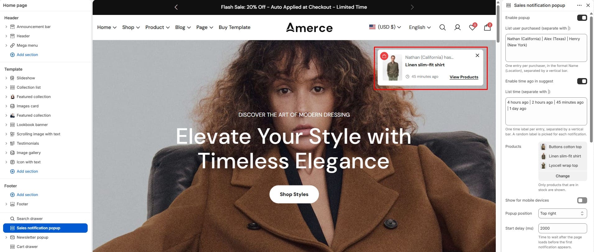
2. How to edit the Sales notification popup section
- • In the Theme Editor (Customize) → choose Sales notification popup.
- • Adjust the display frequency/timing and the message content.
- • Make the necessary adjustments → click Save.
-
Homepage & Content Sections
-
Hero banner
1. What is the Hero banner section?
The Hero banner is a full-width banner block with a Banner block (image, heading, text, buttons) and an optional Marquee ticker block that scrolls a secondary line of text across the banner.
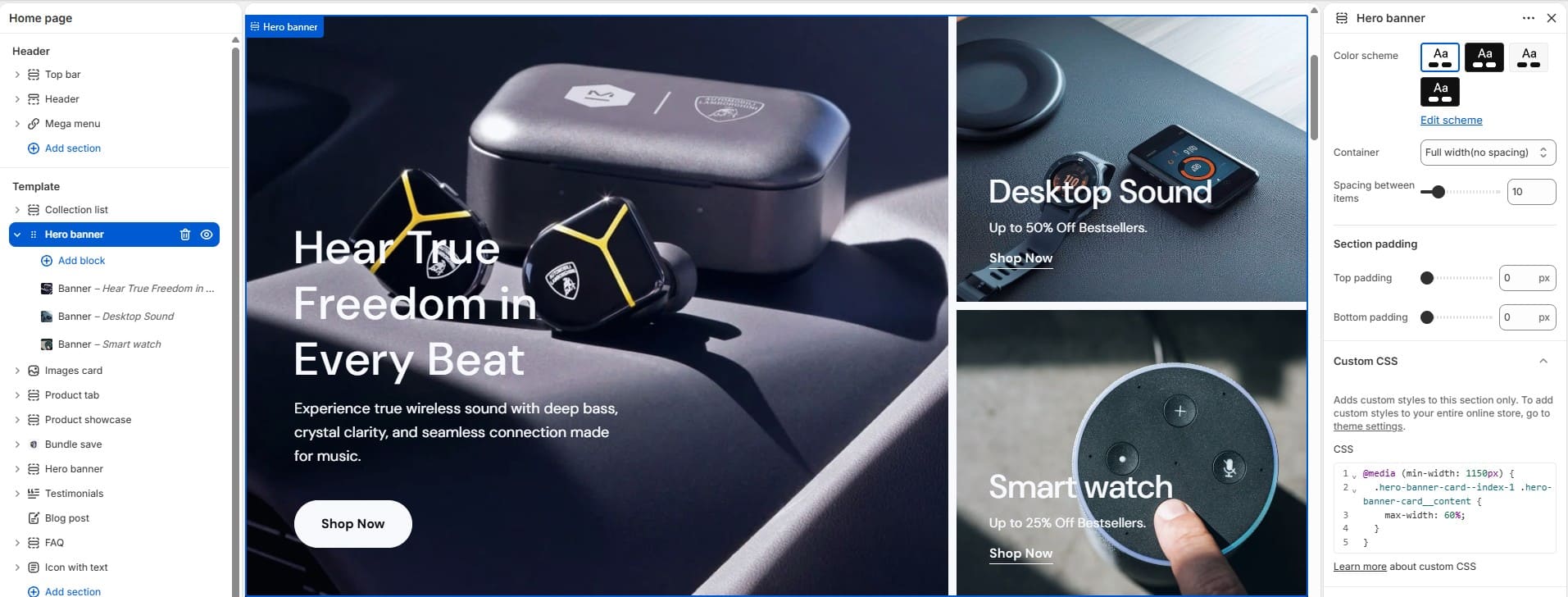
2. How to edit the Hero banner section
- • In the Theme Editor → click Add section → choose Hero banner.
- • Edit the Banner block (image, heading, text, buttons) and, optionally, the Marquee ticker block.
- • Make the necessary adjustments → click Save.
-
Slideshow
1. What is the Slideshow section?
The Slideshow section displays multiple Slide blocks in a carousel. Each slide has its own image (with width/position), and content settings (alignment, position, subheading, heading), plus section-level layout, height, and autoplay/accessibility options.
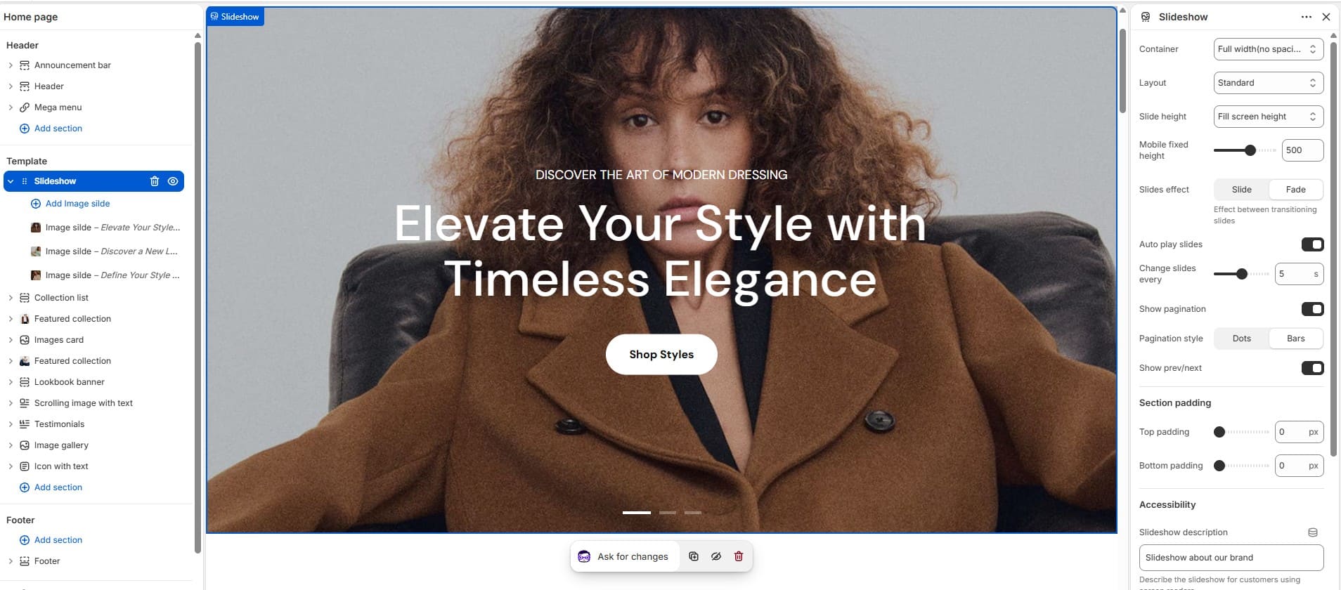
2. How to edit the Slideshow section
- • In the Theme Editor → click Add section → choose Slideshow.
- • Add/edit Slide blocks, then set the section's layout and height.
- • Make the necessary adjustments → click Save.
-
Rich text
1. What is the Rich text section?
The Rich text section displays a custom content banner built from Subheading, Heading, Heading with image, Text, and Button blocks. Use it for promotions, announcements, or call-to-action content.
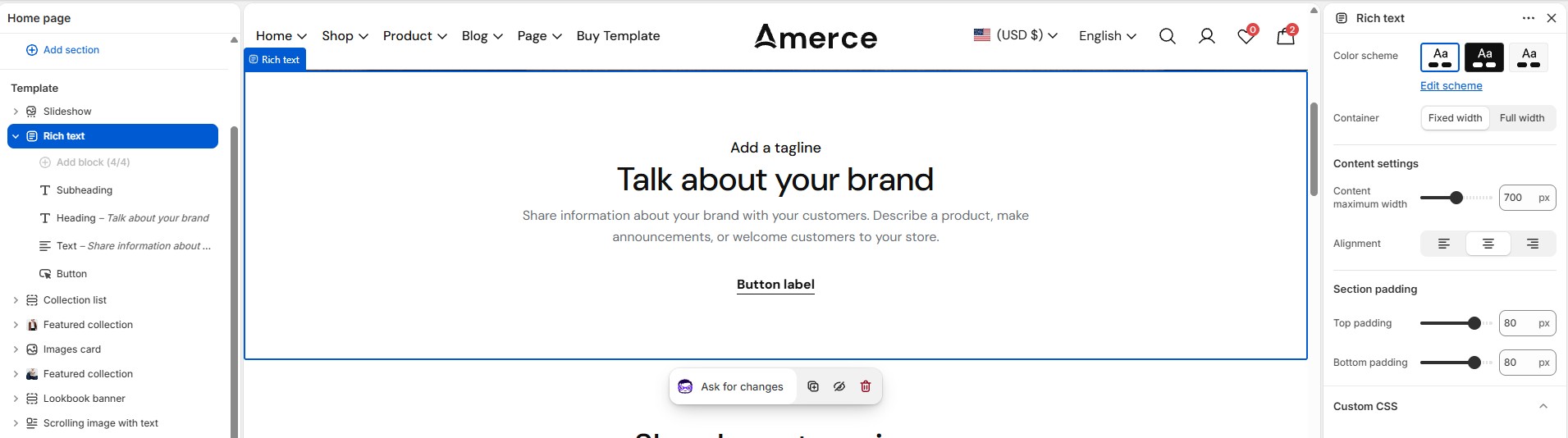
2. How to edit the Rich text section
- • In the Theme Editor → click Add section → choose Rich text.
- • Open each block to edit the heading, text, and button label.
- • Make the necessary adjustments → click Save.
-
Scrolling image with text
1. What is the Scrolling image with text section?
This section alternates Text and Image blocks that reveal as the customer scrolls, with configurable spacing between items and per-block font/text style.
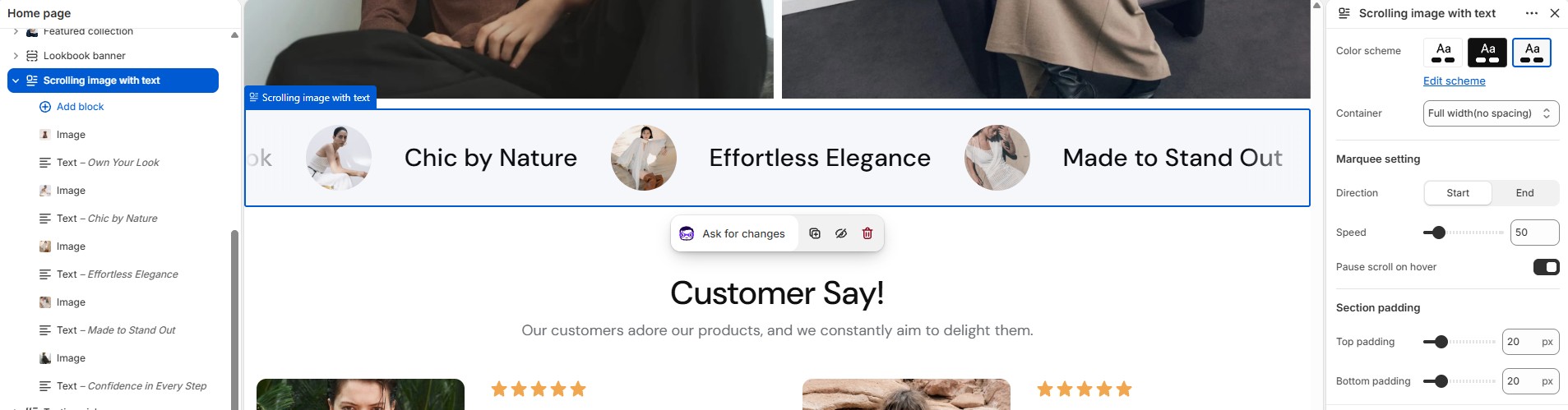
2. How to edit the Scrolling image with text section
- • In the Theme Editor → click Add section → choose Scrolling image with text.
- • Add/edit alternating Text and Image blocks.
- • Make the necessary adjustments → click Save.
-
Image gallery
1. What is the Image gallery section?
The Image gallery section displays a set of images in a grid, with section-header, image radius, and radio/layout options.
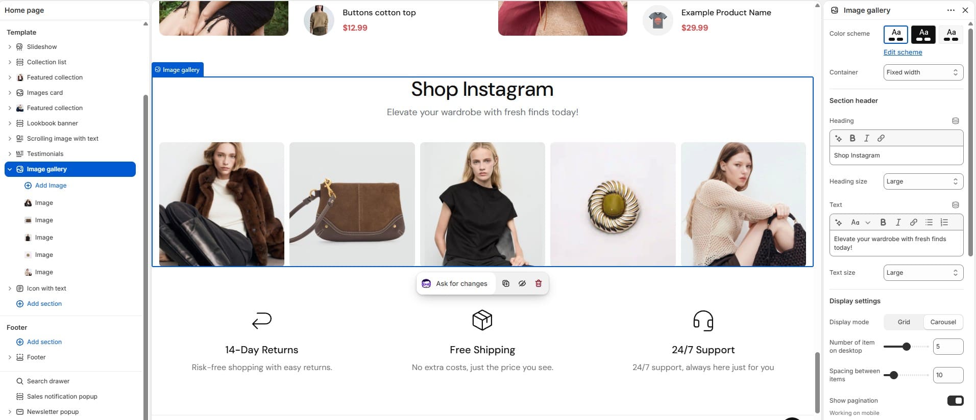
2. How to edit the Image gallery section
- • In the Theme Editor → click Add section → choose Image gallery.
- • Upload/replace images and adjust the layout.
- • Make the necessary adjustments → click Save.
-
Images card
1. What is the Images card section?
The Images card section displays a set of Card blocks (image + caption/link) side by side — handy for category call-outs or promo tiles.
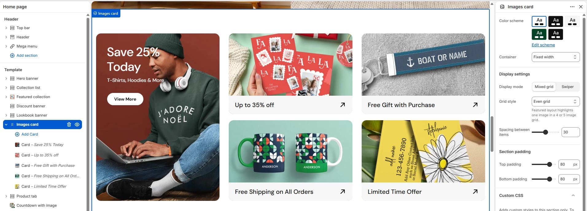
2. How to edit the Images card section
- • In the Theme Editor → click Add section → choose Images card.
- • Add/edit Card blocks.
- • Make the necessary adjustments → click Save.
-
Icon with text
1. What is the Icon with text section?
The Icon with text section displays a row of Icon text blocks — small icon + heading + description tiles typically used for shipping info, guarantees, or other USPs.
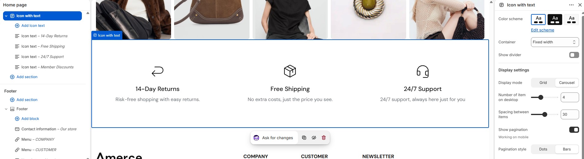
2. How to edit the Icon with text section
- • In the Theme Editor → click Add section → choose Icon with text.
- • Add/edit Icon text blocks.
- • Make the necessary adjustments → click Save.
-
Before/after image slider
1. What is the Before/after image slider section?
Also called Image comparison, this section shows two overlapping images with a drag handle so customers can slide between a "before" and "after" view (e.g. two color variants or a styling comparison).
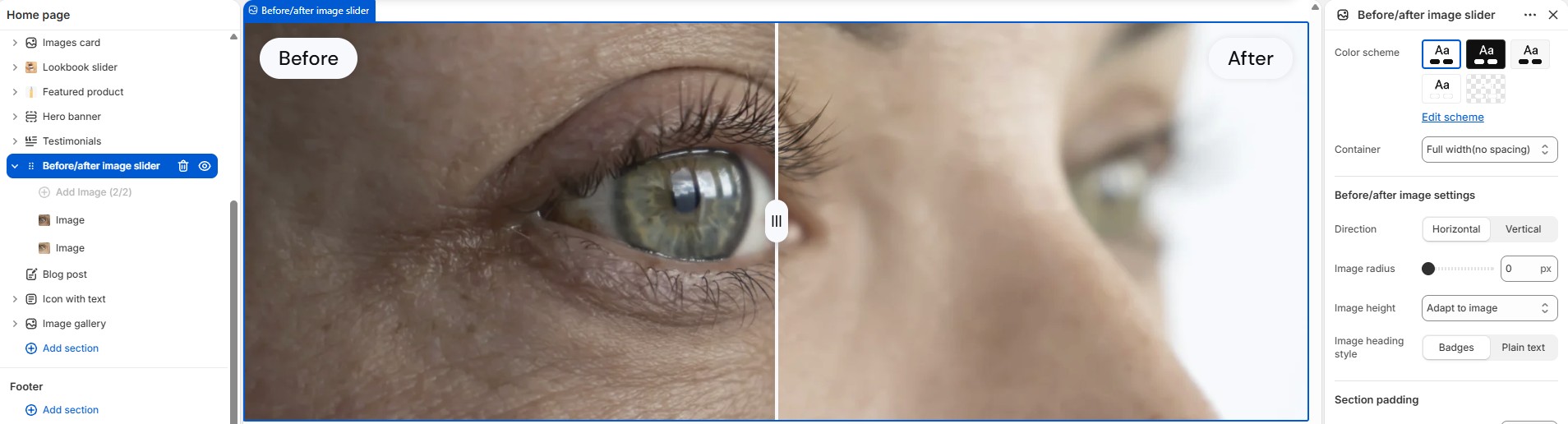
2. How to edit the Before/after image slider section
- • In the Theme Editor → click Add section → choose Before/after image slider.
- • Upload the two comparison images.
- • Make the necessary adjustments → click Save.
-
Lookbook banner
1. What is the Lookbook banner section?
A single-image version of the lookbook concept: a Banner block with one or more Hotspot blocks linking parts of the image to specific products.
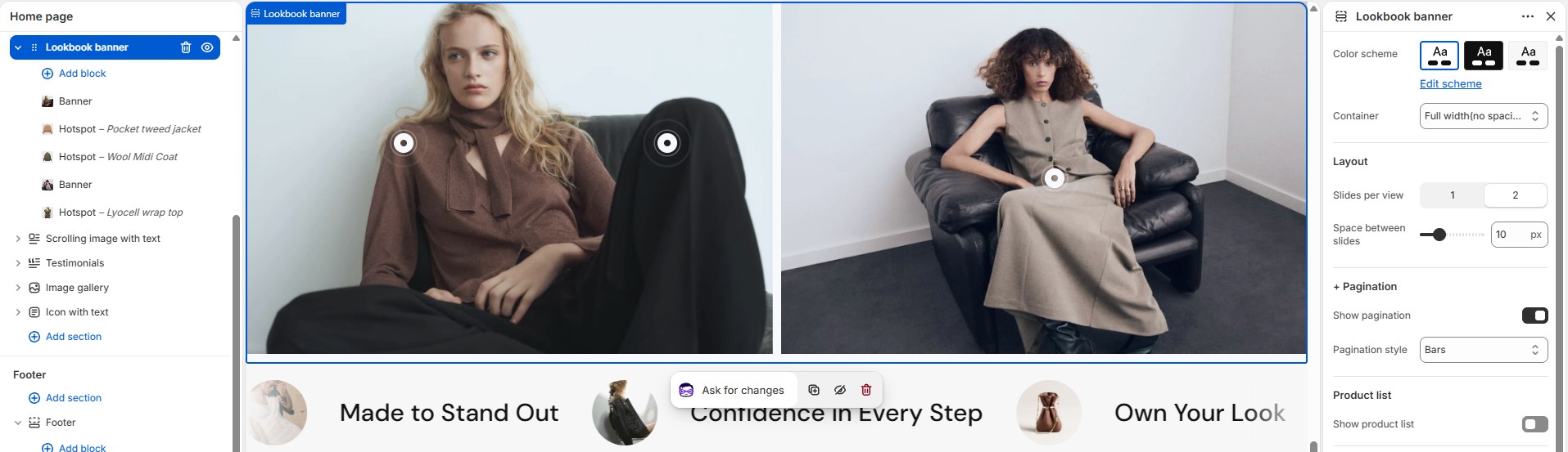
2. How to edit the Lookbook banner section
- • In the Theme Editor → click Add section → choose Lookbook banner.
- • Position Hotspot blocks over the banner image and link them to products.
- • Make the necessary adjustments → click Save.
-
Lookbook slider
1. What is the Lookbook slider section?
The Lookbook slider shows a carousel of styled images with clickable Product hotspot blocks placed over the image, letting customers shop the look directly.
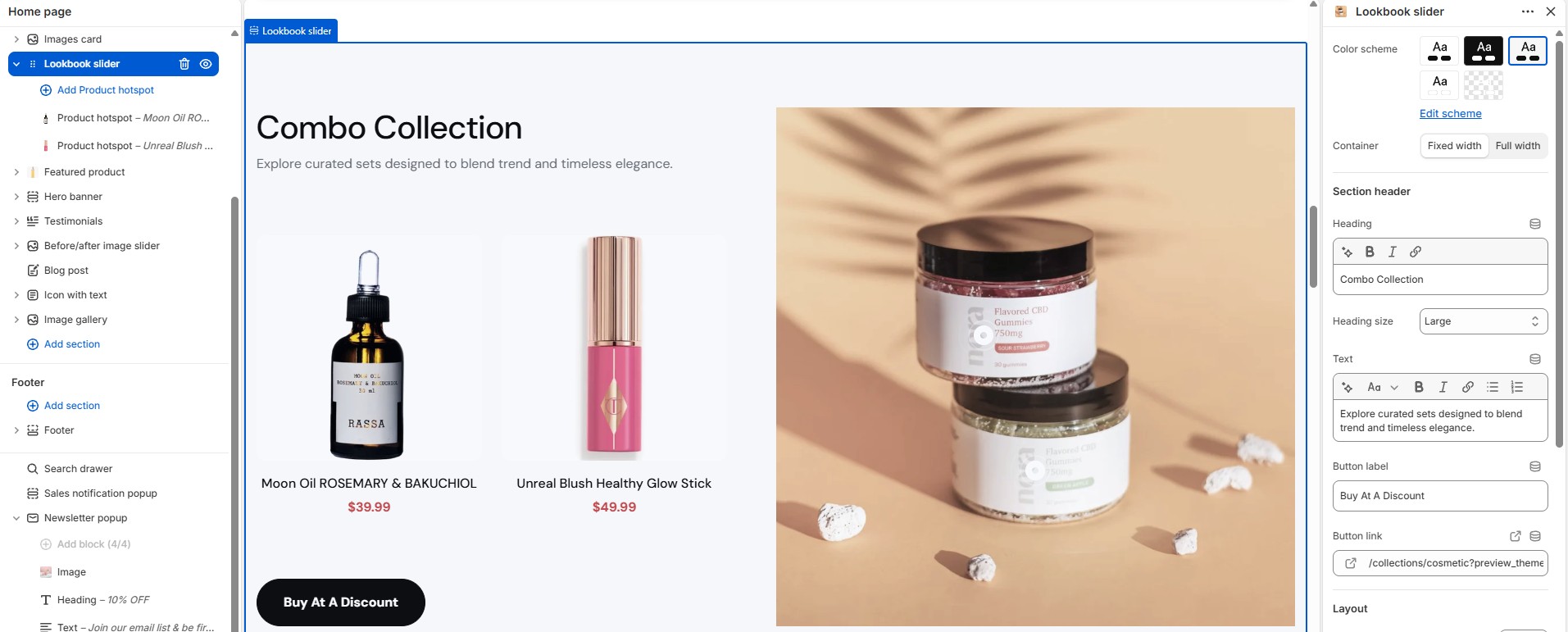
2. How to edit the Lookbook slider section
- • In the Theme Editor → click Add section → choose Lookbook slider.
- • Position Product hotspot blocks over each image and link them to products.
- • Make the necessary adjustments → click Save.
-
Countdown with image
1. What is the Countdown with image section?
This section pairs a left/right image layout with a live Countdown timer block — typically used for a sale or launch banner.
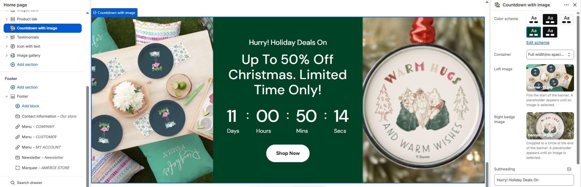
2. How to edit the Countdown with image section
- • In the Theme Editor → click Add section → choose Countdown with image.
- • Set the countdown end date/time and the left/right images.
- • Make the necessary adjustments → click Save.
-
Discount banner
1. What is the Discount banner section?
A promotional banner with a countdown date and style setting, used to advertise a site-wide sale or discount code.
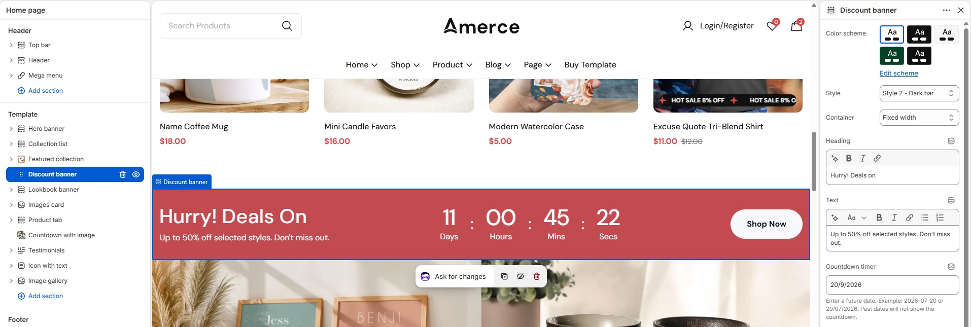
2. How to edit the Discount banner section
- • In the Theme Editor → click Add section → choose Discount banner.
- • Set the countdown date and banner style.
- • Make the necessary adjustments → click Save.
-
FAQ
1. What is the FAQ section?
The FAQ section renders an expandable list of Question blocks (question + answer) as an accordion.
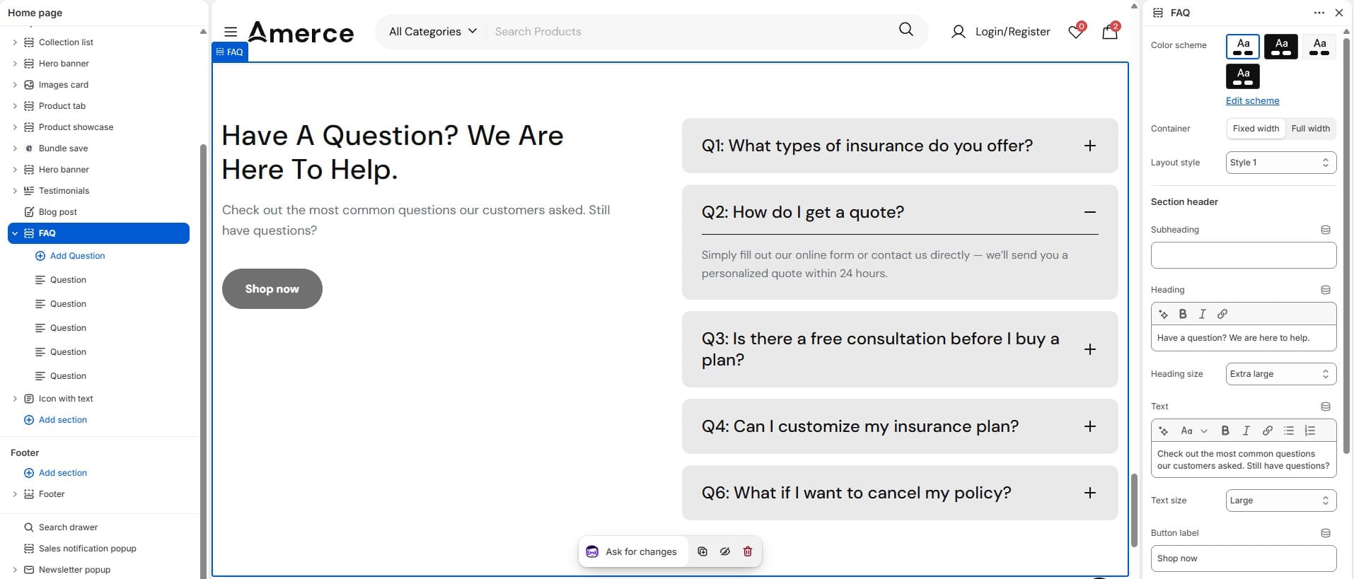
2. How to edit the FAQ section
- • In the Theme Editor → click Add section → choose FAQ.
- • Add/edit Question blocks.
- • Make the necessary adjustments → click Save.
-
Testimonials
1. What is the Testimonials section?
The Testimonials section shows a carousel of Testimonial blocks (customer name, avatar, quote, and optional rating).
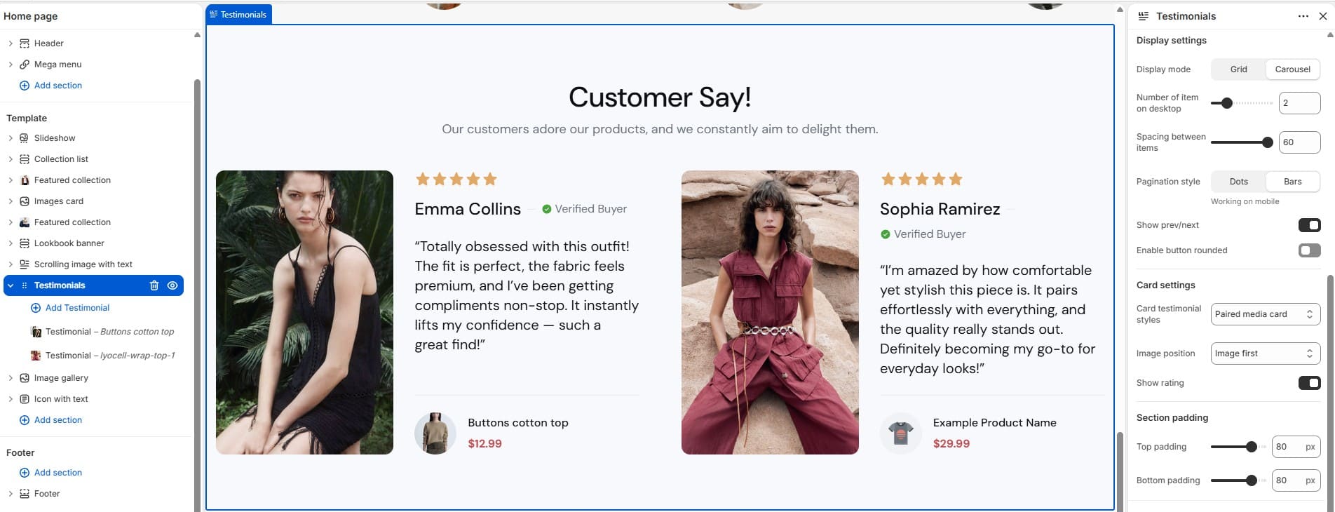
2. How to edit the Testimonials section
- • In the Theme Editor → click Add section → choose Testimonials.
- • Add/edit Testimonial blocks.
- • Make the necessary adjustments → click Save.
-
Map
1. What is the Map section?
The Map section embeds a Google Map (via iframe URL) — typically used on the Contact page.
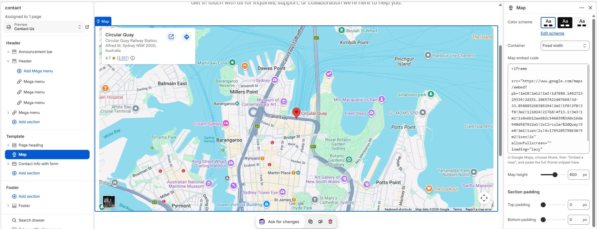
2. How to edit the Map section
- • In the Theme Editor → click Add section → choose Map.
- • Paste your Google Maps embed URL.
- • Make the necessary adjustments → click Save.
-
Contact form with banner
1. What is the Contact form with banner section?
This section pairs a Banner image with a contact form, so customers can send inquiries directly from a visually rich layout.
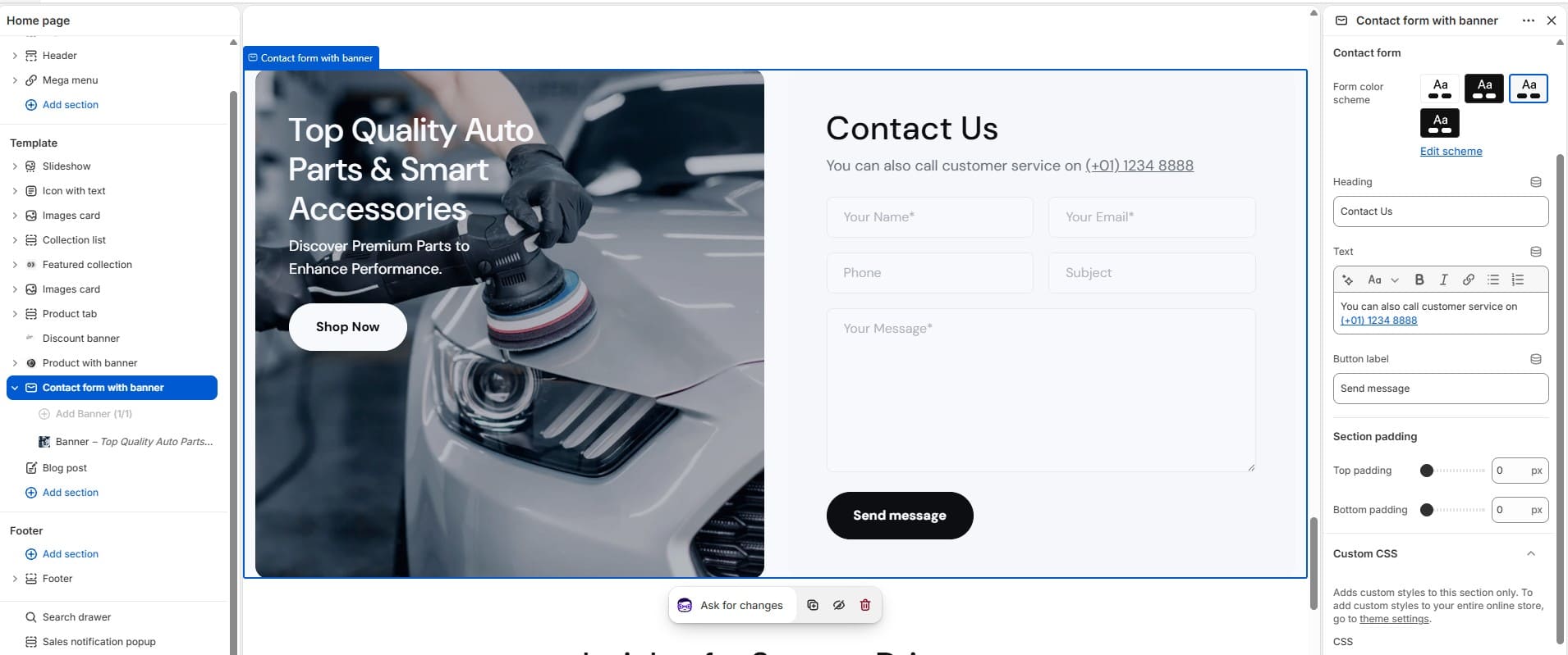
2. How to edit the Contact form with banner section
- • In the Theme Editor → click Add section → choose Contact form with banner.
- • Edit the Banner block and form fields.
- • Make the necessary adjustments → click Save.
-
Blog post
1. What is the Blog post section?
Blog post is a homepage teaser block showing recent articles from a selected blog, with card style and "mixed style" layout options.
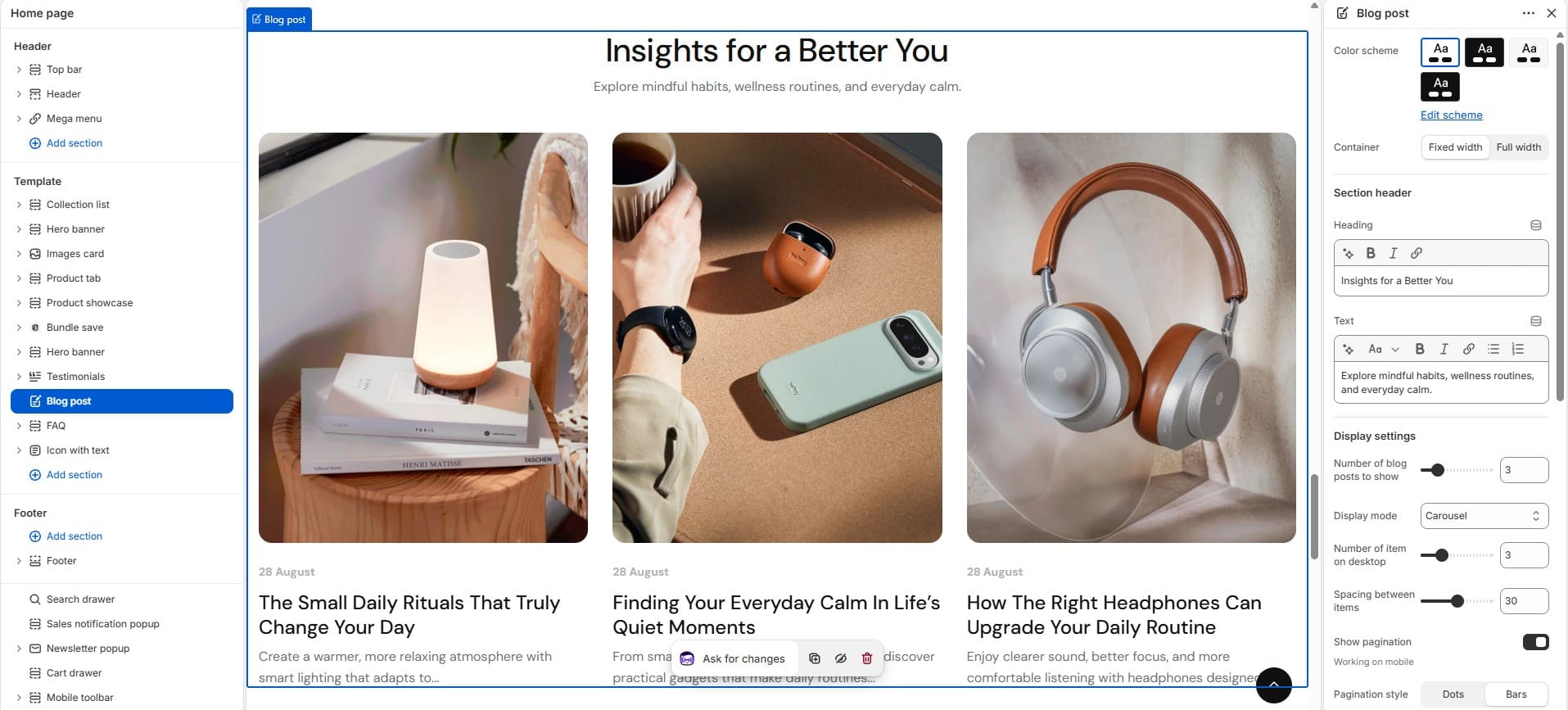
2. How to edit the Blog post section
- • In the Theme Editor → click Add section → choose Blog post.
- • Select the blog, post count, and card style.
- • Make the necessary adjustments → click Save.
-
Collection & Product Sections
-
Collection list
1. What is the Collection list section?
The Collection list section displays a grid of Collection blocks, each with its own image and title override, letting customers browse your store by category.
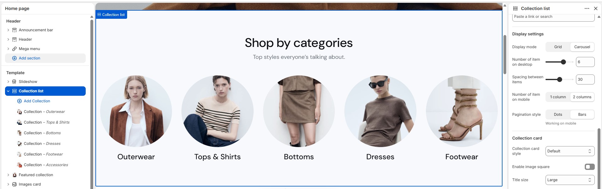
2. How to edit the Collection list section
- • In the Theme Editor → click Add section → choose Collection list.
- • Open each Collection block to select or update the collection and its image.
- • Make the necessary adjustments → click Save.
-
Featured collection
1. What is the Featured collection section?
The Featured collection section displays products from one selected collection, with a Banner block option and settings for product limit and card style.
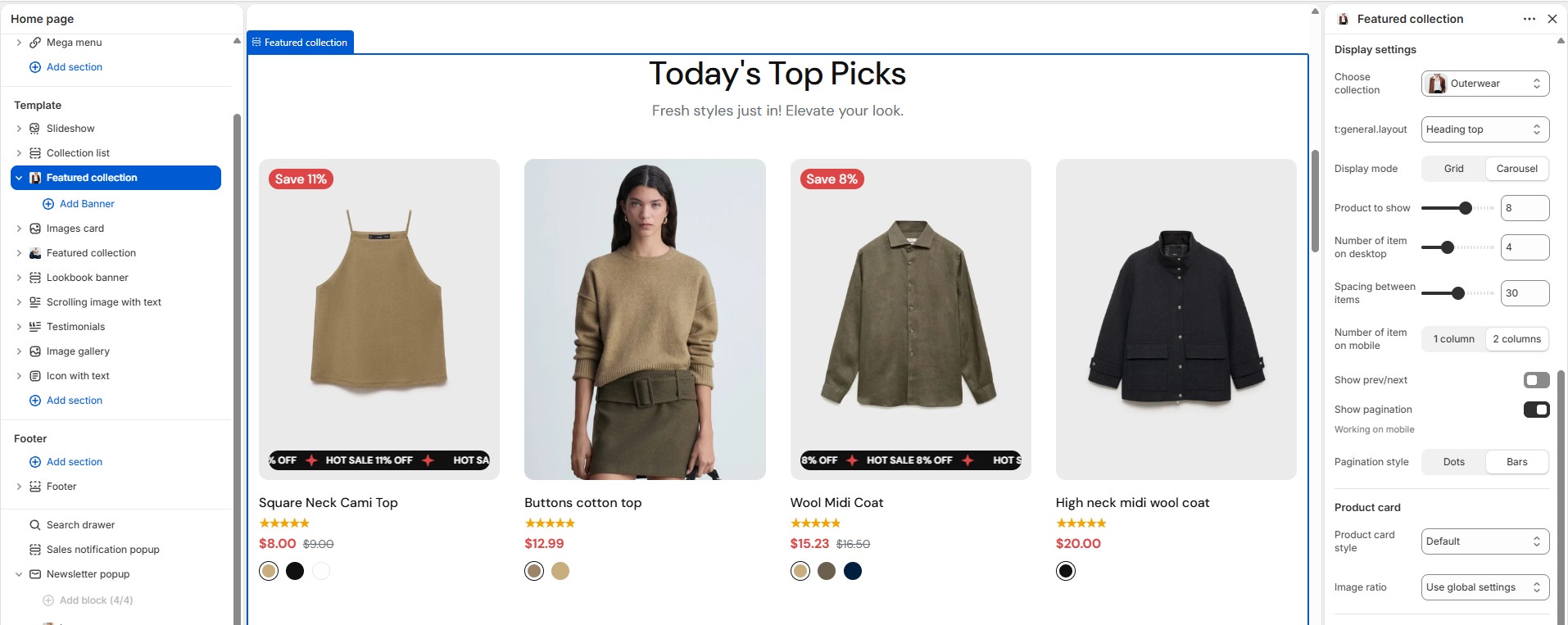
2. How to edit the Featured collection section
- • In the Theme Editor → click Add section → choose Featured collection.
- • Select the collection, product limit, and card style.
- • Make the necessary adjustments → click Save.
-
Product tab
1. What is the Product tab section?
The Product tab section displays products from multiple collections using Tab blocks — customers switch tabs to browse different collections without leaving the page.
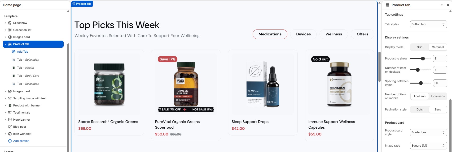
2. How to edit the Product tab section
- • In the Theme Editor → click Add section → choose Product tab.
- • Open each Tab block to select or update its collection.
- • Make the necessary adjustments → click Save.
-
Featured product
1. What is the Featured product section?
The Featured product section highlights a single product with a rich set of optional blocks: Title, Rating, Badges and tags, Inventory status, Stock progress bar, Countdown timer, Addon buttons, View full details link, SKU, Urgency badge, and Live viewers.
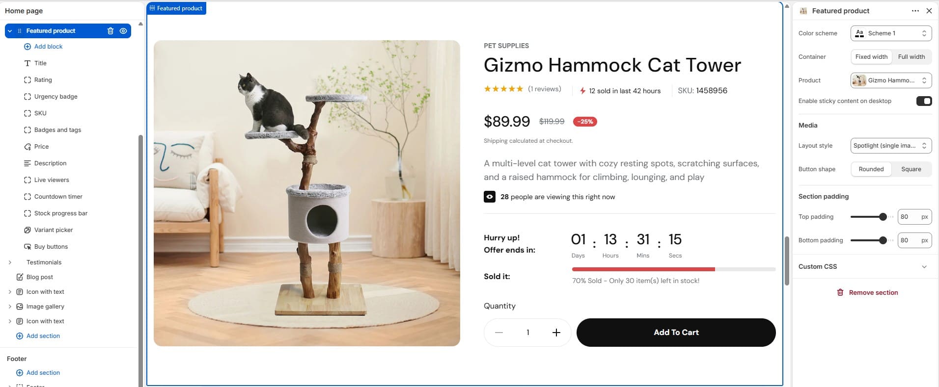
2. How to edit the Featured product section
- • In the Theme Editor → click Add section → choose Featured product.
- • Select the product, then add/reorder the blocks you want to show (rating, countdown, urgency badge, live viewers, etc.).
- • Some blocks require metafields — see Metafields.
- • Make the necessary adjustments → click Save.
-
Product with banner
1. What is the Product with banner section?
This section shows a product (or product list) next to a Banner block image — typically used to merchandise a specific product against lifestyle imagery.
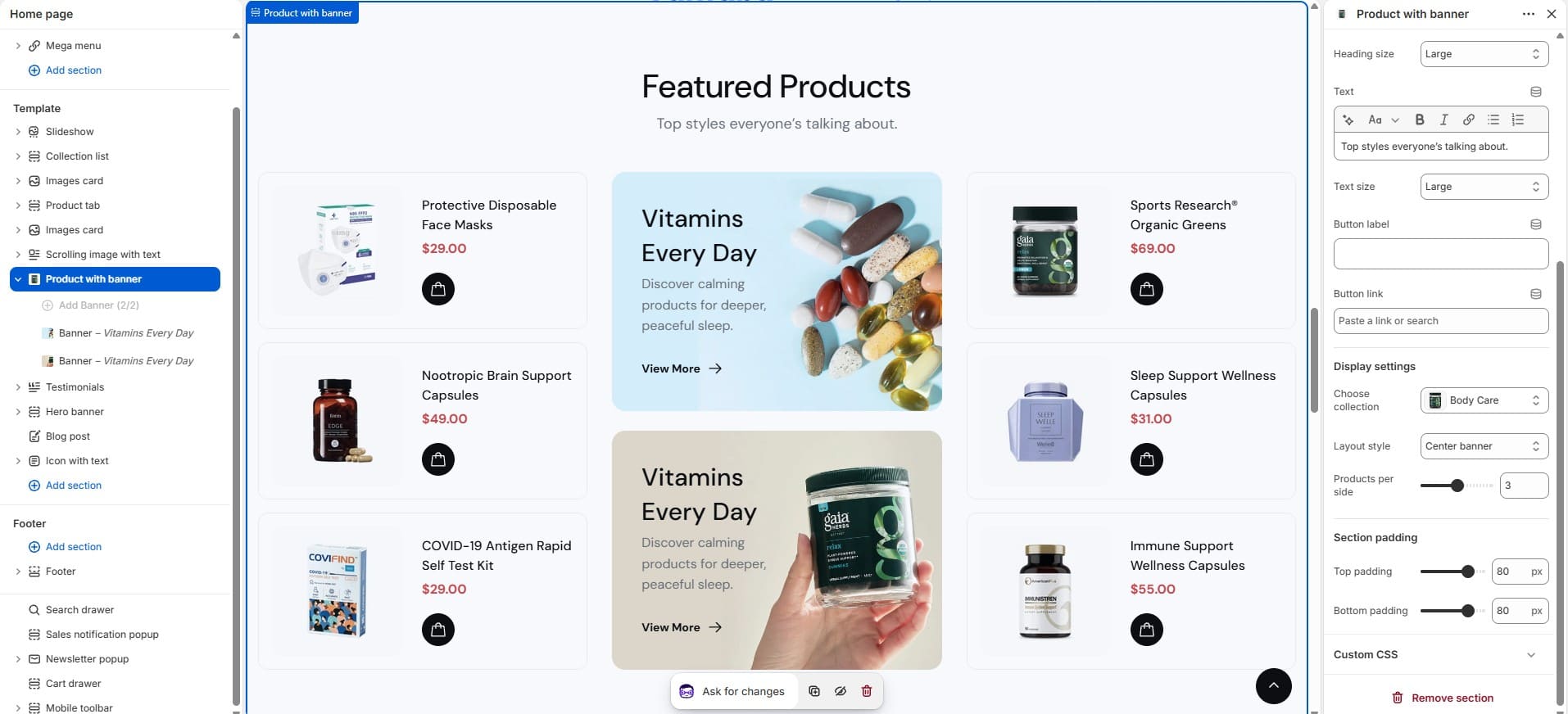
2. How to edit the Product with banner section
- • In the Theme Editor → click Add section → choose Product with banner.
- • Edit the Banner block and select the product(s).
- • Make the necessary adjustments → click Save.
-
Product showcase
1. What is the Product showcase section?
The Product showcase section displays a curated set of Product item blocks in a gallery-style layout for editorial merchandising.
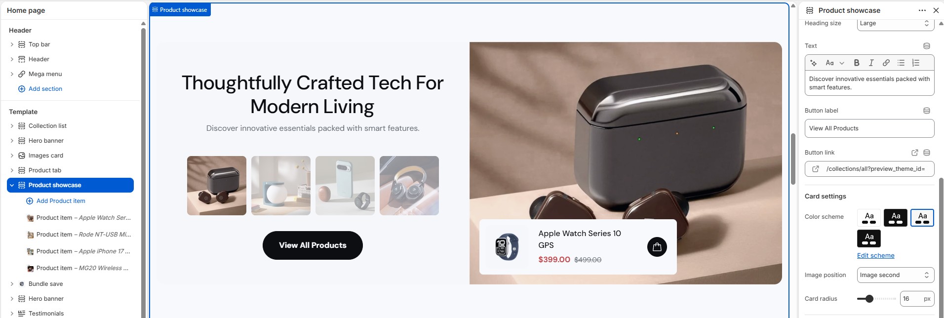
2. How to edit the Product showcase section
- • In the Theme Editor → click Add section → choose Product showcase.
- • Add/edit Product item blocks.
- • Make the necessary adjustments → click Save.
-
Bundle save
1. What is the Bundle save section?
Bundle save lets you group several Bundle product blocks into a "buy the set" offer, showing a combined price and savings versus buying separately.
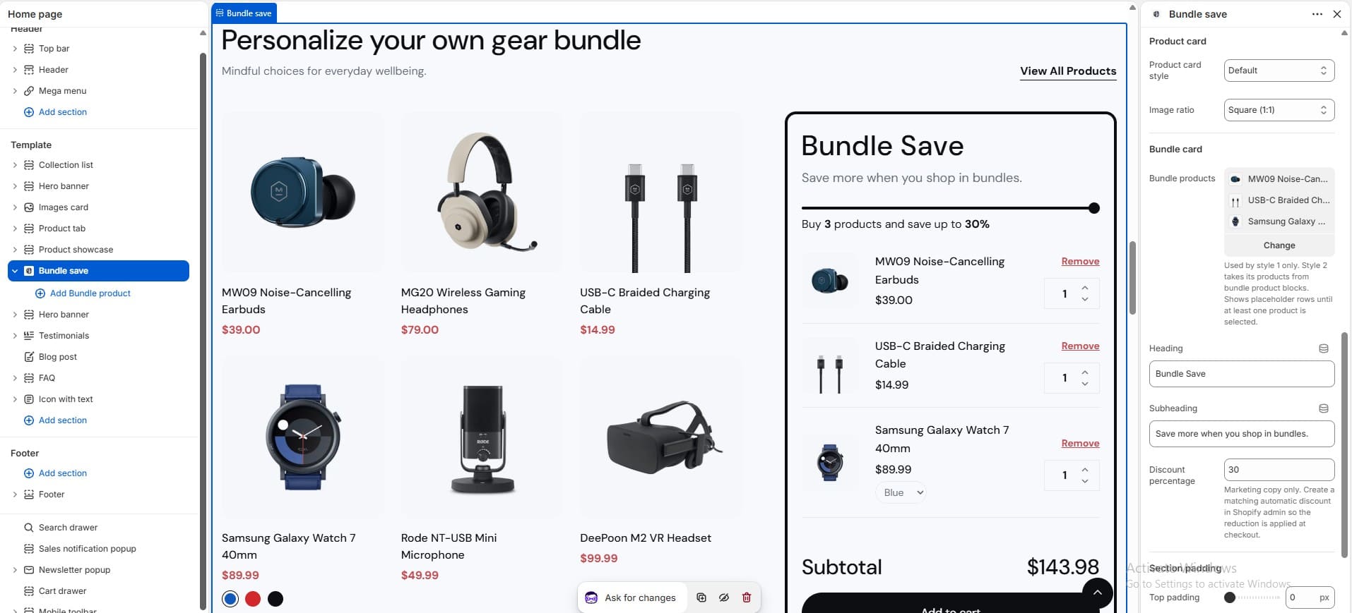
2. How to edit the Bundle save section
- • In the Theme Editor → click Add section → choose Bundle save.
- • Add Bundle product blocks and set the bundle image/style.
- • Make the necessary adjustments → click Save.
-
Collection Pages
-
Collections
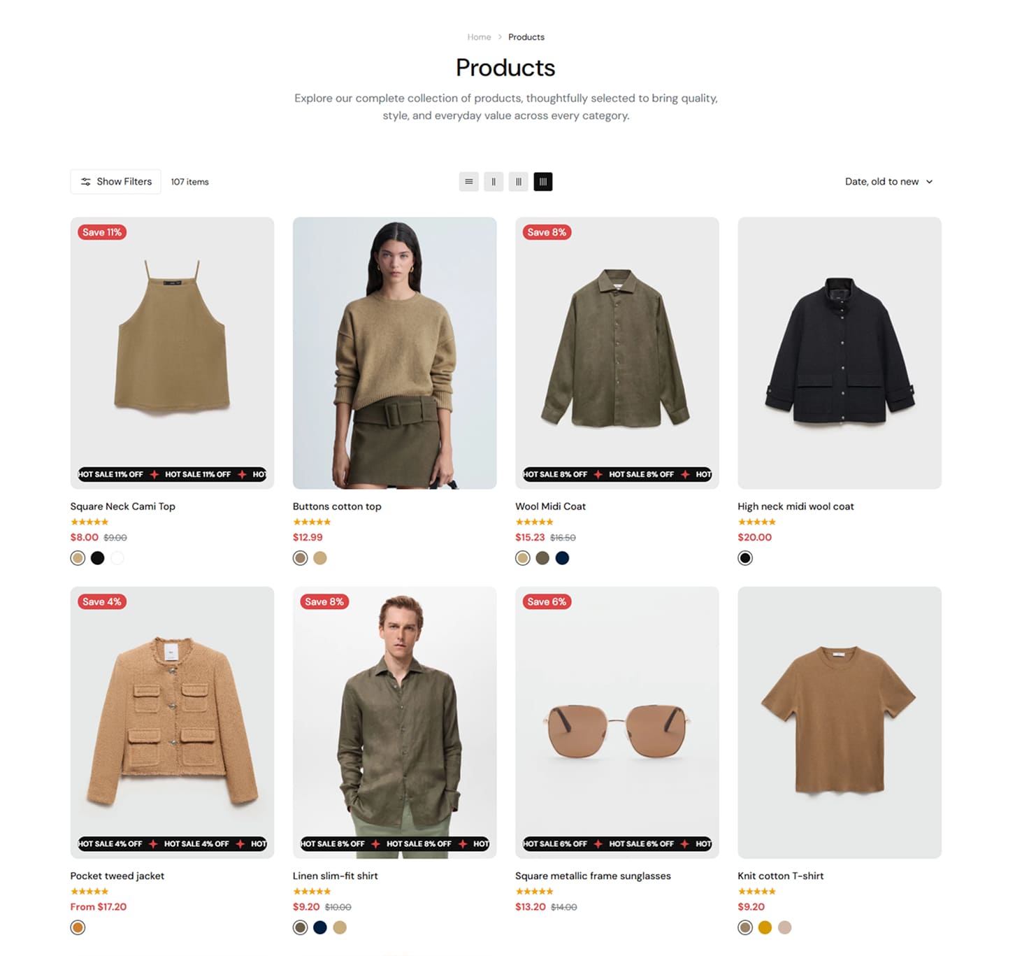
1. What is the Collection page?
The Collection page displays all products that belong to a specific collection. It helps customers browse products by category, view product cards, use facets/filters, sort results, and switch between grid or list layouts.
2. How to create a Collection page?
- Step 1: Login to your Shopify store, go to Online Store > Products
- Step 2: Add product
Note: Please click the link below. We have already provided a step-by-step guide on how to create and configure products. Simply follow the instructions there to set up your products correctly. Link
3. How to customize the Collection page
- • Go to Online Store → Themes → click Customize.
- • Open the template dropdown at the top and select Collections → Default collection.
- • This template already includes built-in sections such as Page heading, Main collection (grid + facets/filter sidebar).
- • Edit each section as needed, or click Add section to add more content.
- • Make the necessary adjustments → click Save.
-
Collections list
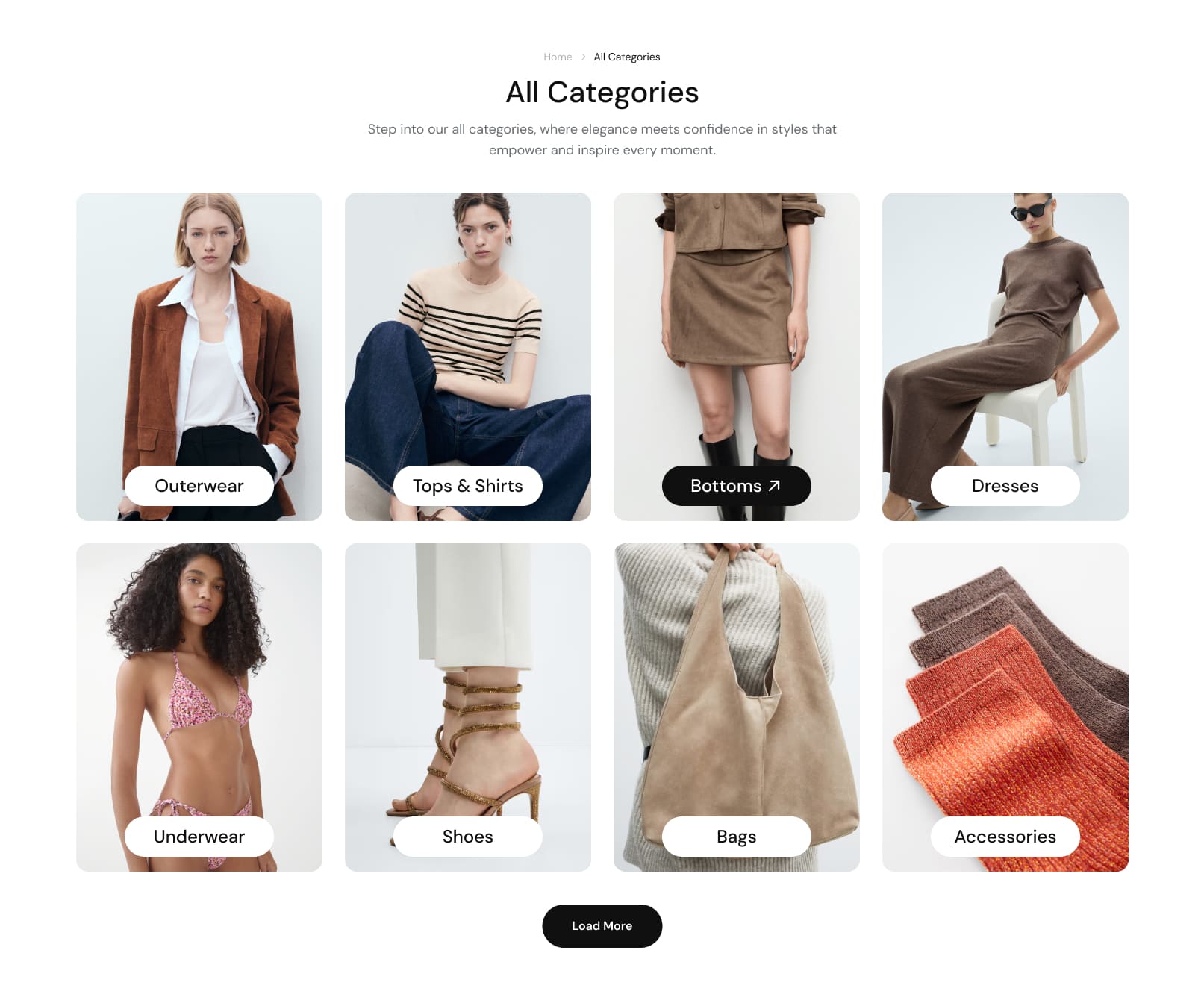
1. What is the Collections list page?
The Collections list page displays all collections created in your store as a grid, so customers can browse every category and click through to the one they're interested in.
2. How to add/manage Collections
Note: Please click the link below. We have already provided a step-by-step guide on how to create and configure collections. Simply follow the instructions there to set up your collections correctly. Link
3. How to customize the Collections list page
- • Go to Online Store → Themes → click Customize.
- • Open the template dropdown at the top and select Collection list.
- • This template already includes built-in sections such as Page heading (breadcrumb, heading, content text) and Collections Grid (the grid that lists every collection).
- • Open the Collections grid section to edit the number of collections shown per page, the number of columns on desktop/tablet/mobile, spacing, card corner radius, pagination type (link, load more button, or infinite scrolling), and alignment.
- • Edit each section as needed, or click Add section to add more content.
- • Make the necessary adjustments → click Save.
-
Product Pages
-
Product Pages
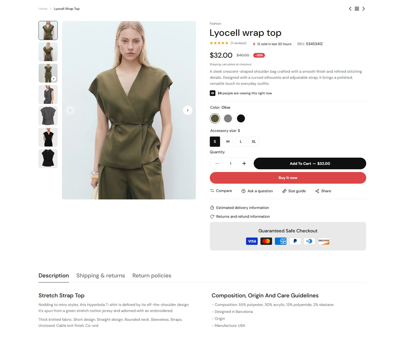
1. What is the Product page?
The Product page displays the full details of a specific product. It helps customers view the product gallery, price, rating, variant options, buy buttons, collapsible details (description, shipping, returns), bought together, complementary products, and related/recently viewed products. This page gives customers all important product information in one place, making it easier for them to decide and add the product to cart.
2. How to create and edit a Product ?
- Step 1: Login to your Shopify store, go to Online Store > Products
- Step 2: Add product or choose product -> edit content
Note: Please click the link below. We have already provided a step-by-step guide on how to create and configure products. Simply follow the instructions there to set up your products correctly. Link
3. How to create and edit Metafields ?
Note: Please click the link below. We have already provided a step-by-step guide on how to create and configure metafields. Simply follow the instructions there to set up your metafields correctly. Link
4. How to customize the Product page
- • Go to Online Store → Themes → click Customize.
- • Open the template dropdown at the top and select Products → choose the product template.
- • This template already includes built-in sections such as Main product, Product details tabs, and Related and recently viewed.
- • Make the necessary adjustments → click Save.
-
Blog Pages
-
Blogs
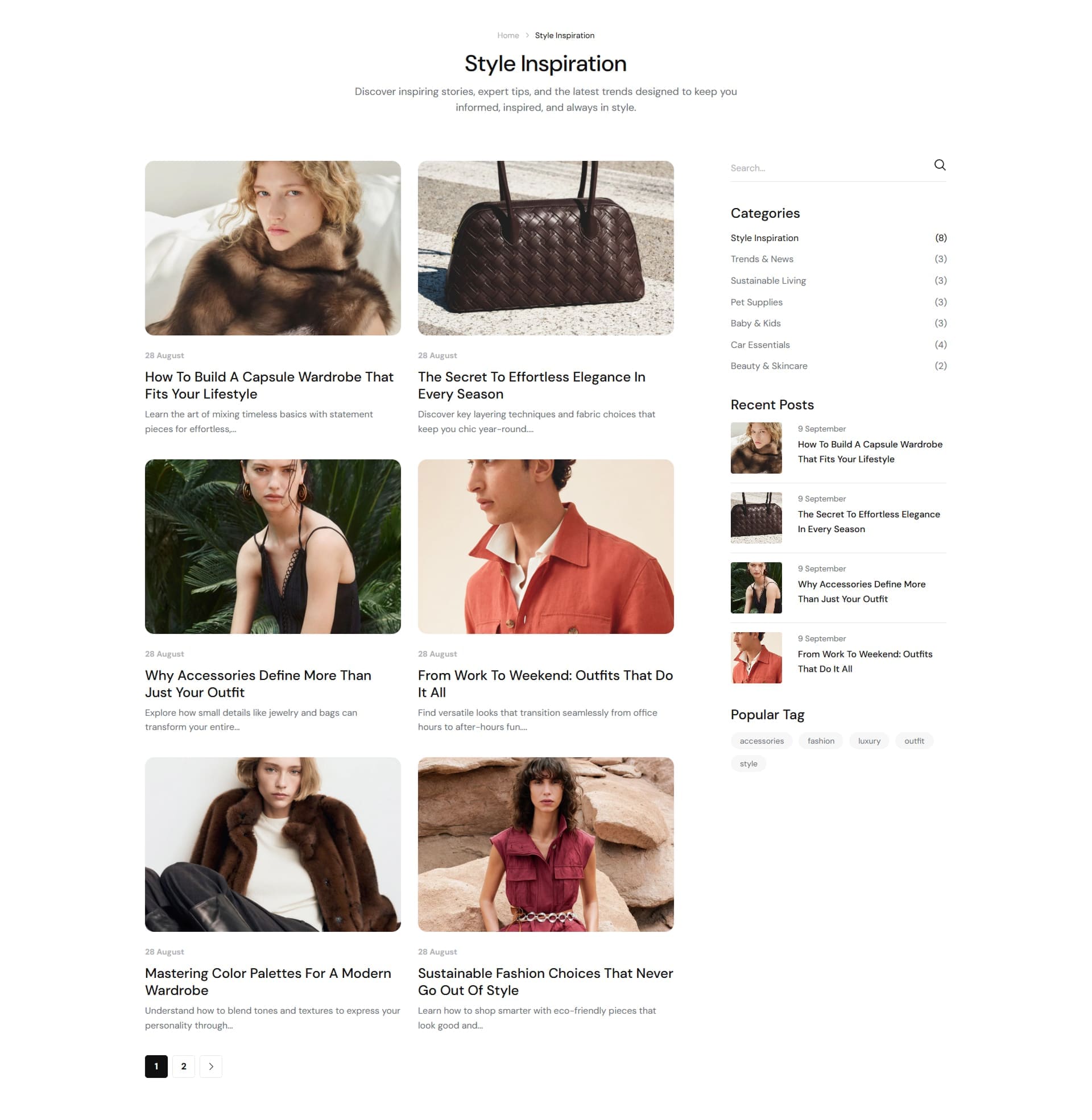
1. What is the Blogs page?
The Blogs page displays a list of blog posts from a selected blog. It usually shows each post with an image, tag, author, date, and title, helping customers browse and read your latest articles.
2. How to manage blogs and blog posts
Please click the link below. We have already provided a step-by-step guide on how to create and configure your Blog and Blog Posts. Simply follow the instructions there to set up your blog correctly. Link
3. How to customize the Blogs page
- • Go to Online Store → Themes → click Customize.
- • Open the template dropdown at the top and select Blogs → Default blog.
- • This template already includes built-in sections such as Page heading and Blog.
- • Edit each section as needed, or click Add section to add more content.
- • Make the necessary adjustments → click Save.
-
Blog Post Page
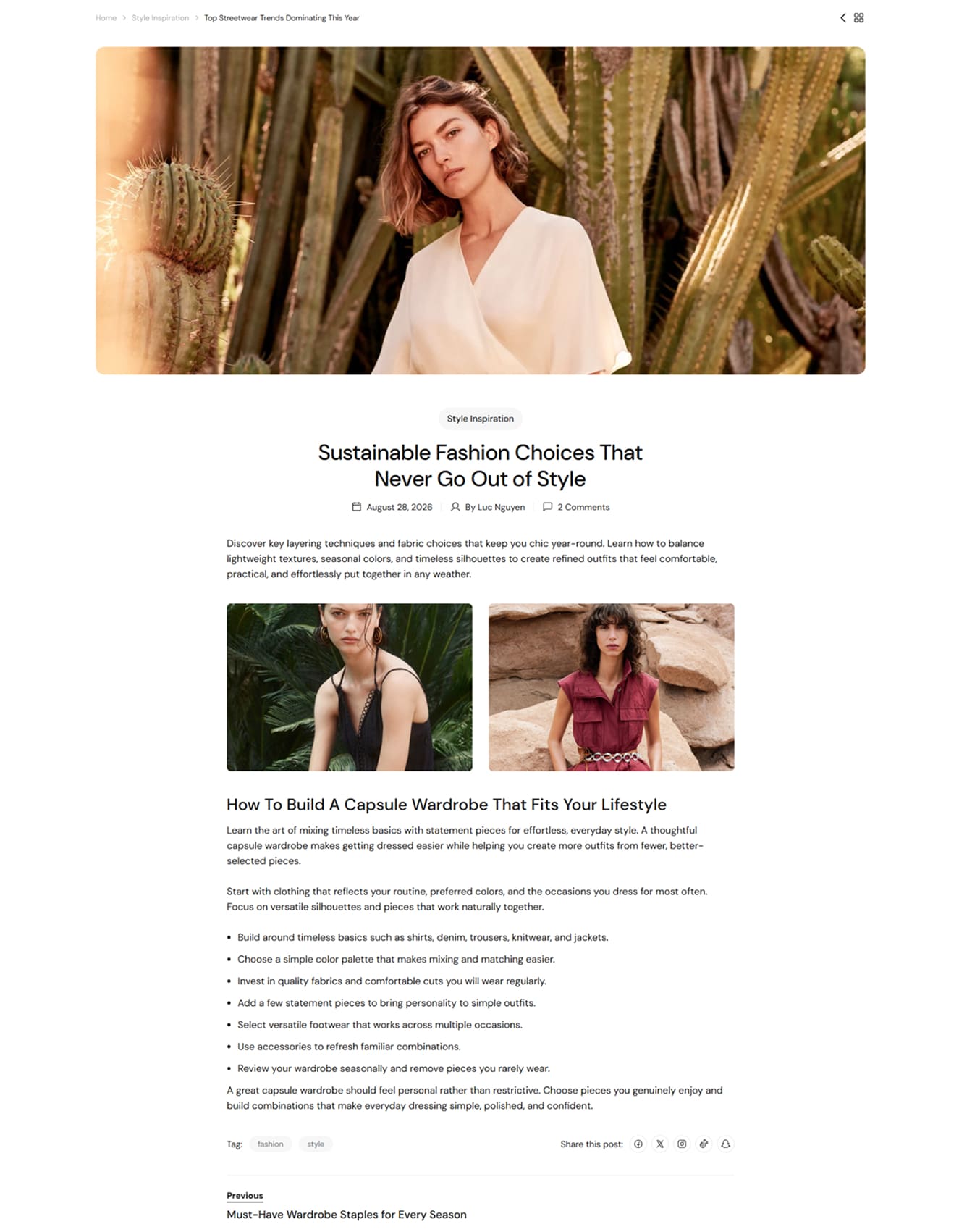
1. What is the Blog post page?
The Blog post page displays the full content of a single article. It usually includes the featured image, title, article content, tags, sidebar blog, and related posts.
2. How to customize the Blog post page
- • Go to Online Store → Themes → click Customize.
- • Open the template dropdown at the top and select Blog posts → Default blog post.
- • This template already includes built-in sections such as Page heading, Article, Sidebar blog, and Related Post.
- • Open each section to update the article layout, sidebar content, related posts, spacing, and display settings.
- • If needed, click Add section to add more content to the blog post page.
- • Make the necessary adjustments → click Save.
-
Other Pages
-
Contact Us
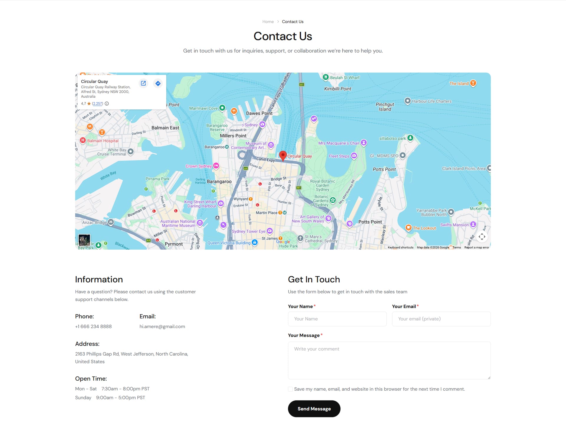
1. What is the Contact Us page?
The Contact Us page allows customers to reach your store directly. It usually includes a Google Map, business contact information, social links, and a contact form where customers can send inquiries.
2. How to create the Contact Us page
- Step 1: Go to Online Store > Pages
- Step 2: Create page new page
- • Title: Contact
- • Visibility: Visible
- • Theme template contact
Note: Please click the link below. We have already provided a step-by-step guide on how to create pages and configure them. Simply follow the instructions there to set up your page correctly. Link
3. How to customize the Contact Us page
- • Go to Online Store → Themes → click Customize.
- • Open the template dropdown at the top and select Pages → contact.
- • This template already includes built-in sections such as Page heading, Map, and Contact info with form.
- • Edit each section as needed, or click Add section to add more content.
- • Make the necessary adjustments → click Save.
-
About Us
1. What is the About Us page?
The About Us page tells your brand story. It usually includes an image with text block, key stats (counters), a FAQ, customer testimonials, and a team section to build trust with visitors.
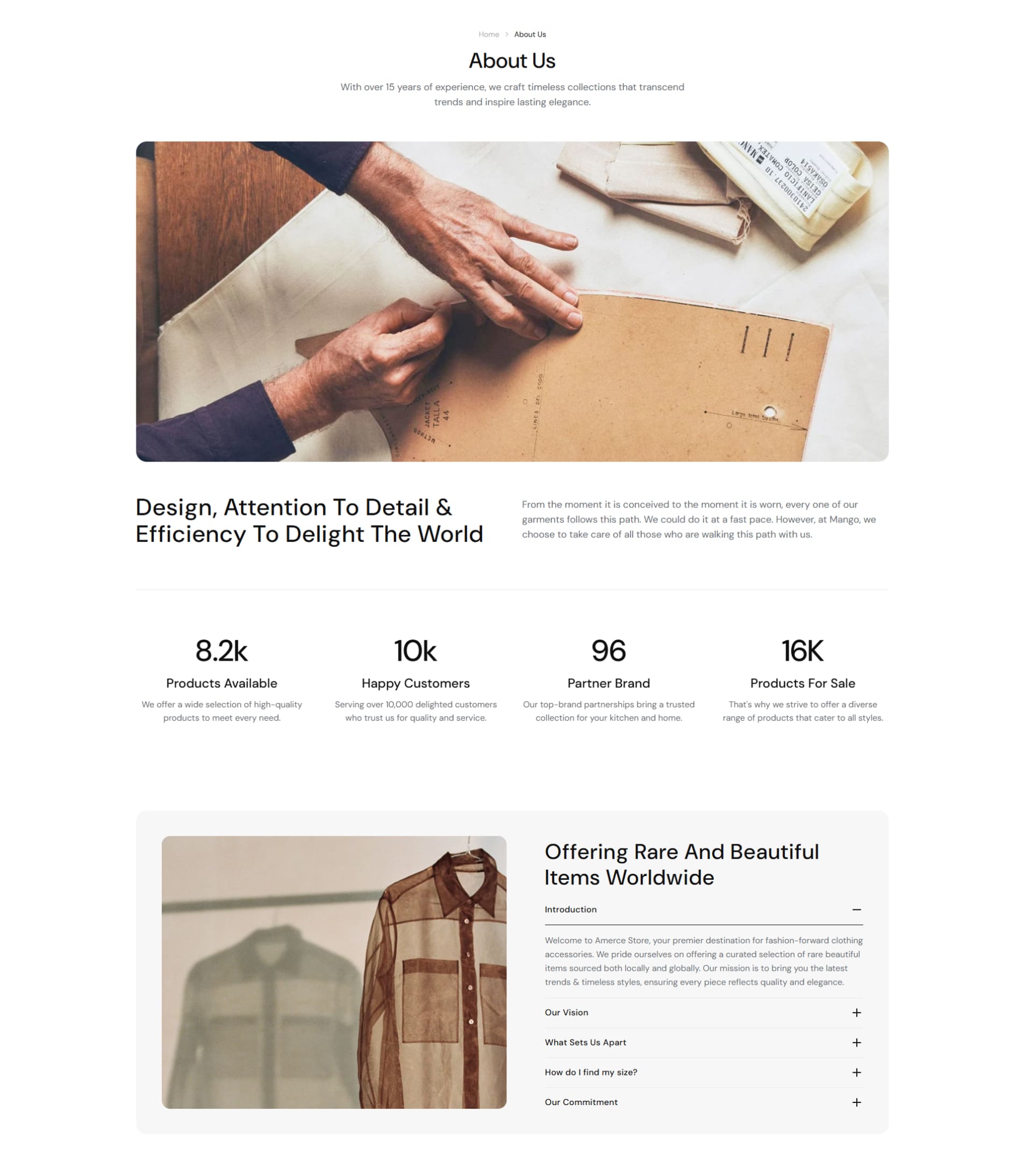
2. How to create the About Us page
- Step 1: Go to Online Store > Pages
- Step 2: Create a new page
- • Title: About Us
- • Visibility: Visible
- • Theme template about
Note: Please click the link below. We have already provided a step-by-step guide on how to create pages and configure them. Simply follow the instructions there to set up your page correctly. Link
3. How to customize the About Us page
- • Go to Online Store → Themes → click Customize.
- • Open the template dropdown at the top and select Pages → about.
- • This template already includes built-in sections such as Page heading, Image with text, Counter, FAQ, Testimonials, and Team.
- • Edit each section as needed, or click Add section to add more content.
- • Make the necessary adjustments → click Save.
-
Our Store
1. What is the Our Store page?
The Our Store page lists all your physical store/showroom locations, each with an image, address, phone, email, and a "Get direction" link to Google Maps, helping customers find and visit the location nearest them.
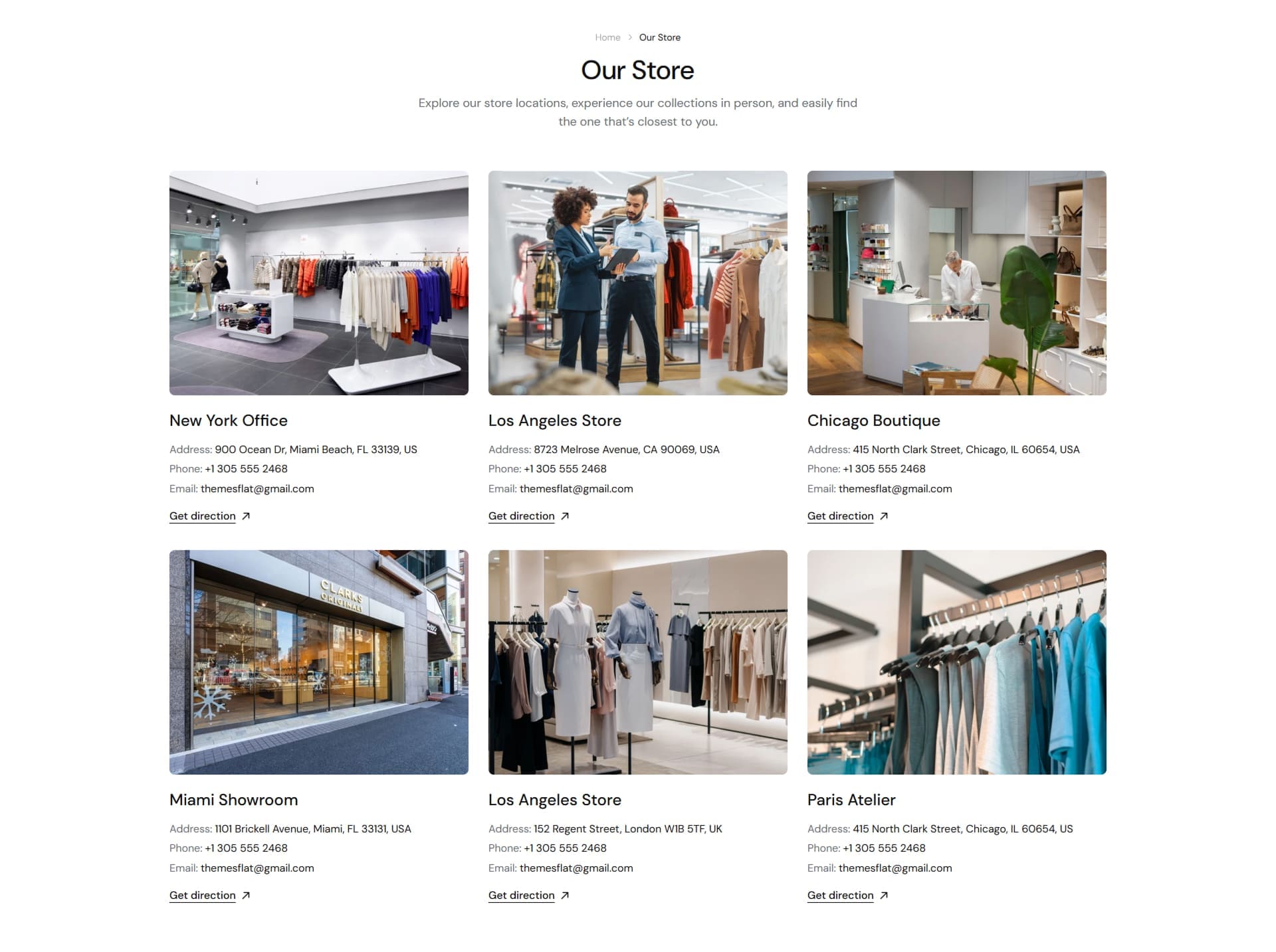
2. How to create the Our Store page
- Step 1: Go to Online Store > Pages
- Step 2: Create a new page
- • Title: Our Store
- • Visibility: Visible
- • Theme template our-store
Note: Please click the link below. We have already provided a step-by-step guide on how to create pages and configure them. Simply follow the instructions there to set up your page correctly. Link
3. How to customize the Our Store page
- • Go to Online Store → Themes → click Customize.
- • Open the template dropdown at the top and select Pages → our-store.
- • This template already includes built-in sections such as Page heading and Store locations.
- • Open the Store locations section → add/edit each Location block (image, title, address, phone, email, direction link), and set the display mode (grid/carousel) and number of columns.
- • Make the necessary adjustments → click Save.
-
FAQs
1. What is the FAQs page?
The FAQs page groups common customer questions — shipping, returns, sizing, payment — into an expandable question/answer list, helping customers self-serve answers before contacting support.
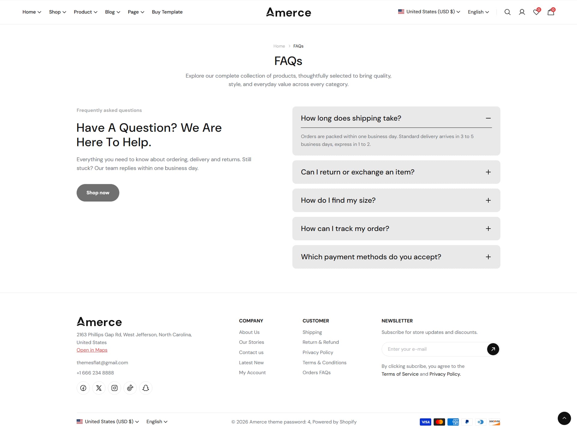
2. How to create the FAQs page
- Step 1: Go to Online Store > Pages
- Step 2: Create a new page
- • Title: FAQs
- • Visibility: Visible
- • Theme template faq
Note: Please click the link below. We have already provided a step-by-step guide on how to create pages and configure them. Simply follow the instructions there to set up your page correctly. Link
3. How to customize the FAQs page
- • Go to Online Store → Themes → click Customize.
- • Open the template dropdown at the top and select Pages → faq.
- • This template already includes built-in sections such as Page heading and FAQ.
- • Open the FAQ section → add/edit each Question block (question, answer, open by default).
- • Edit each section as needed, or click Add section to add more content.
- • Make the necessary adjustments → click Save.
-
Wishlist
1. What is the Wishlist page?
The Wishlist page lets customers view every product they have saved from a product card or product page. Wishlist data is stored client-side (browser localStorage), so it is per-browser rather than tied to a customer account.
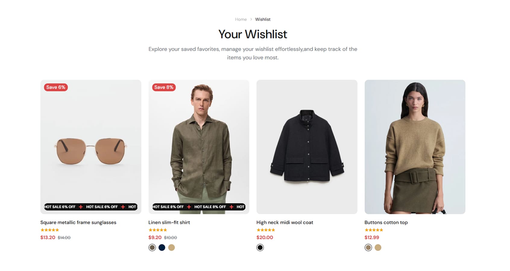
2. How to create the Wishlist page
- Step 1: Go to Online Store > Pages
- Step 2: Create a new page
- • Title: Wishlist
- • Visibility: Visible
- • Theme template wishlist
Note: Please click the link below. We have already provided a step-by-step guide on how to create pages and configure them. Simply follow the instructions there to set up your page correctly. Link
3. How to customize the Wishlist page
- • Go to Online Store → Themes → click Customize.
- • Open the template dropdown at the top and select Pages → wishlist.
- • This template already includes built-in sections such as Page heading, Wishlist page.
- • Make the necessary adjustments → click Save.
-
Compare
1. What is the Compare page?
The Compare page lets customers compare selected products side by side. It displays product images, prices, and key information such as vendor, availability, rating, and variant options.
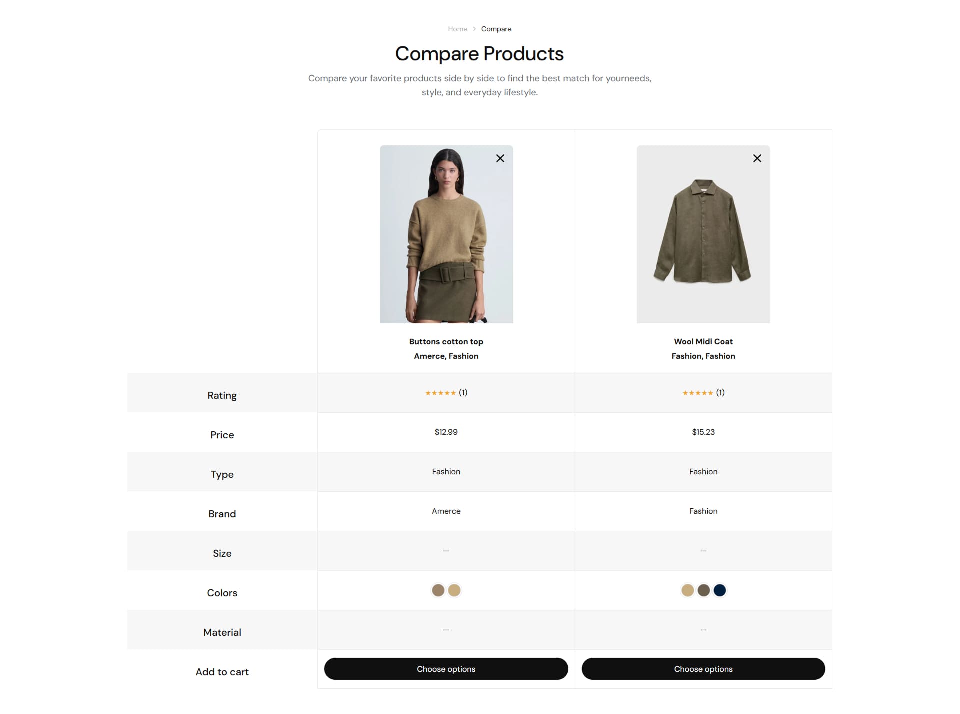
2. How to create the Compare page
- Step 1: Go to Online Store > Pages
- Step 2: Create page new page
- • Title: Compare
- • Visibility: Visible
- • Theme template compare
Note: Please click the link below. We have already provided a step-by-step guide on how to create pages and configure them. Simply follow the instructions there to set up your page correctly. Link
3. How to customize the Compare page
- • Go to Online Store → Themes → click Customize.
- • Open the template dropdown at the top and select Pages → compare.
- • This template already includes built-in sections such as Page heading, Compare.
- • Edit each section as needed, or click Add section to add more content.
- • Make the necessary adjustments → click Save.
-
Search page
1. What is the Search page?
The Search page lets customers search for content in your store. It displays search results — products, articles, and pages — for the keyword entered by the customer, using the same filter sidebar, sorting, and grid/list layout as the Collection page.
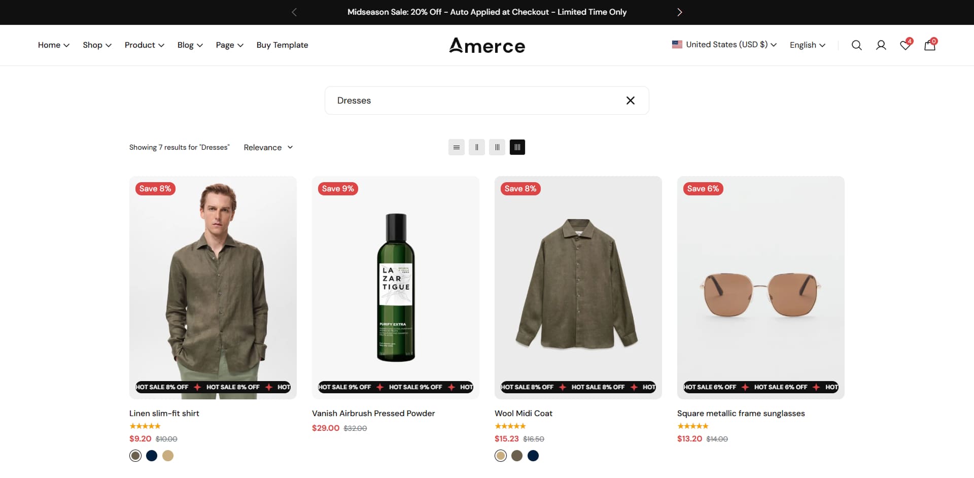
2. How to customize the Search page
- • Go to Online Store → Themes → click Customize.
- • Open the template dropdown at the top and select Search.
- • This template includes one built-in section, Main search, where you can enable filtering (sidebar or drawer layout), sorting, product count, the view switcher (grid/list), number of columns per breakpoint, pagination type, product card options (badges, swatches, quick view/quick add, wishlist, compare), and whether matching articles and pages are shown alongside products.
- • Make the necessary adjustments → click Save.
-
Cart page
1. What is the Cart page?
The Cart page lists every item the customer has added to their cart, with quantity, price, subtotal, order note, discount code, shipping estimator, and the checkout button. It is shown at the /cart URL, or as a cart drawer instead if Cart type is set to Drawer.
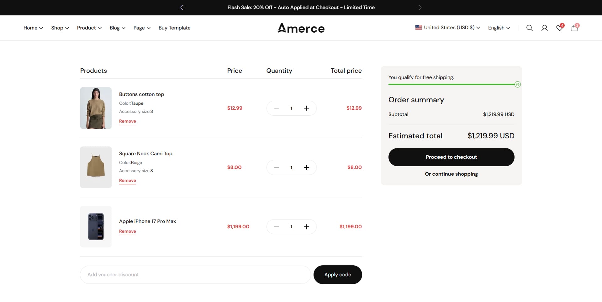
2. How to customize the Cart page
- • Go to Online Store → Themes → click Customize.
- • Open the template dropdown at the top and select Cart.
- • This template includes one built-in section, Main cart, where you can enable the cart timer, the free shipping progress bar, the discount code field, the terms & conditions checkbox (with a linked terms page), and dynamic checkout buttons.
- • Make the necessary adjustments → click Save.
Note: Whether the cart opens as a drawer or a full page, along with its recommendations and free shipping settings, is configured under Theme settings → Cart. Link
-
Shipping Policy
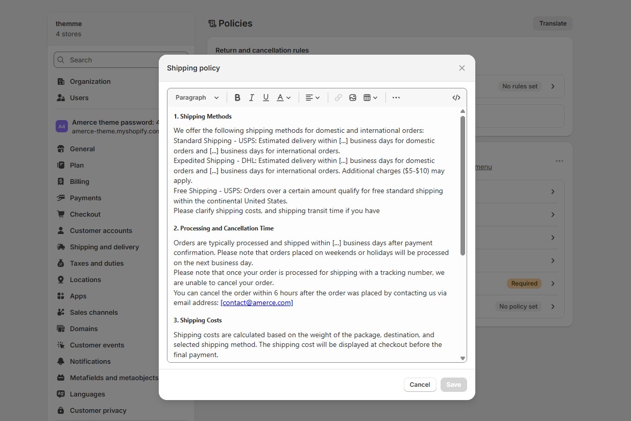
1. What is the Shipping policy page?
Provides clear information about shipping methods, delivery times, and costs. It helps customers understand how and when their orders will be delivered, including domestic and international shipping details.
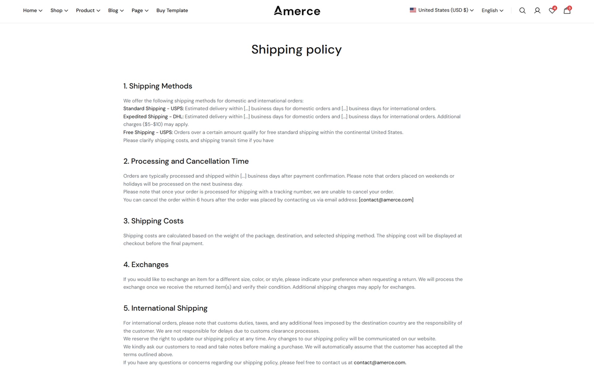
2. How to create page Shipping Policy ?
- • Log in to your Shopify admin and navigate to Settings > Policies.
- • Open the Shipping policy section.
- • Edit your shipping policy content → click Save.
-
Refund policy
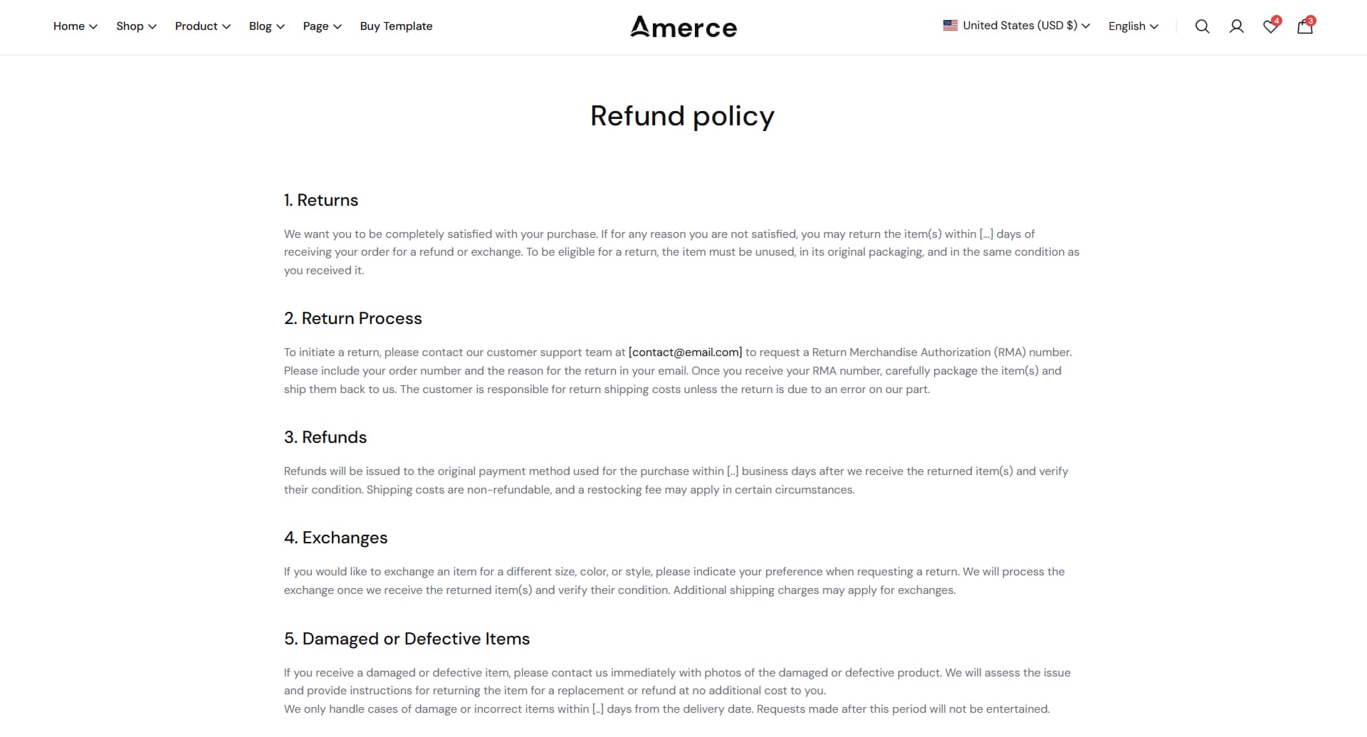
1. What is the Refund policy page?
Explains the return and refund process, including conditions, timelines, and exceptions. It ensures customers know what to expect if they need to return or exchange a product.
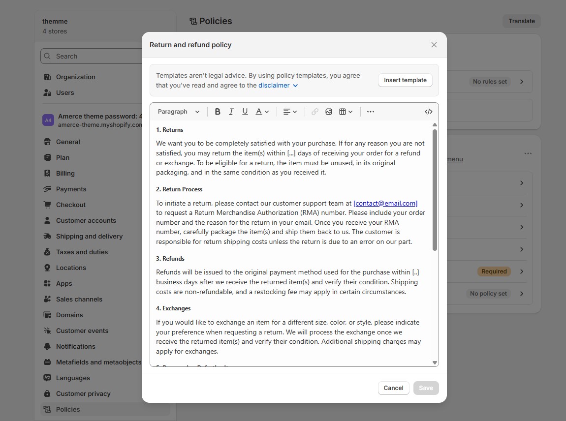
2. How to create page Returns Policy ?
- • Log in to your Shopify admin and navigate to Settings > Policies.
- • Open the Return and refund policy section.
- • Edit your Return and refund policy content → click Save.
-
Privacy Policy
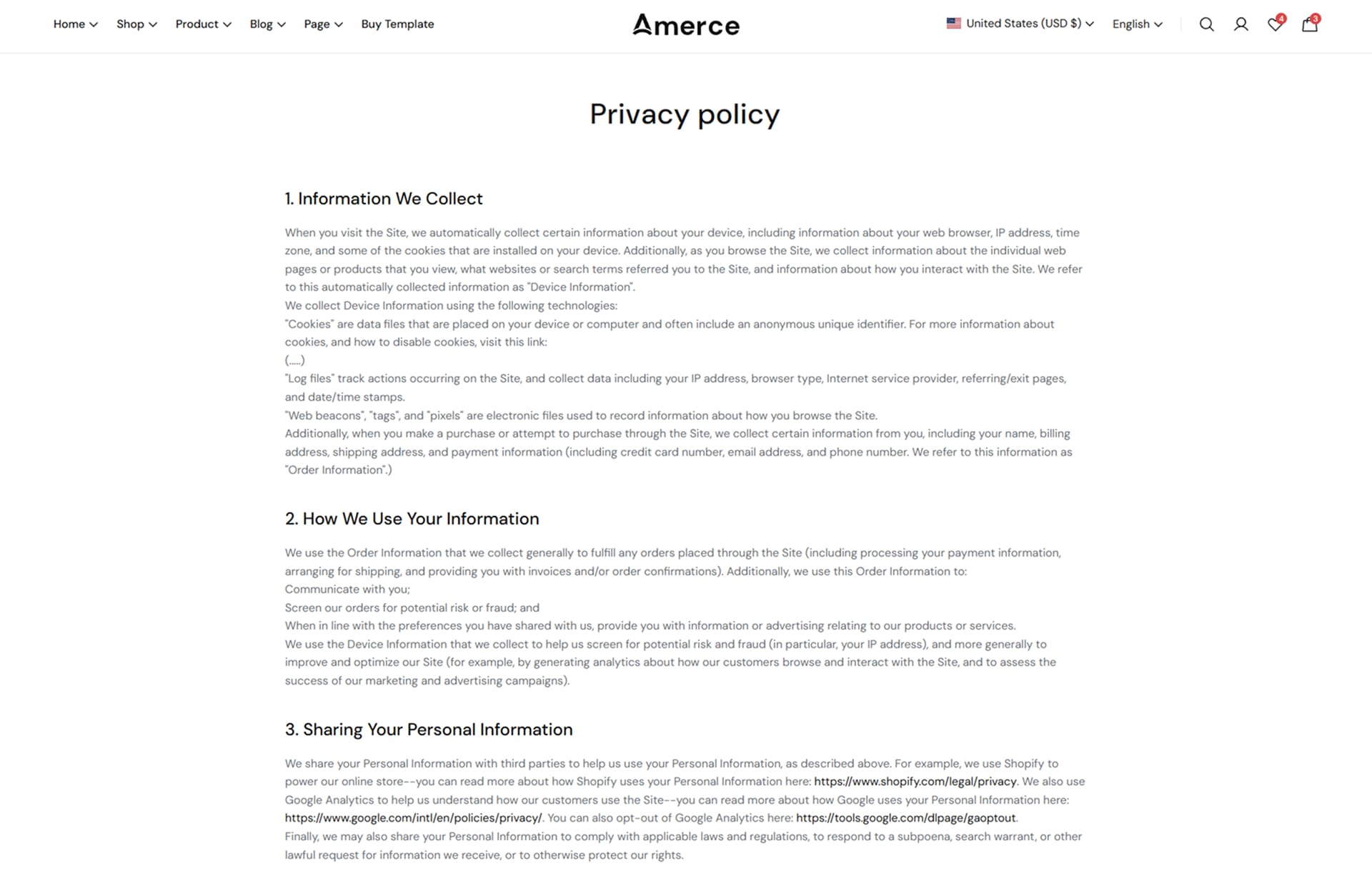
1. What is the Privacy policy page?
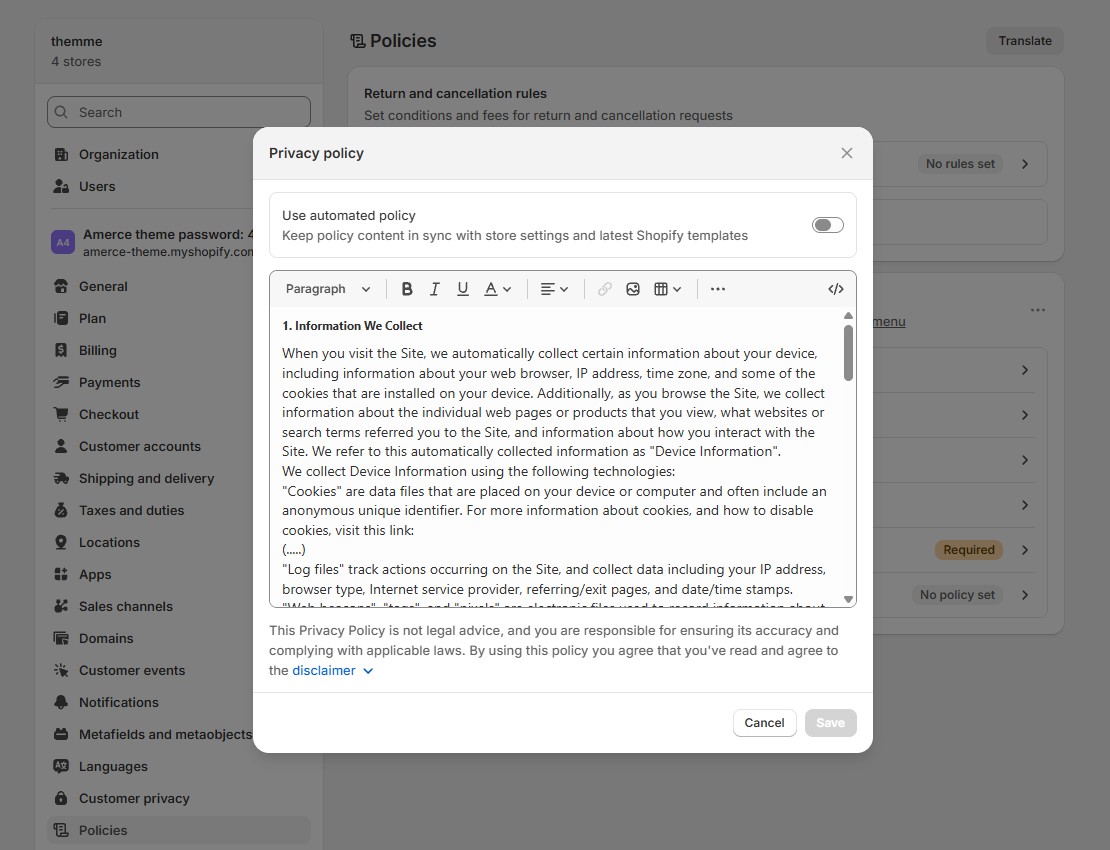
Describes how customer information is collected, used, and protected. It builds trust by ensuring transparency and compliance with data privacy standards.
2. How to create page Privacy policy ?
- • Log in to your Shopify admin and navigate to Settings > Policies.
- • Open the Privacy policy section.
- • Edit your Privacy policy content → click Save.
-
Terms of Service
1. What is the Terms of Service page?
Outlines the rules and conditions for using the website, including user responsibilities, product information, and legal terms. It protects both the business and its customers.
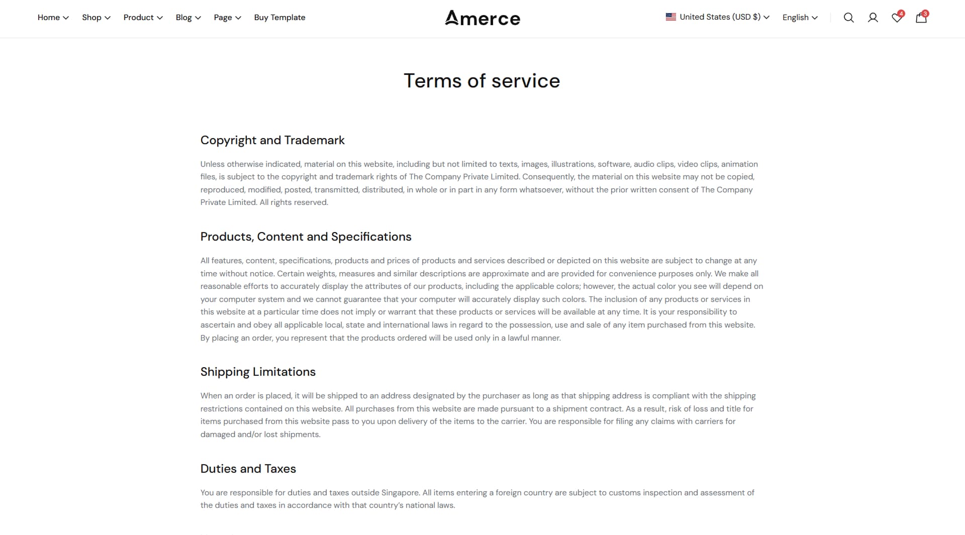
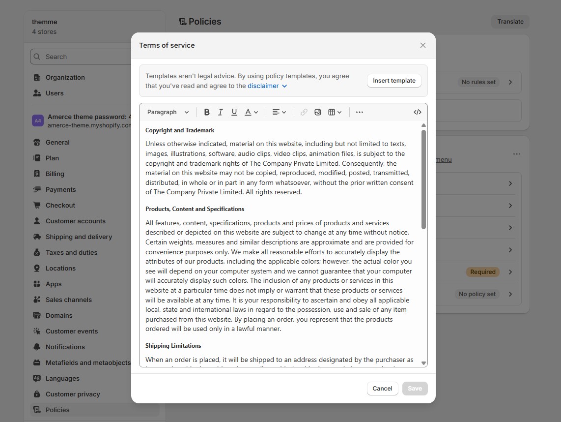
2. How to create page Terms of Service ?
- • Log in to your Shopify admin and navigate to Settings > Policies.
- • Open the Terms of service section.
- • Edit your Terms of service content → click Save.
-
Support
-
Support
1. Need more help?
If you cannot find the answer in this documentation, please contact us for support.
- • Email: themesflat@gmail.com
- • Microsoft Teams: themesflat@gmail.com
2. Support scope
Our support covers theme setup, building your site like the demo, using theme features, and fixing theme-related bugs. Please note that customization requests and third-party extensions are not included in our support scope.
3. Support time
We try our best to respond as soon as possible. Our working time is 8:00 AM – 5:00 PM, Monday to Friday (GMT+7). Requests sent during weekends or holidays may take a little longer to receive a response. Thank you for your patience.